C-Mini | Fall 2020
Part One: Typeface Spread
September 26, 2020
Project Overview
In this project, we were each assigned to do research on a typeface and get to know them better by compiling a list of adjectives that describe the typeface, a brief statement (50–65 words), and a narrative essay. I chose the font Futura.

Initial Notes:
- Consider the different stroke weights in the typeface family (diverse, versatile)
- Who is the designer? From what country during what time period?
- Type classification (serif vs. sans serif vs. slab serif, etc.)
- What was the font originally designed for? What did people end up using it for? (History through context and use)
Typeface Exploration:
I had previously worked a little bit with Futura before for a project last semester (letterform animations), though I focused way more on the physical/visual attributes of the typeface rather than the type-specific vernacular or contextual information, I decided to start there.
Research From Last Year
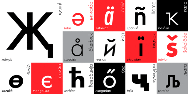

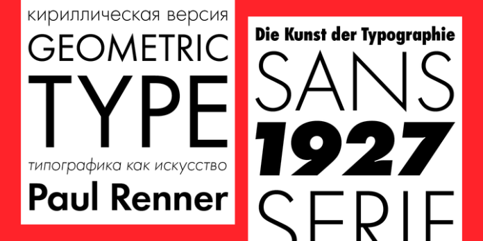
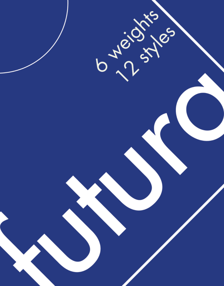

Important (REDUCED) Notes & Vocabulary
- Futura is classified as a geometric sans-serif (visual form based on geometry and letterforms devoid of extending features known as serifs.)
- Designed by Paul Renner for the New Frankfurt Project (Affordable housing in Frankfurt) in 1927 after being commissioned in 1924.
- Paul Renner was a profi writer on typography and director of the Master School for German Printers in Munich between 1927 and 1933.
- the appearance of efficiency and forwardness
- contrasting against the popular “handwritten type” that was popular at the time
- Low x-height, with tall ascenders
- Near roman proportions
- not associated with Bauhaus, but embodies many similar beliefs & Ideology
- Monolinear: vertical and horizontal strokes are the same weight in each specific stroke weight.
- Multiple different iterations, been around for 93 years now!
- Cropped this short since this medium is already ridiculously long
Adjectives
- Modern
- Versatile
- Readable
- Breathable
- Clean
- Geometric
- Industrial
- Timeless
- Countless Variations/Iterations
- Balance of Classic/Modern
- Consistent
- Reliable
Statement + Essay (Draft One)


Class Discussion + Typesetting
Class Notes: In class we looked at the template we were given for this project and discussed how to set it up from scratch, as well as basic typsetting for paragraphs of text + things to look out for.
- Legibility (clarity of individual letterforms and characters (type designer)) vs Readability (clarity/”visual comfort” of a piece of text (typesetting, controlled by the designer)).
- Weight: each typeface family has multiple different weights. Pairing an extremely light stroke weight with an extremely bold stroke weight decreases readability(comfort) and extreme stroke weights are generally less legible.
- Serif Fonts: serif fonts are more commonly used for body copy, the serifs of each character is believed to support the movement of the eye.
- Line spacing: should be 2–4 points larger than body copy
- Avoid more than one hyphenation/paragraph! (toggle off hyphenate)
- Text alignment: justification is extremely difficult (too many rivers), flush left + good rag is the way to go (generally).
- Type size: for this spread, aim for 9–12pts and adjust based on the individual typeface.
- Avoid widows and orphans! (going into new paragraph/new page)
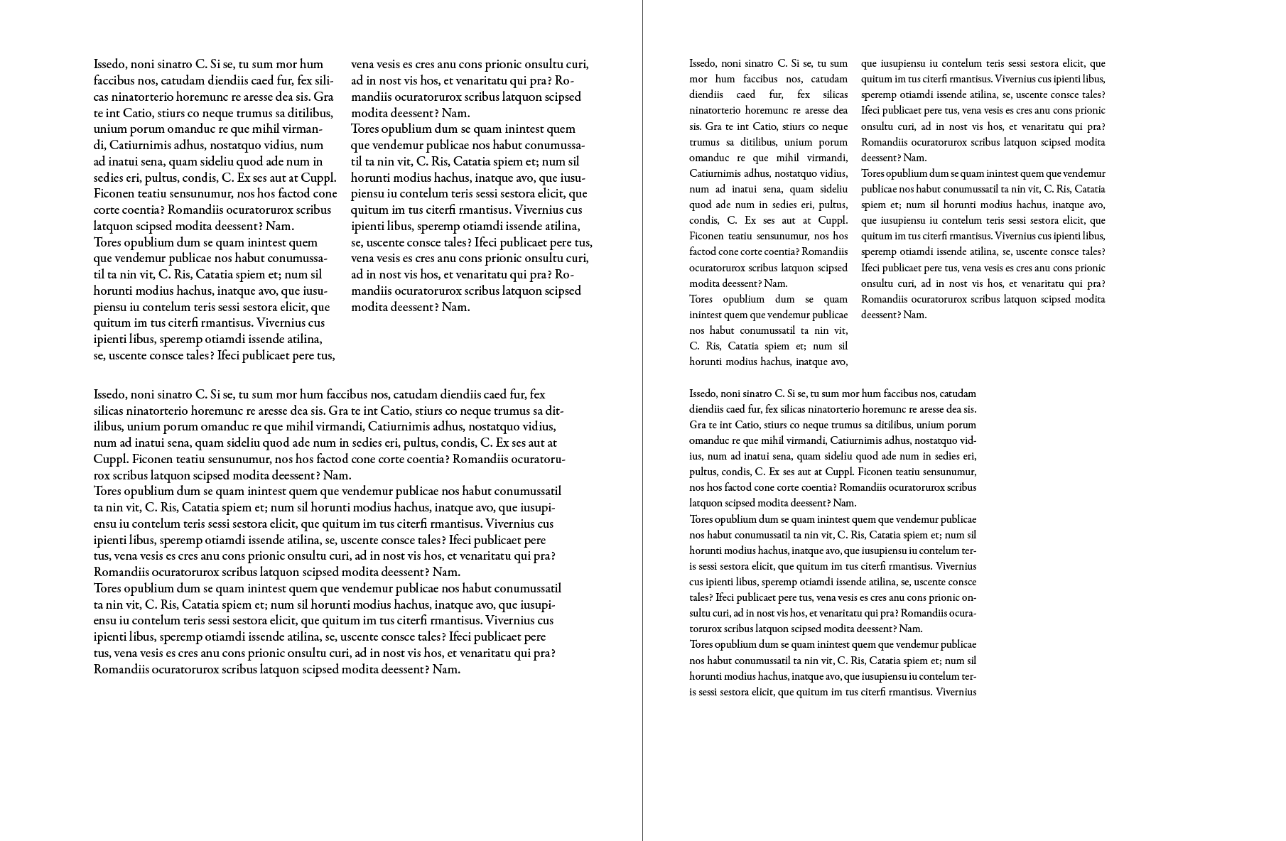
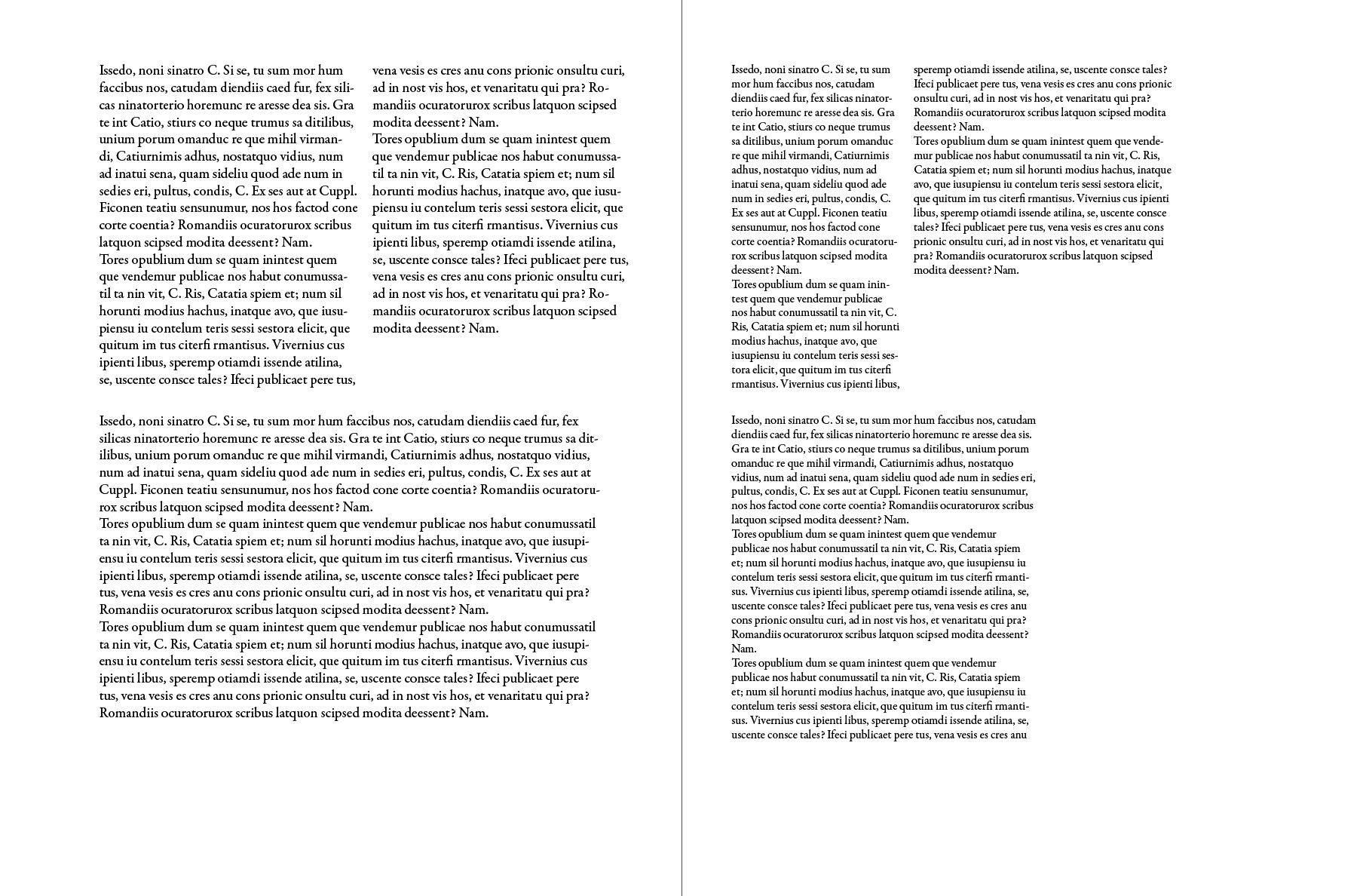
Thumbnail Explorations
I began with a few sketches (thumbnails) and mainly focused on typesetting, for which InDesign file I seem to have lost (sorry! I promise I brought it to crit though!)


It was difficult at this stage for me to think about layout without knowing exactly what kind of imagery/color scheme I was going to use, but I spend the most time considering the following:
- German 1920s architecture (very specific vibe)
- Primary colors
- Space exploration (futura’s affiliation with space)
- Circular motifs
- Playful Vibe, lack of serifs makes Futura look sort of bouncy (?)
Class Critique (Vicki)
Notes:
- 9/14 safe choice, but play around depending on what the body copy text you choose to use
- Serifs typically work better, follow your gut instinct (Garamond seems like a good choice)
- Three columns (the way I had it, aligned to the left of the page) can seem a bit crowded, consider cutting down on the essay and reducing to two columns.
- Start adding images, work composition around images rather than vice versa.
Image Explorations (Pt.1)
After that, I began my initial spread explorations, looking, and working with each of the different ideas I brainstormed earlier. I was very focused on the micro (details) of the typesetting that I didn’t have a chance to look at the larger picture!
I began by collecting images that I associated with Futura, which to me initially spoke of a very futuristic feeling:
- rendered / low contrast materials and fibers
- bright yet non-saturated color scheme
- ambiguous materials
- circular/round motifs

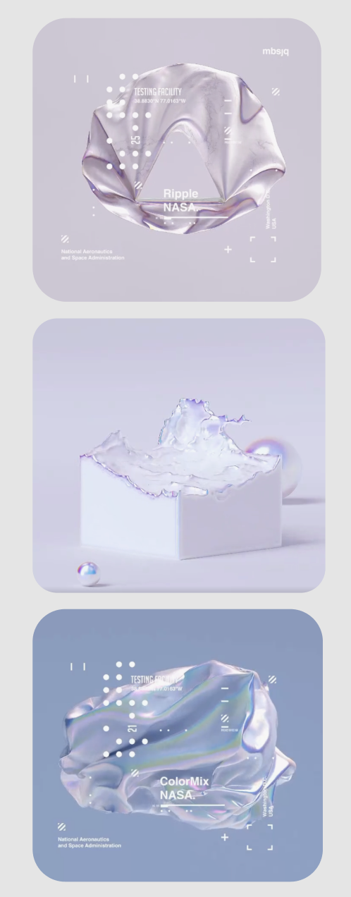

For this project, I definitely wanted to focus on achieving a breath of different explorations, rather than playing it safe.
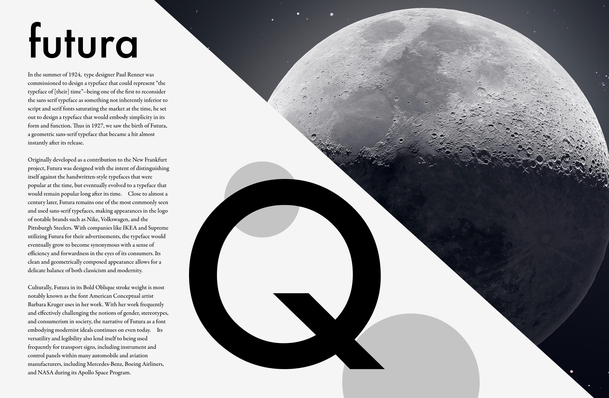
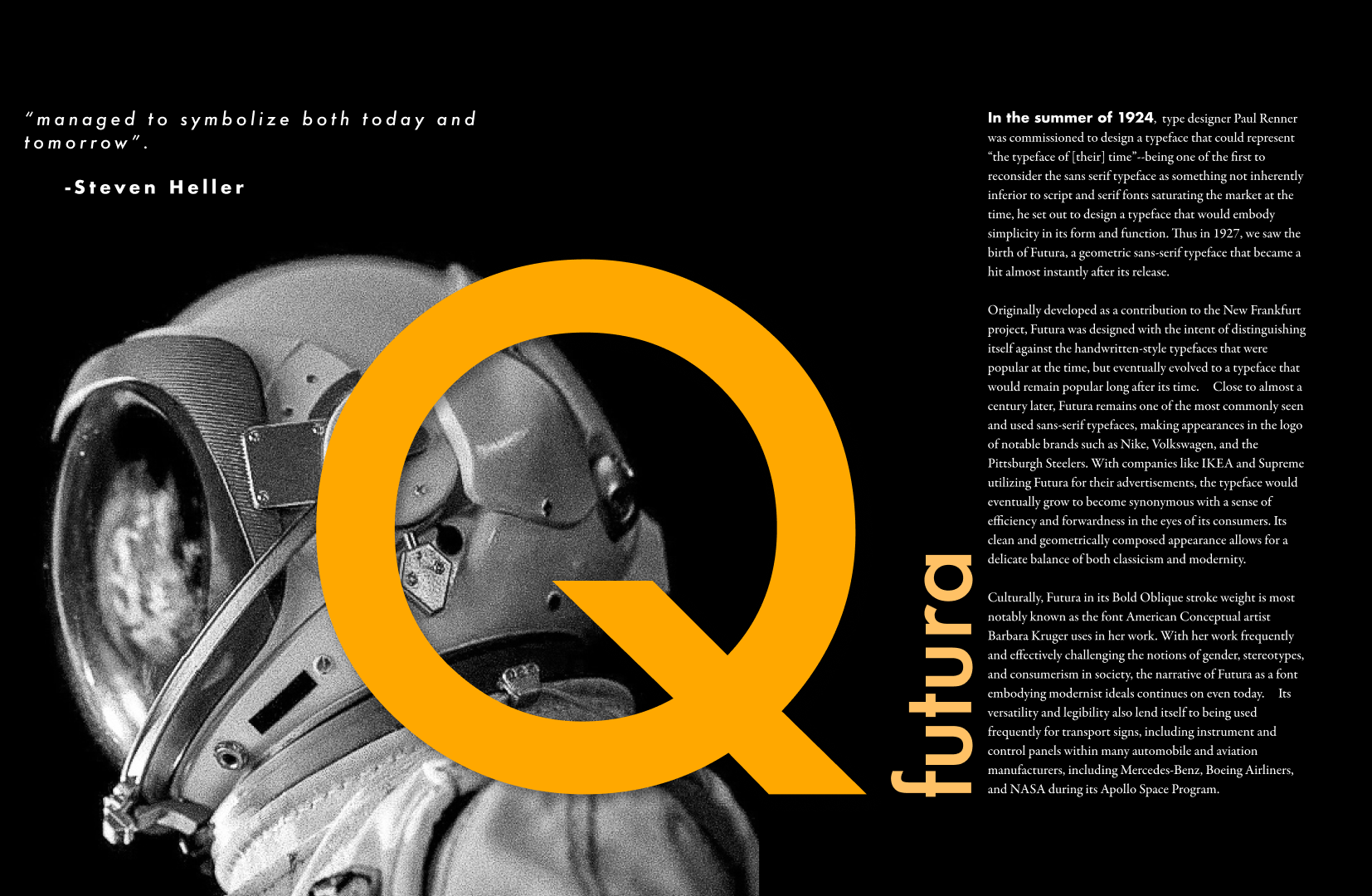
IDEA ONE: Ovoid/Circular + Space Motif
- letter Q is very circular, but wouldn’t be possibly confused with another shape/something more ambiguous like an O would
- Moon is round.
- Astronaut head is round.
- Yes those are all the thoughts I had.




IDEA TWO: Germany & Architecture
- New Frankfurt project = contextually relevant
- clean shapes and cuts of buildings
- geometric
- blueprint+ housing


IDEA THREE: Both Futuristic & Geometric
- wanted to focus on the feeling of Futura more, since I didn’t feel confident in my grasp of german design principles at all
- one idea felt too simple (doesn’t speak like Futura) and the other felt too technologically oriented
- this looks like a PUBLIC BUS SEAT (HELP)
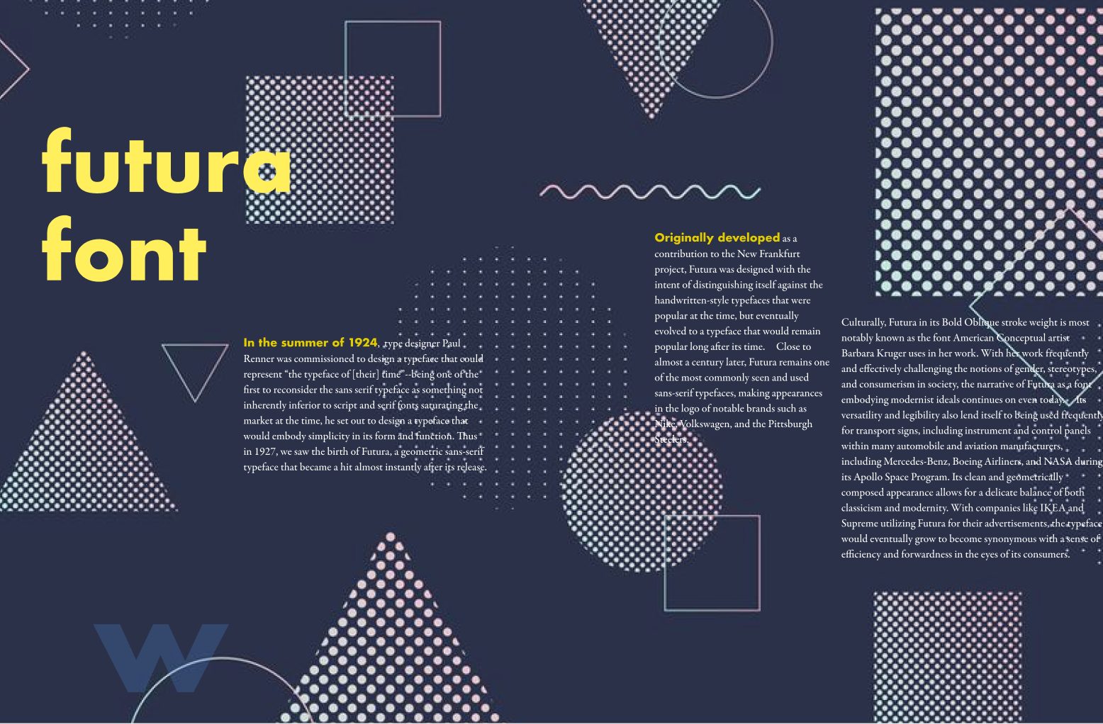

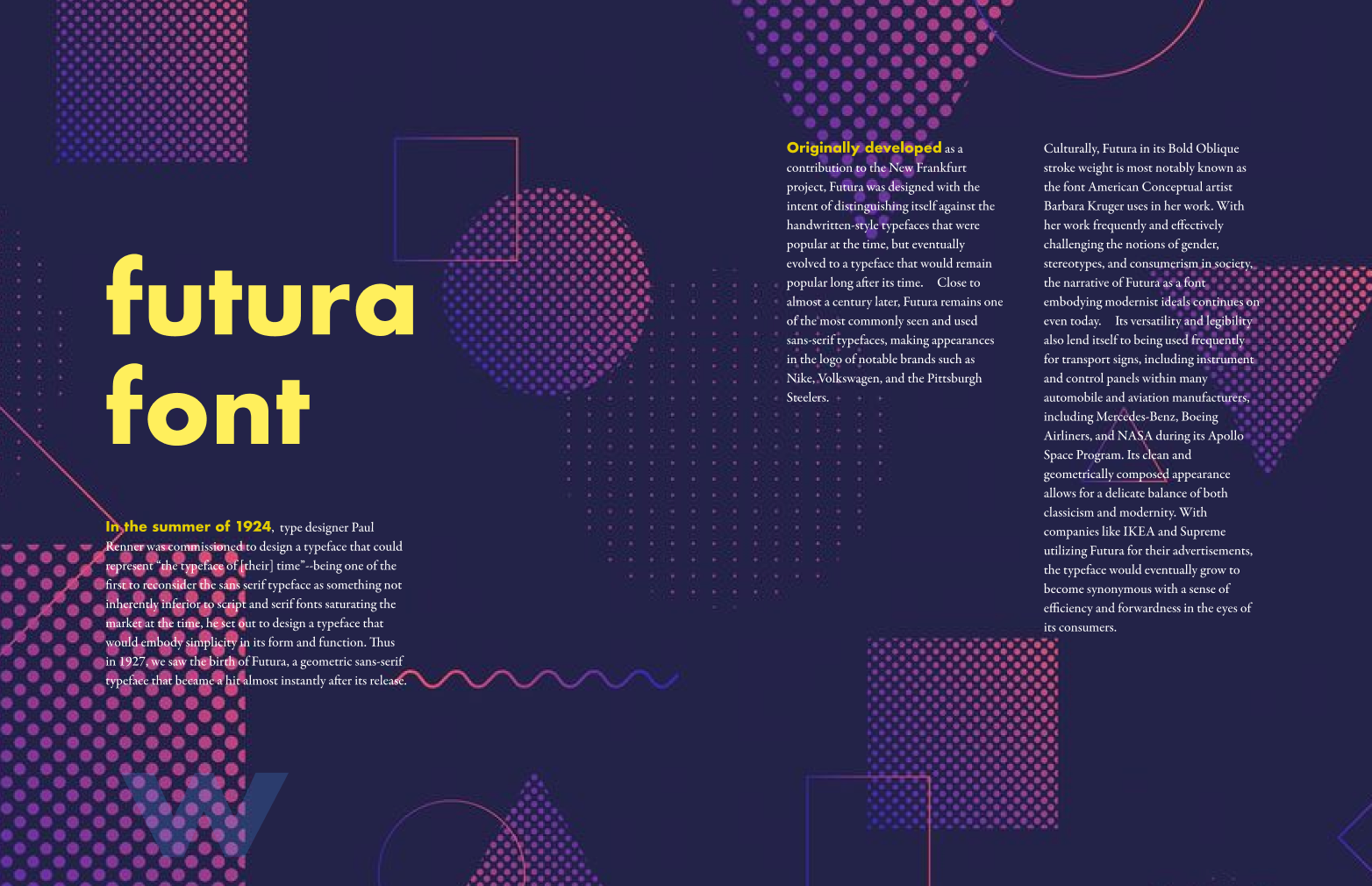
IDEA FOUR: Circles + Colors + Futuristic Energy
- played with more visual elements that I liked, but in hindsight doesn’t fit very well with Futura
- sort of had a crisis here
- Grids + smaller circles are a nice touch, but overall not doing much for me
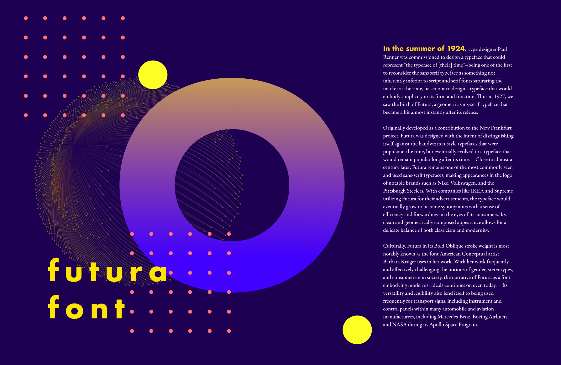


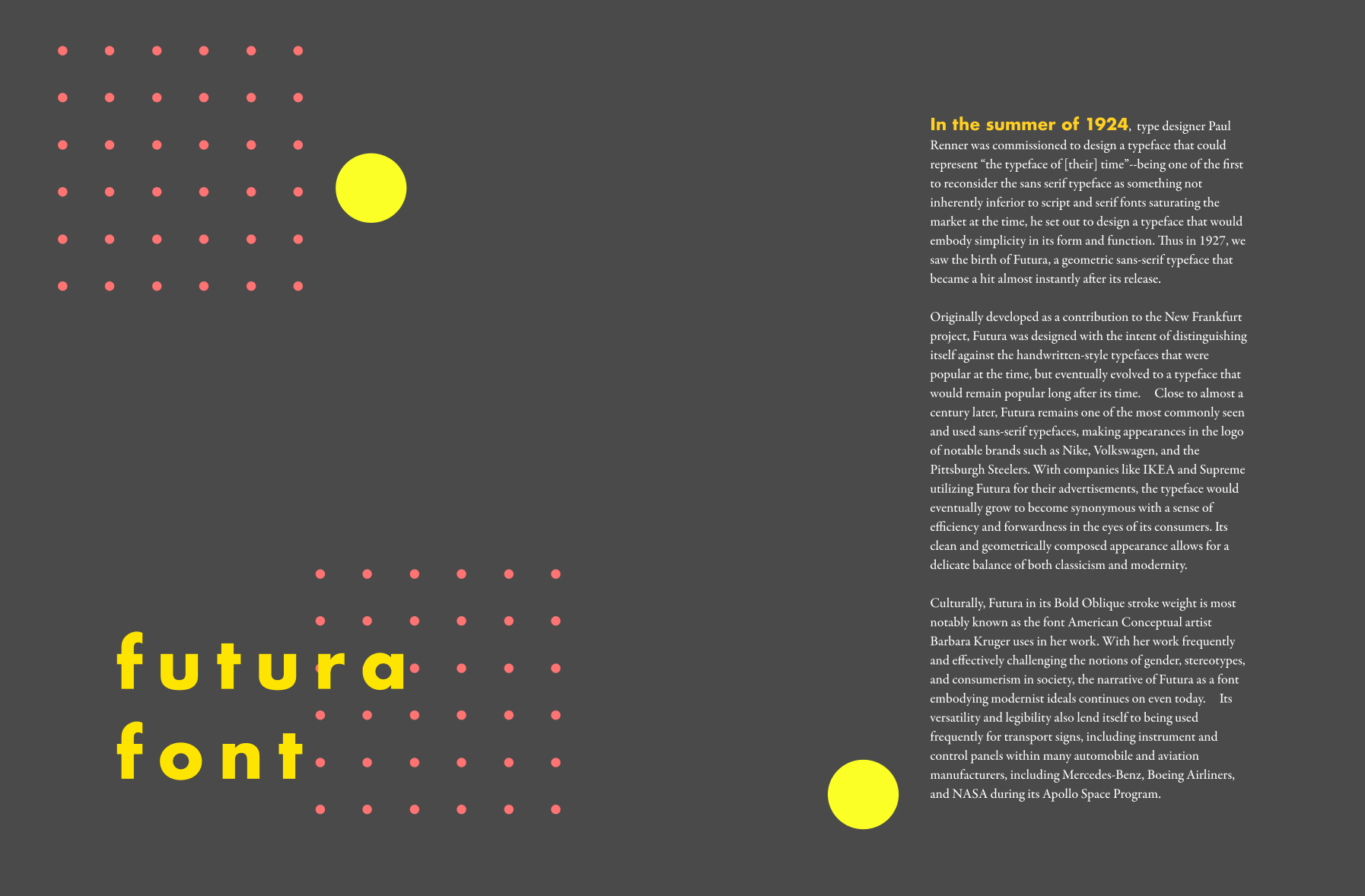
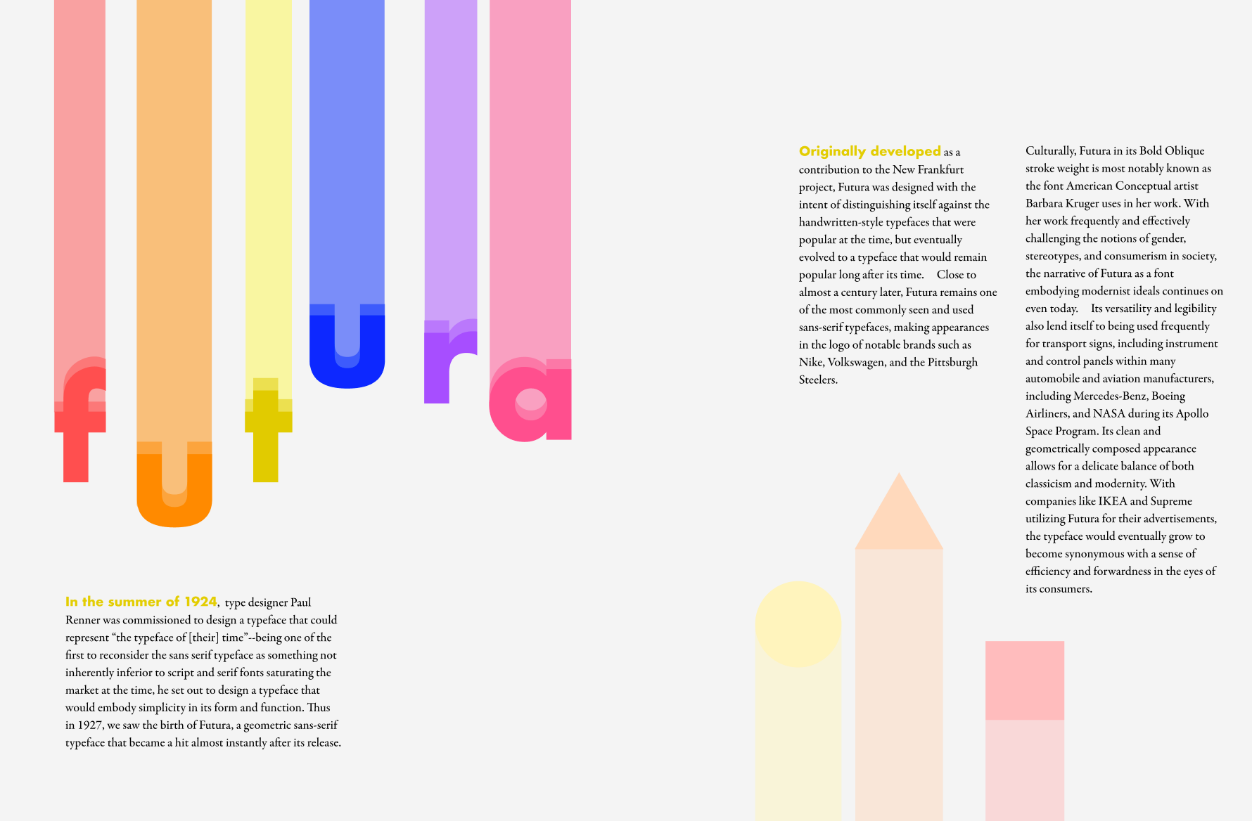
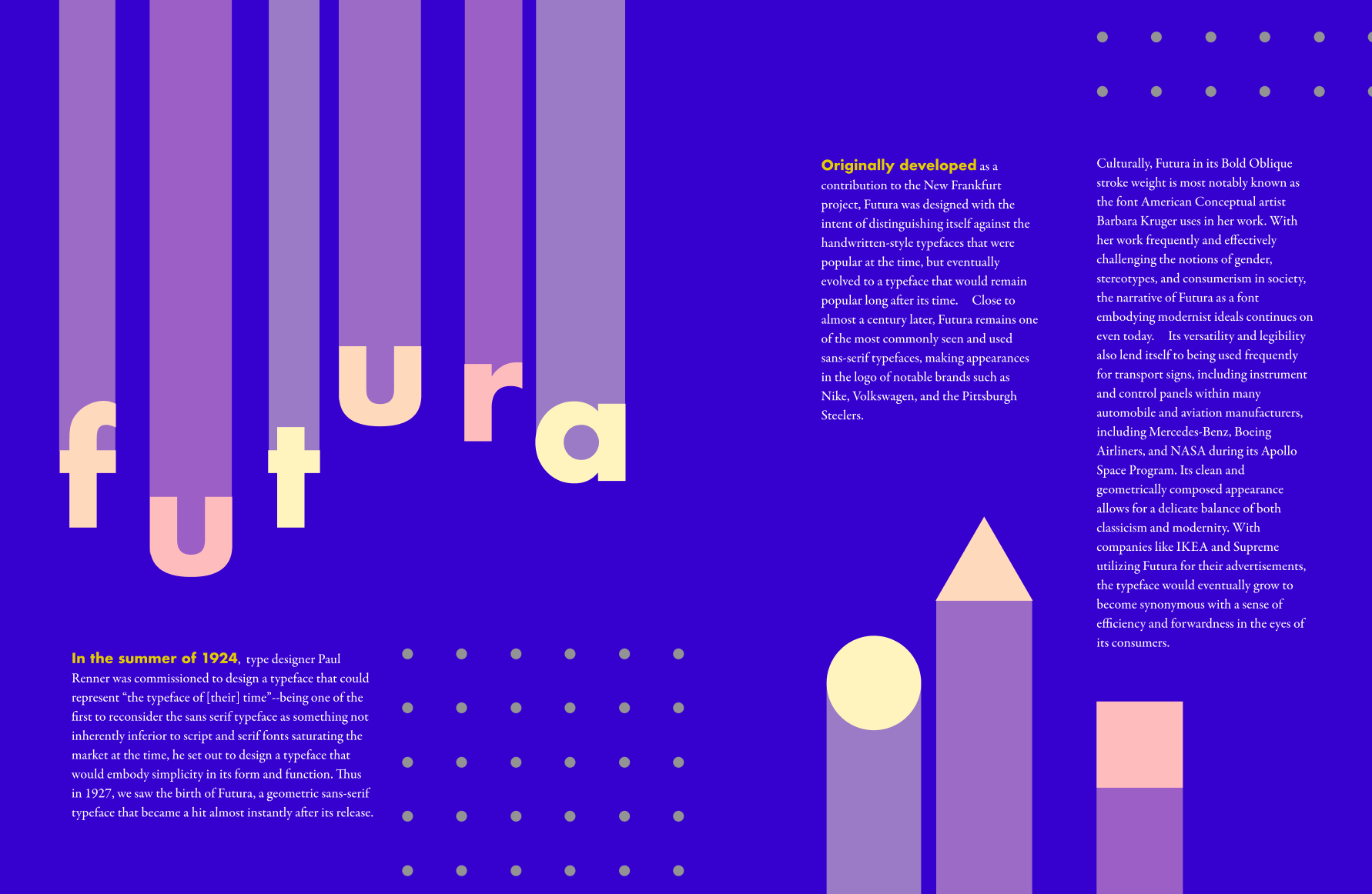
IDEA FIVE: brighter colors + shapes
- brain associated primary colors with primary shapes + simple geometry from which Futura is composed of
- circle/triangle/square combination worked well
- interesting verticals


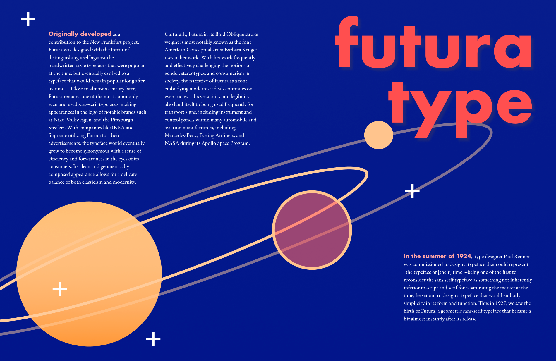
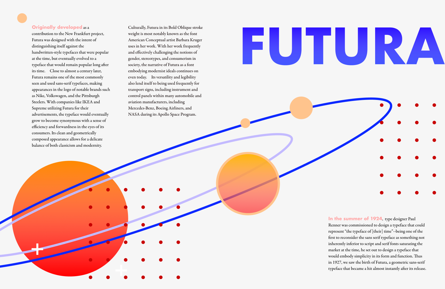
IDEA SIX: Tapping into those IKEA aesthetics
- ridiculous but valuable experience
- brought me a lot of joy because I love IKEA
- condense the idea of space → less hardcore imagery, more abstraction
- more simplified look + some gradients to bring dimension
- working more with primary colors → something with this is working!!
- hard to see the immediate connection with Futura and Space but getting there



[Brief Interlude] Essay Revisions (Vicki)
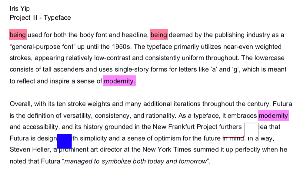
At this point, I took a look at revising my essay, mostly because it was way too long, and formatting my spreads with it was becoming a nightmare.
Overall, at this point, I realized I focused a bit too much on the modern aspects of Futura rather than the history and overall feeling, which are things I also considered when looking at my image sources.

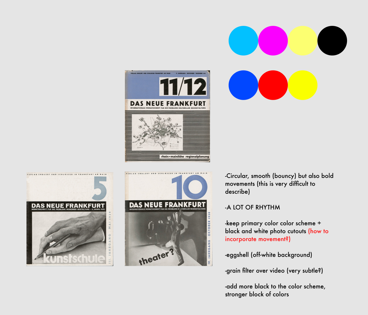
As part of revising my essay, I also looked at the covers of the New Frankfurt (Das Neue Frankfurt) Publication that Vicki sent, which helped me a lot in coming up with spread ideas later on.


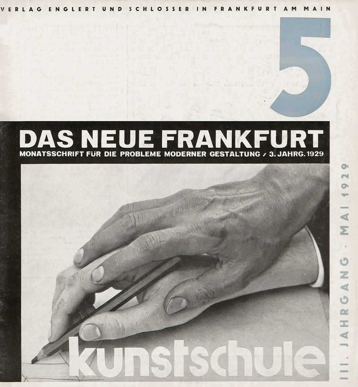
Observations:
- solid colors of black, off-white (maybe because it’s old, maybe paper back then was just super grey)
- used a bolder stroke weight of Futura
- running header with wide kerning
- shows off the diversity of Futura
- grainy quality to show age/Futura’s long history
- B&W photos bring attention to the pop of color
- strong lines (horizontals show a sense of texture and rhythm)
- more empty space, very minimalistic, direct to the point (not at all excessive, very communicative and direct.)
From there, I continued my initial spread explorations.
IDEA SEVEN: Empty Space + Limited colors (and a dash of history)
- I worked to reduce the colors to one-two spot colors (chose yellow for its vibrancy against blue, because of IKEA)
- focused on making the page feel ‘neater’, with more empty space
- off-white background
- experimented with some black and white photos
- re-inserted circle motif


IDEA EIGHT: empty space + geometric motifs + movement
- reconsidered adding photos
- worked off the O in the previous explorations, brought back some color
- used circles to allude to movement
- created a more industrial feeling



Class Critique (Proud) + Notes
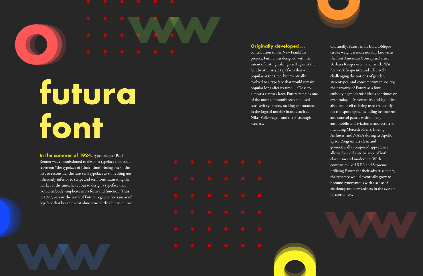
In class, we had one on one feedback sessions. My primary goal for this session was understanding which one of my ideas was headed in the right direction.
Notes:
- The space-oriented spreads (columns 1–2) are interesting and eye-catching because of their colors and depth, but not sure what the Q means, or what space has to do with Futura
- Her impression of Futura is more of all capitals, rather than all lowercase (which was what I worked with a lot)
- ‘Futura Font’ → redundant (and also not a font, a typeface)
- The large O (Column 10) is really eye-catching from a distance but might look too big up close, a little unnecessary
Vicki also mentioned that while the ones with the larger O is eye-catching, the ones that speak more like Futura is the middle section where the page isn’t as crowded and there aren’t as many strong colors, particularly in the background.
Revised Spread Explorations
For this next step, I took the three most communicative/effective spreads based on the feedback I received in Critique, and simply worked off the elements from each that I enjoyed individually:


I focused on:
Emphasizing: circular motifs, light backgrounds, primary colors, motion, and rhythm, using all caps in Futura
Decreasing: random grid, the sheer largeness of Paul Renner's face
Office Hour Critique (With Vicki)
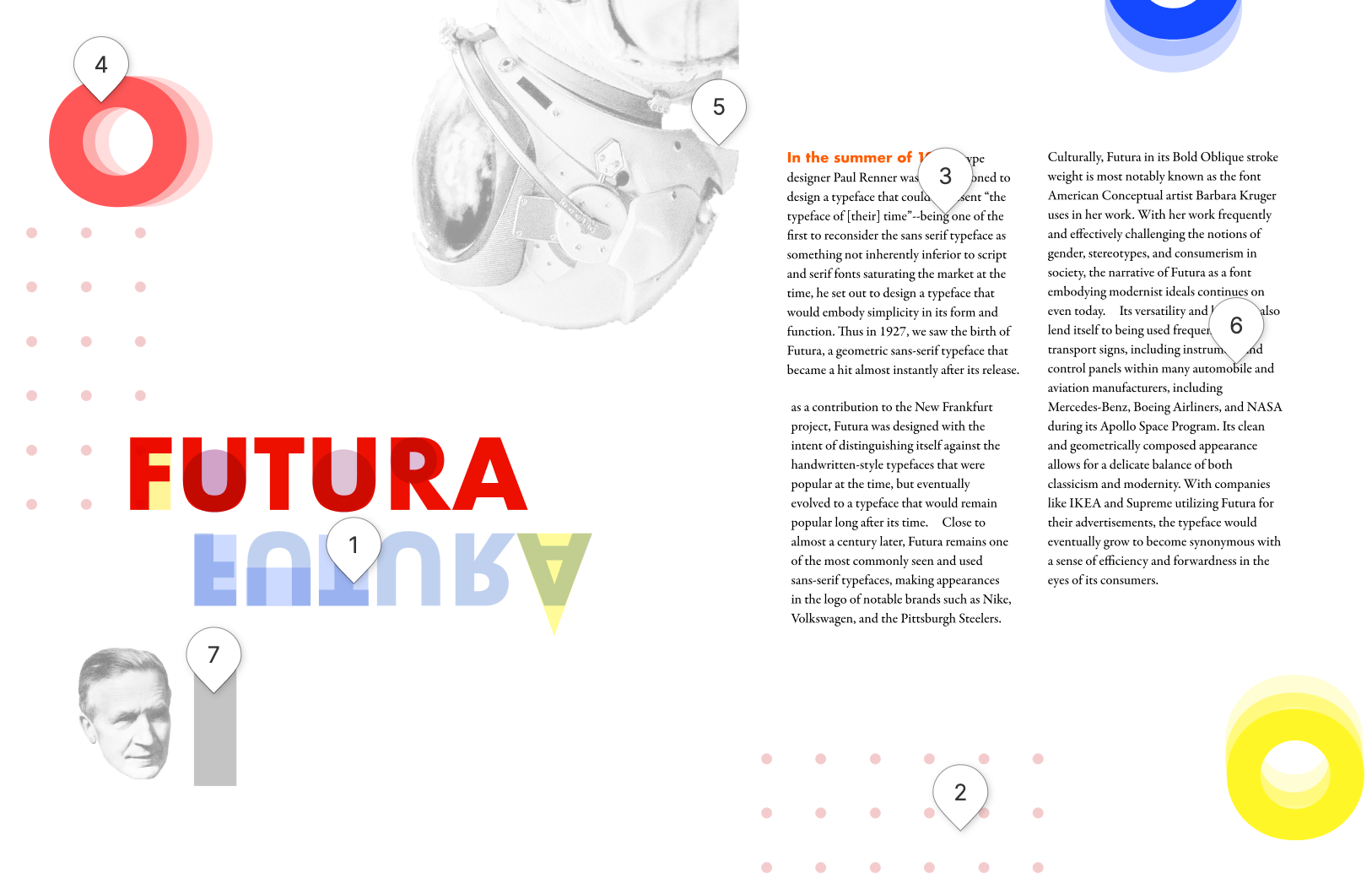
For office hours, I met with Vicki with the following iteration that I planned on following through with for the final:

Notes & Adjustments:
- Paul Renner’s head is too large (still)
- The astronaut is nice (very round) but there should be some indication/clarification for why it’s there
- the type could be adjusted all to the right side of the spread, there is no extremely obvious divide, so it doesn’t run the risk of feeling like there’s something on the next page and the text would flow better.
- Upside down Futura not needed, introduces too many colors into the mix → maybe replace it with the original german slogan if running out of space
- Lighten up the background slightly, it’s too strong of a grey (looks strange with primary colors)
- four sets of circles feel like there’s two many (too boxed in), maybe 3 would work better?
- really focus on the micro for tomorrow, there’s a really wonky rag, etc.
- make 5–6 iterations of this one where smaller details are refined and focused on!

Final Adjustments
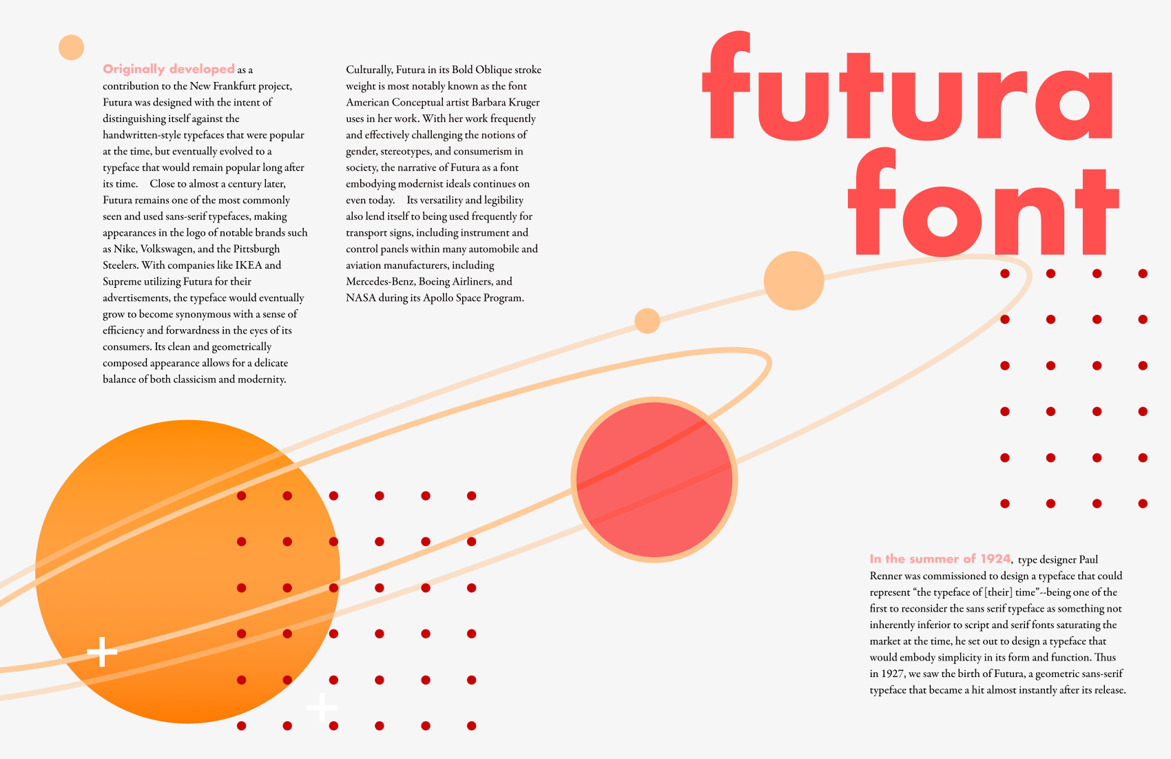
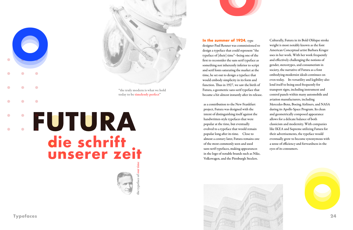
For the final, I mostly played around with smaller details, like the color of the subheading, how to highlight the geometric shape of the letterforms, and creating an overall flow through the page through the use of negative space.


Final Critique

Comments (Some specific, some general):
- Futura is a very bright-looking spread (saturated, with a good amount of contrast)
- Great rhythm, but the circle movements work against the direction where the eye goes, it would be better if they helped the viewer move their eye across the page (switch some of the circle directions)
- The scale of smaller circles that form a grid + the larger circles is interesting (“small dots are fun”?)
- The header is always ‘pulled out’ to be the largest
- When highlighting an element, having the feature and the text be the same color can help distinguish/visually clue the readers in on what’s being talked about
- fewer colors = easier to tell primary/secondary levels of importance/information hierarchy
- be careful of too many hanging words on a rag (if, and, but, etc.)
Post-Critique Edits
For my post-critique edits, I tried to justify the text, since I had a rag that was very close to being justified. Aside from that, I kept to only changing the direction of the circles :)

Reflection
Overall, I was really happy with the way that my spread turned out for this project! One of the biggest difficulties was reconciling my interpretation of Futura versus everyone else around me, and being able to navigate a period/style of print design that I wasn’t familiar with into my own existing style and aesthetics. Overall, I’m glad that I didn’t have to compromise too much of what I envisioned Futura to be in the beginning and was still able to work with something I felt unfamiliar with.
I learned a lot about typesetting (especially given that I’ve never really officially typeset anything before) and overall I’m a lot happier with the visual elements in this spread compared to the last project, and overall I experienced a much smoother working process. One of the biggest takeaways I have from the project is the importance of breadth of exploration, especially at the beginning. Doing a lot of work when it came to my initial spread/visual concepts helped me get more holistic feedback on my direction as a whole, and I didn’t feel as unsure going into my final edits. While I don’t think there’s necessarily anything wrong with changing your work more drastically later on in the process (as I am prone to do), I now see that it’s really important to save time and energy to make small changes! Focusing on the micro details is just as important as the macro overview, and having the time to think over a design during the final stages really helped me bring my work to a level I was satisfied with. I was really thankful I had a lot of time to just work on refining rather than trying to focus on both iterating and refining at the same time. Onto part two! ❤
Part Two: Type & Motion
October 10th, 2020
Project Overview
As a continuation of the previous project, we were tasked with creating a 60sec animated video to present a narrative of our typeface similarly to what we did with our spreads. The focus of this project was on the personality of our typeface, and their greater context.
Initial Notes
Some initial thoughts+notes I had during the initial debriefing:
- how do rhythm and time lend itself to establish the hierarchy in different ways than a still image (spread)?
- what type of song/music reminds me of my typeface? Why? Is it contextually appropriate?
- how does a typeface “move”?
- What information should I show/say visually, what information is better off implied? (Ex. usage of different stroke weights, etc.)
- How is the identity of the typeface relevant to the overall story?
- How do you create a cohesive narrative of transitions?
Choosing Music
This was one of the most difficult parts I had to work on! Music isn’t really my strong suit (just ask my mom and those years of wasted piano lessons), so I decided to focus on the type of feeling I wanted my video to convey, as well as the way that I imagine the way Futura ‘moves’. I focused on looking for bold music, something with a clean beat drop. My first thought was clean electro music, but I felt that it was a bit too modern, especially when I worked on emphasizing the reconciliation between the historical context of Futura and its longevity in the modern age. I also considered swing music, jazz, and ragtime, which were popular around the time period, if not maybe exclusively in Germany.
I also knew I wanted it to either be an instrumental cover or something that doesn’t have distinctly human vocals if any words at all. Knowing from experience, having a lot of lyrics, and also text on the screen can create a bit of dissonance for the viewers.
One of the parts of my spread I really enjoyed was its rhythmic nature, so I looked at music that specifically had a loud rhythm/consistent beat and meter.
CHOICE ONE: Triadisches Ballett von Oskar Schlemmer — Bauhaus
- Era and time appropriate for the most part
- An interesting beginning that has a modern feeling despite being created almost 100 years ago — much like Futura!
- Overall mild, too much emphasis on the melody during certain parts
- Very slow, wouldn’t lend itself well to fast-paced animations
CHOICE TWO: MINO (송민호) — FIANCÉ (아낙네) (Instrumental Edit)
- Easy to work with beat signature (+very consistent rhythm, lots of subtle repetition between sections, but overall diverse → would be super hard to be off-beat with this one)
- Can’t figure out how to work in a conclusion easily :(
- Doesn’t feel overly modern despite having EDM characteristics
CHOICE TWO: Invisible — Vibe Tracks
- Sounds like gamer music (this is a con if you’re wondering)
- Too modern sounding, notes are very high, no sense of gravity or grounding (might be a pro?)
- Too high tension at the beat drop
- I feel like I’m at a rave, this is a terrible idea
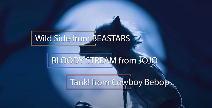
CHOICE THREE: Billie Holiday and Her Orchestra feat. Lester Young — Travelling All Alone
- A little bit of a basic choice
- sounds very domestic, not necessarily good for dramatic reveals
- Jazz music = difficult to time transitions well BUT does help dictate (read: limit) a lot of on-screen movements
- Makes historical context fit in place well, but not so many modern examples + no real good transition from one to the other, tone is super consistent throughout the song
CHOICE FOUR: Tank! (カウボーイビバップ)
- Dramatic introduction
- Bebop is mostly (?) time accurate
- Percussion (bongos) keeps a relatively good rhythm throughout
- Sax part is a bit questionable (?)
CHOICE FOUR: Geniously Hacked Bebop (수상한메신저)
- Pros are similar to tank!
- no existing vocals, no significant change in rhythm, and is more bass-oriented
- I like this song
- Honestly sounds a lot like a Tom and Jerry soundtrack and I’ve just realized that is exactly how I imagine Futura moving.
- Really long intertwined sections would be extremely difficult to edit.
Thumbnails + Script
From there, I temporarily moved on to creating a script + storyboard before making my final music choice.
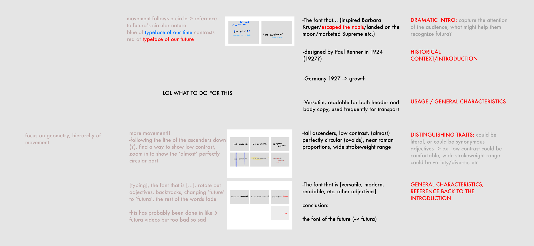
I split my work into four sections, with a visual storyboard in the middle, descriptions of movements (what you see) on the left, and the actual script text (in black) and general outline/goals/meta comments (in red and grey) to the right.
This was a pretty difficult process since I was always caught between trying to figure out how to visually storyboard something so it would show what I needed it to show (large movements? arrows? labels?) and be able to actually communicate it to another person. I couldn’t figure out a way to do it efficiently without making an actual video, so I settled for a lot of comments and narration instead.
Class Critique (With Jacyln)
My first Tuesday crit was with Jaclyn. Overall, she said that creating some kind of slideshow with stills could help if I was having trouble creating a linear storyboard; I agreed since relying on guessing the time markers of each song and then going back and forth between drawing/editing and then revising was a really problematic process for me.
Overall, we talked more about Futura-specific content, such as ways I could integrate the history as to not be redundant or go too off-topic with the history, which I found really helpful.
In terms of the music choices, she thought Tank! was the most effective but also interesting, but overall it felt too deep and didn’t fit with how light/weightless I made my spread.
Notes in Class:
- read your script out loud to make sure it’s timed well!
- Don’t disregard hierarchy/other things learned in previous projects, don’t think of it as video vs image, but rather the video as a series of images.
- don’t complicate the meaning by overusing transitions (reduce cognitive load and visual noise)
- consider using a grid
Refine Music + Storyboard
After class on Tuesday, I finally found my music choice — a piano cover of Tank! that didn’t fall the heavy presence of percussion/bass. It had a lot of the same type of rhythm and flow but overall it was a lot lighter where some of the elements inspired by Jazz could be heard more clearly than just bebop.
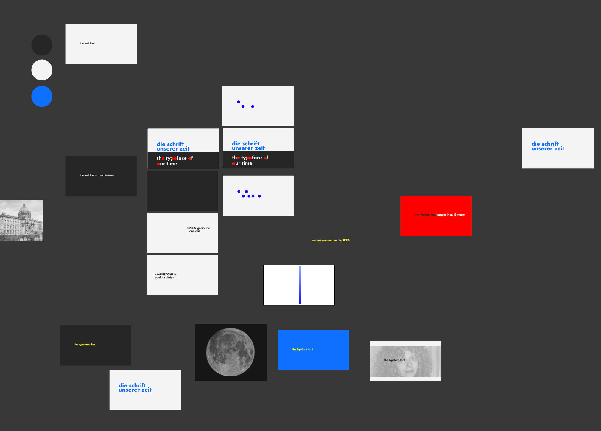
I followed Jaclyn’s advice and actually ‘pseudo-animated’ as I went, fitting still frames to the song in iMovie as I worked. Overall, this went a lot smoother and I had an easier time coming up with a storyboard while working in reverse order:


One thing I did notice in hindsight was that overall, my storyboards felt heavier and darker. However, I wanted to bring in a bit more of the aesthetics found in the New Frankfurt publication, as I wanted to try prioritizing readability over lightness since rather than conveying something that is ‘fast-paced’ through imagery and a sense of rhythm, I planned to actually have fast-paced animations. I felt like overall, this was one of the things I struggled with most in this project.
Storyboard Animation
Class Critique (With Vicki)
On Thursday I had my critique with Vicki. Overall, it was noted that it was good I was planning out the whole video before refining, but I should try and stick to one software since moving everything from iMovie to After Effects could potentially take a long time.
Notes:
- ‘Simplicity’ slide doesn’t actually feel simpler
- 1927 moment is nice, but the running header (Germany) doesn’t feel needed
- the images aren’t working as well as they did in the spread (maybe because they’re also much larger?)
- ‘Used for both headline/body copy’ doesn’t feel very necessary/ a bit redundant
- text goes way too slow in the beginning, way too fast at the end (read it out loud!)
- repetitive screen with ‘distinctive’ isn’t the most effective, etc.
Overall, I felt like most of my work was in refining the video and making sure the flow of the video worked well when I eventually add motion to the transitions, which was what I focused on for the next class.
From this, I worked out a more comprehensive version of the draft and planned movements before I continued on to the next full iteration.


Draft Video — Iteration #1
In terms of refining, my actual process was fairly simple; aside from starting to create some of the assets in Illustrator/InDesign to get a feel of the grid when I first started, I mostly worked in After Effects.

Something that was definitely unexpected was that overall, I didn’t have one specific complex animation I spent a lot of time on. I think by creating the draft storyboard video, I had an easier time dividing my attention and working through it at a fairly standard pace. It was initially really frustrating to figure out how I wanted to do something in After Effects, but once I got the hang of the first few transitions the rest was a lot easier!
Class Critique (With Vicki, Jaclyn, Elysha, Se A, Joseph)
In class, we had a group critique with Vicki and Jaclyn.

Mostly, everyone agreed on a few very similar points:
- The speed was a little fast, there was a lot of visual noise so it took them longer to read
- the jumps in stroke weights were interesting and added a lot of movement, but sometimes felt a little unnecessary (wasn’t always explained why something was highlighted)
- simplify one or two movements, there is. just. a lot. going on.
- history and images were leveraged well
- feels relatively streamlined
- sees the influence of my spread in the video
- focus on refining! Relatively solid but lots of nit-picky things that should be tidied up.
Overall, I spent most of my time after this critique refining and fixing the smaller details that were pointed out to me, such as adjusting the brightness of the yellow circle (too far offset) and changing some of the stroke weight jumps.


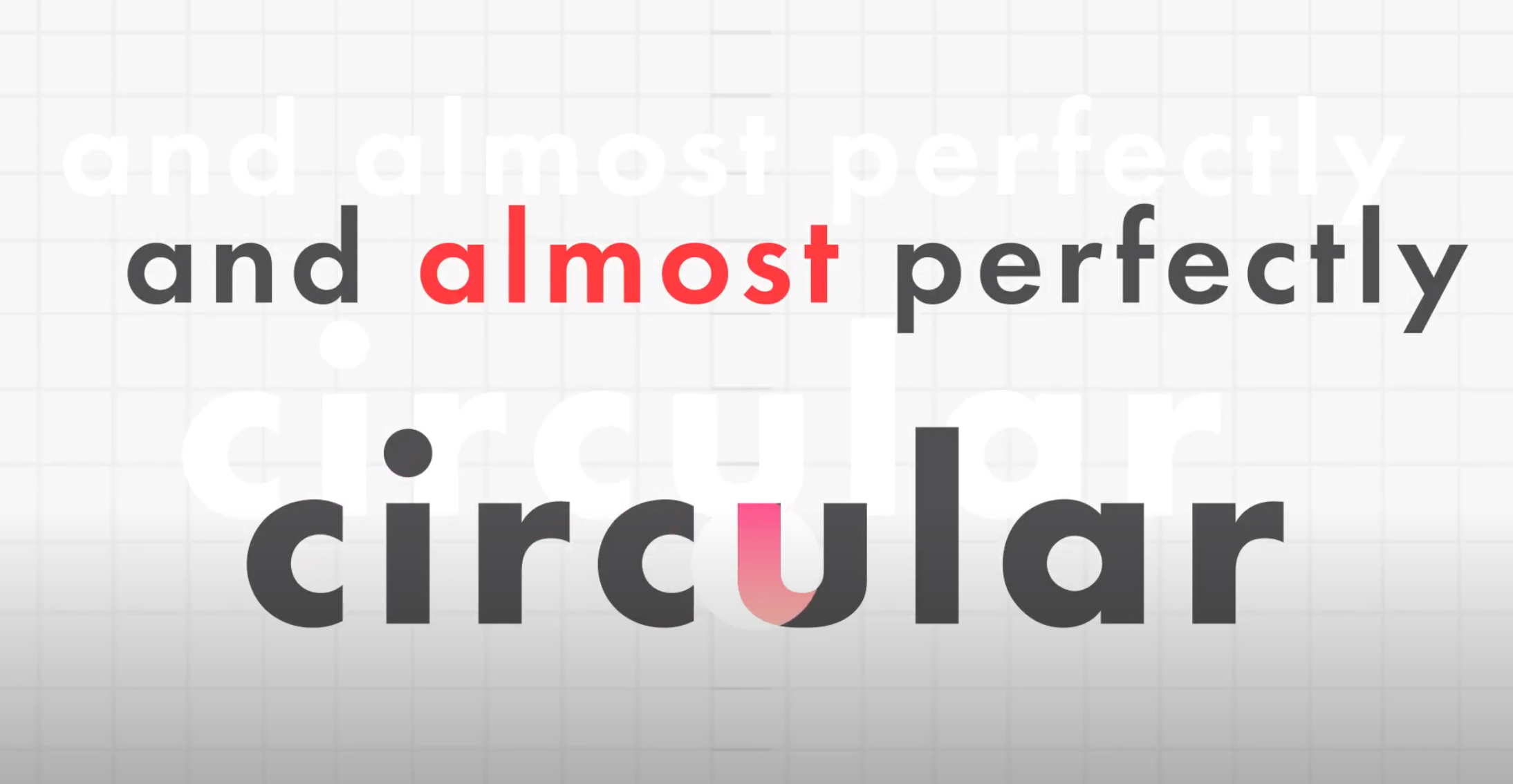

Final Video (for Crit)

Class Final Crit Feedback
During the final crit, we got feedback from our professors, guests (Q and Dylan)
- Interesting (???) transitions
- Minor change: compared to the way Germany/IKEA/Barbara Kruger was shown, SUPREME takes up a lot of time and space — feels a bit too irrelevant and takes viewers of the video
- 0:43
- Weird things happening with tracking: the kerning is a bit too wide in a few of them, not consistent
- Mostly readable in terms of pacing, but sometimes the letters are really widely spread
- Very chaotic since a lot of things didn’t line up with the grid (sorry Dylan)
- Again, switch the kerning to default
- Doesn’t have as much open space/doesn’t flow as well as the spread did
- Feels like it took too long for the beat to drop in (🤔??)
- since there was a grid planted in, it’d be better to follow the grid, since not everyone might see that the elements aren’t aligned, but they will notice it.
Overall, there definitely were a lot of things I didn’t notice (😭) BUT at least it was good that the things people found problematic with the last iteration weren’t brought up again! Comparatively, most of the changes I had to make were small this time around, though time-consuming since getting things to line up was pretty difficult.
Vicki + Andrew Final Crit Feedback
I decided to check in with Vicki and Andrew one last time before I submitted my final.
Notes:
- Minimal changes: just things that were brought up from crit
- Play around with justifying text (for spread revisions)
- the overall tone is fine, but the Supreme moment was a bit too big
- watch the alignment of the baseline in the first scene, it hangs a bit low
- watch kerning + use a grid
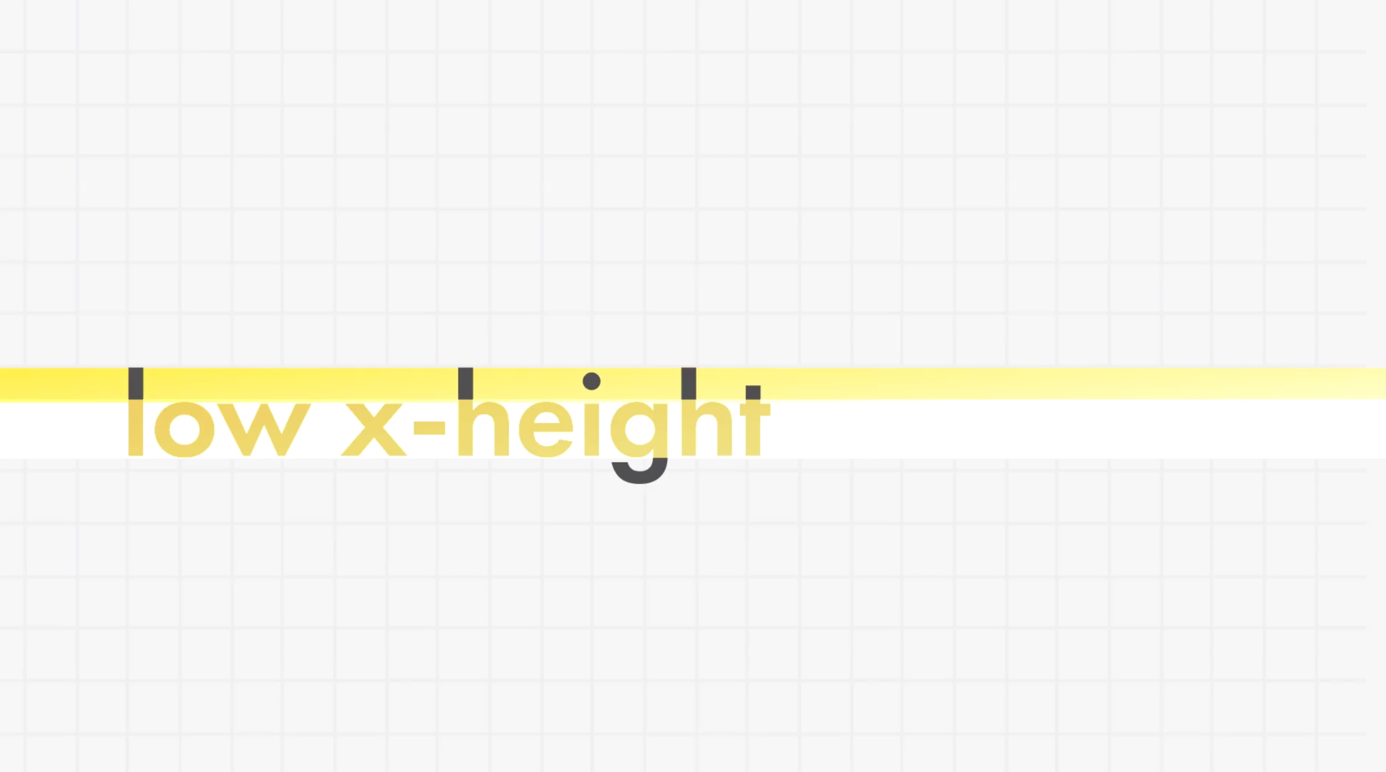
- LOW CONTRAST is actually LOW X-HEIGHT
+Futura is apparently the official font of gentrification! Sort of alarming I didn’t find out about this earlier


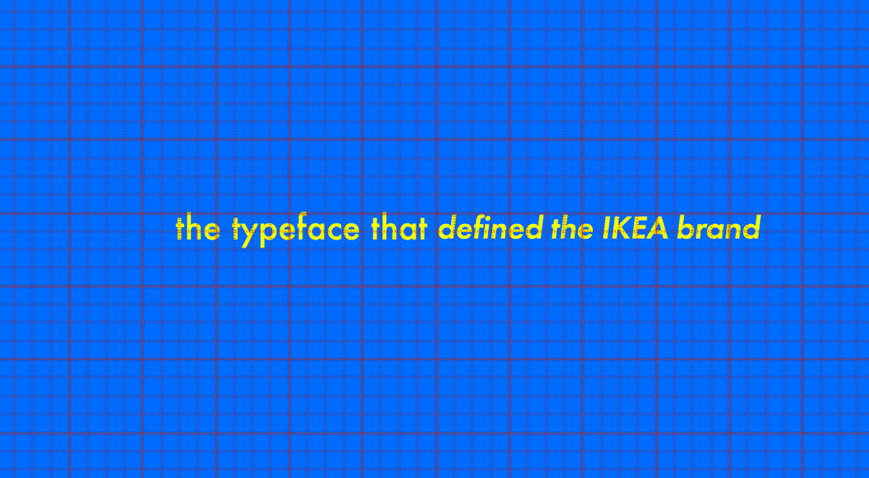
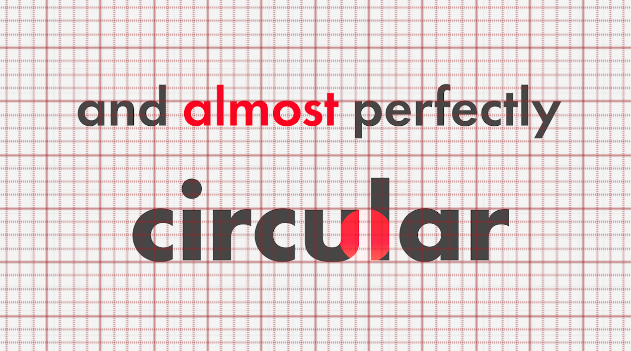
I went back through the entire video with the grid on and corrected as much as I could, though some of it I left alone since the half-changing sentences and jumping stroke weights were used to reduce visual strain. (Like the transition between the moon and IKEA part of the video shown above.)
Overall though, I moved around the components so they would either be centered or snap to the grid background as mentioned in the critique:





Final (FINAL!) Video + Revised Spread

Reflection
Overall, I had a lot of fun creating the video! I’ve used After Effects a bit before, but definitely not to the extent of this project so being able to push myself to learn more about the software was really great.
I definitely ran into a lot more difficulties (both conceptual and technical) for the video though, at least in comparison to the spread. It was a lot of work for two weeks, and I also wished I had more opportunities to see what my classmates did. I was a lot more inspired after watching everyone’s video, and I definitely had a lot more ideas that I would’ve definitely incorporated into mine if I had the chance. I think the consideration for movement, rhythm, what’s directly between told versus what’s being implied was really well leveraged in a lot of these videos. I definitely saw a lot of unique solutions I hadn’t thought of personally that worked really well in their given contexts.
I’ve also definitely grown from someone who struggled with making a decision earlier on to a designer who values having the time to refine and focus on the smaller details!
I think overall, I’m pretty satisfied with the outcome given the circumstances. However, if given the chance, I think I’d really like being able to go back and working off my spread a little bit more by making the video more delicate and light just to see what it’d be like — though, at this point, I’m definitely content to be able to put it down! Especially since I’m definitely looking forwards to making more motion/time-based projects in the future now that I’m more familiar with the medium.
Regardless, I definitely learned a lot and I’m proud of myself for completing it since it was definitely one of the most intimidating projects I remember seeing for myself as a freshman! Seriously wondered how I was going to be able to pull something like this off.