INTRODUCTION
In this project, I will be exploring ways to create objects that emanate artificial light and the role that their intended contexts play to help shape and determine their forms. The basis of this project is founded on how humans use and design light for every day (or occasional) use while keeping in mind how these objects primarily possess an ‘ON’ and ‘OFF’ state that complement each other.
11.05 — WHAT IS ARTIFICIAL LIGHTING? (CLASS DISCUSSION)

In class, we began this project by thinking about the context in which artificial light is used in society & how that context determines the form, amount, etc:
- Society & culture defines/shapes how much artificial light is needed. (In certain regions — like Russia (?) — the average amount of light people are accustomed to completing day-to-day tasks is different than the average in the United States.) Personal preferences probably help shape this too, since I personally prefer darker rooms/spaces over lighter ones.
- Task lighting vs. Accent lighting vs. ‘Decorative’ lighting. Task lighting, is generally used to ‘increase illuminance’ in order to better accomplish a specific task. Aside from illuminance, contrast is also considered. Large/disruptive shadows caused by bad choices in lighting placement would actually decrease visibility. Accent lighting, on the other hand, is used to illuminate or emphasize a particular feature, like art or object. ‘Decorative’ lighting is designed to be more atmospheric in nature and is less likely to put emphasis on one particular surface/object/subject, but rather add to the overall feeling and aesthetic of a space. (There are, of course, probably lights that are a combination of multiple.) As one of my classmates pointed out with decorative light, sometimes the light is the main attraction. Personally, I thought this was interesting and would also be influenced by culture/society as mentioned above as well.
- Ultraviolet and infrared light spectrum. These are two ends of the electromagnetic radiation spectrum — humans can only see a small portion of this (400–700). It goes from red to violet (like the names suggest), and in short, the longer the wavelength, the lower the frequency, which allows it to travel further. (Why do we need to know this? Because it exists.)
- Caravaggio — An Italian painter who was known to use ‘realistic observation of the human state, both physical and emotional’ (Wikipedia) combined with the use of dramatic lighting. Looking at his works, it seems that lighting plays a big role in framing a specific scene and mood.
- What is glare? (Getting a flashlight shone in your face?) When the Ikea bulb is exposed, it is a bit difficult to see into it directly. A lot of people also involuntarily winced when the light was unexpectedly shone at them even if the light itself isn’t that bright, which made me think that it would be better if the light faded in, rather than flickered on suddenly. Not sure if this is possible within the constraints of the project, but I’d like to try it.
- Navigation. What are some things that are easier to do in the dark? For me, sleeping and resting are easier in the dark; in fact, it’s almost impossible when it’s not. When it is really bright, I feel awake and I act more like I would in a really public area. I let my guard down when it is darker (but probably only if the darkness is expected and not something that alarms me, like a dimly lit alley that instills fear instead). When the room is darker, it is also easier to see the screen, as the light emanating from the screen is no longer ‘competing’ with other sources of light. In contrast, this source of light seems brighter. I also feel more drawn to the light when there is an obvious source of it; which is why even though a light might only take up a small amount of space, it can be very distracting. (An example of this is when I always accidentally wake up my roommate when I turn on my desk lamp after coming back to the dorms late at night — things always seem brighter if the environment is always very dark.)
- The role of color & color theory. For this project, I think we are mostly dealing with the differences between ‘cool tone’ and ‘warm tone’, rather than vivid colors. Color theory in lighting design is used most frequently in stage lighting design. In psychology, we learned about illusions and how, for example, if you point a blue light at a red surface, it makes the surface look black.


11.07 — TYPES OF LIGHTING AROUND CAMPUS + THEIR CONTEXT (CLASS DISCUSSION)
On Campus





Off Campus


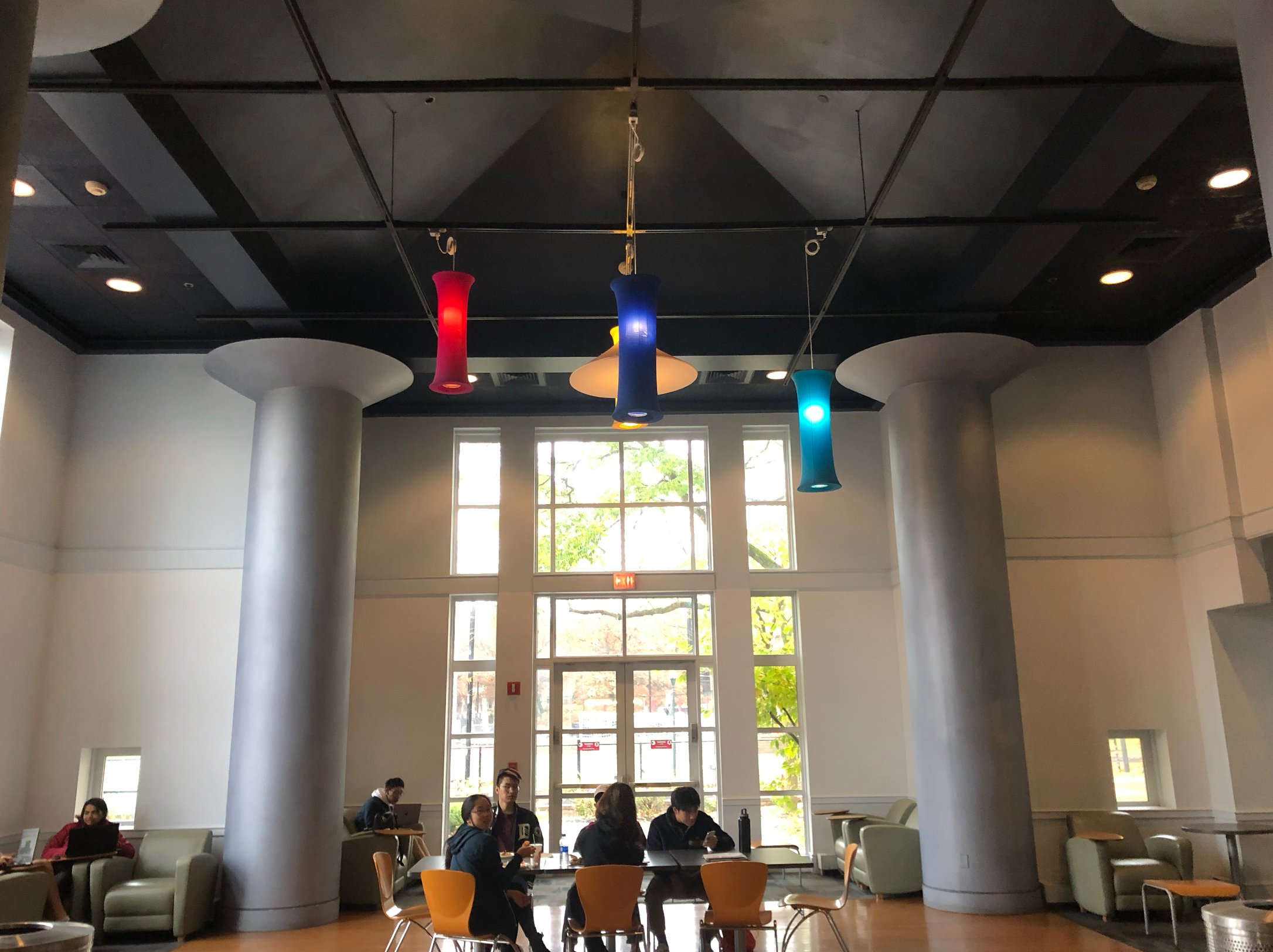
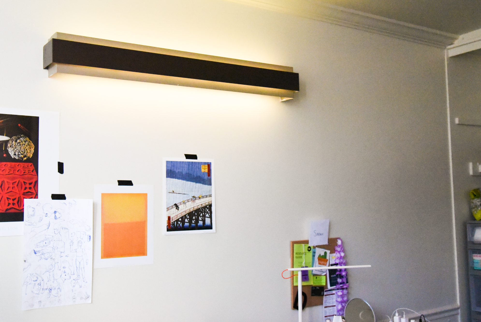
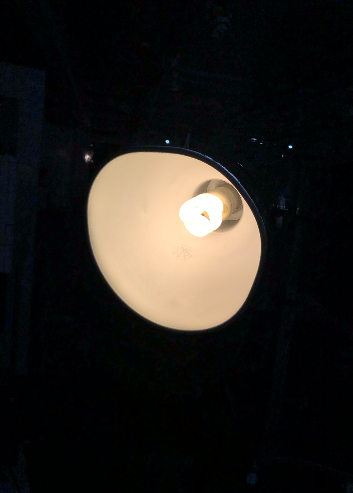
During this class, we pinned up photos of interesting lights around campus, ranging from more utilitarian lights (meant for illuminating/navigating), such as the lights in the underground of the UC (near package-pickup), and others that are more decorative, like the string/fairy lights between the UC & West Wing. Some of the key things brought up during the discussion that I found interesting were:
- Should the photos be categorized in any particular way? Aka, do certain categories of lights share characteristics? While the images were brought in from different people, Steve brought up that some of them feel like they should be grouped together— may be an indication of just how important context is in influencing the lighting. Stacie also brought up that just from looking at photos of the lights alone with minimal indication of background/setting, many people agreed that the light simply felt ‘larger’, and that it was hung a certain orientation — this to me means that the inverse is also true: context brings significance to lighting, and lighting brings significance to context. For example, even without seeing the sinks, the way that the light is arranged in the space is reminiscent of a bathroom, not a hallway.
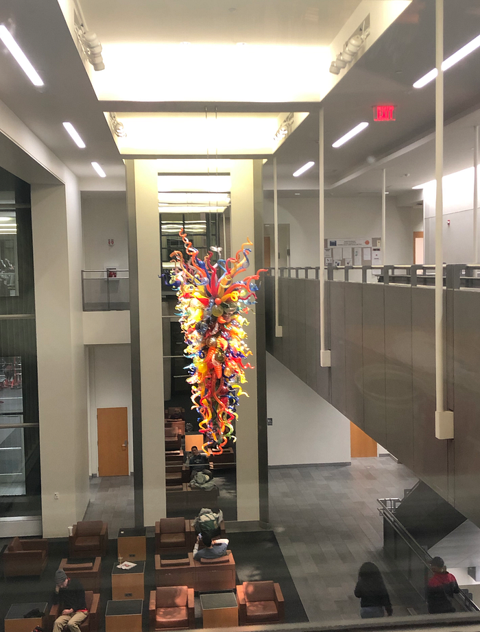
- Chihuly lights — Lights and Context. Someone brought up that the Chihuly lights don’t feel like it ‘fits’ with the University Cohon Center. However, Steve brought up that while it maybe doesn’t feel like it fits thematically, it fits the UC on an economic level. This brought me to consider that lights can, aside from the ways described in the list, be used to communicate certain information about the owner of the light. In a way, the Chihuly lights in the UC communicate prestige. It is also placed in a way that makes it difficult not to be seen (clearly visible from the outside of the building through the windows, from the stairwell on the second floor, and from almost on angles on the first floor). However, it also brings up the concern that whether or not the Chihuly sculpture can be considered a light — and whether there is a difference between a light and a sculpture that just happens to light up. (This ties back into OFF/ON stages)
- Really bad Scotty dog design light. Someone had a photo of an outline of the Scotty dog that lit up, and that tied into the idea of something being ‘kitsch’ (considered to be in bad taste/tactless) that was brought up during the special carriers project.
- Dorms = Prison. Dorm lighting is particularly badly designed, and it makes it feel as if whoever designed the dorm doesn’t ‘trust’ it. For me, this relates a lot back to how in time-based instructions, we talked about how some videos made the viewer feel ‘guilty’/lacking in believability or credibility. Additionally, it could simply be that sometimes, there are places with lighting that makes me feel like I don’t want to be or stay in the space.
Preliminary Paper Experiments
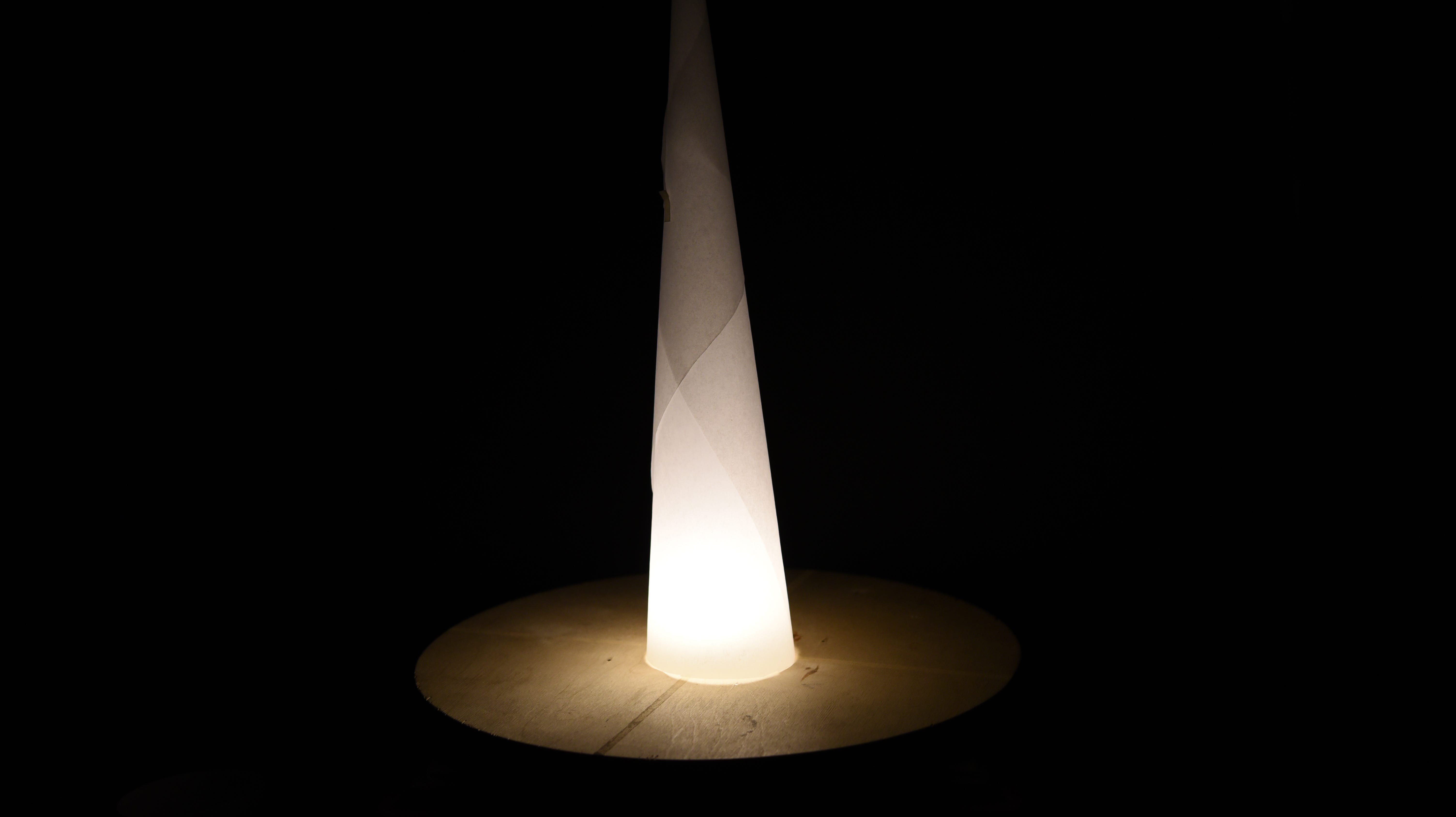
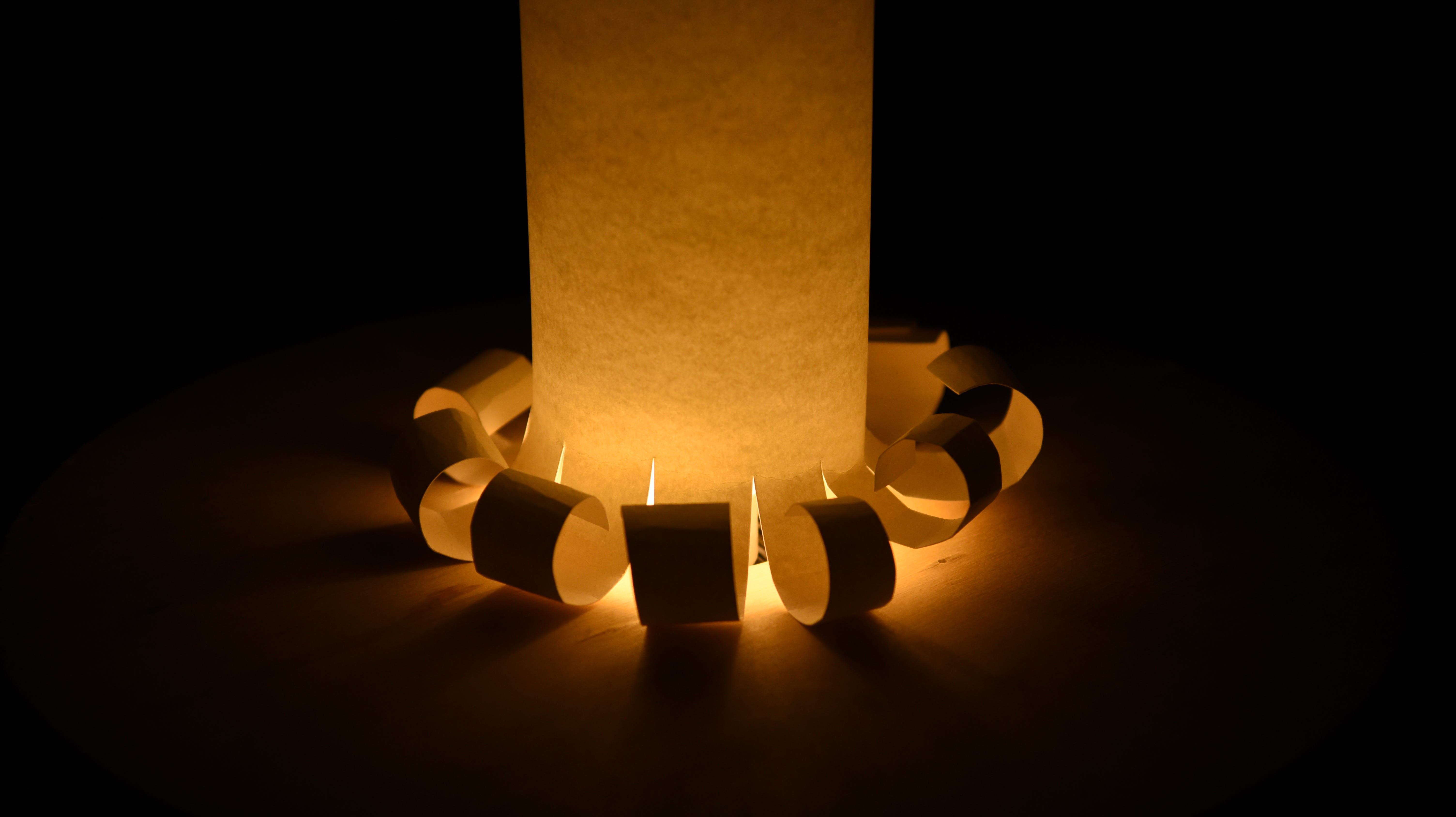
For these experiments, I focused on the way that light is represented and reflected in the form, as well as other traits that are dependant on the type of paper I’m using/what I’m doing to the paper, such as color, diffusion/casting of light onto surfaces.




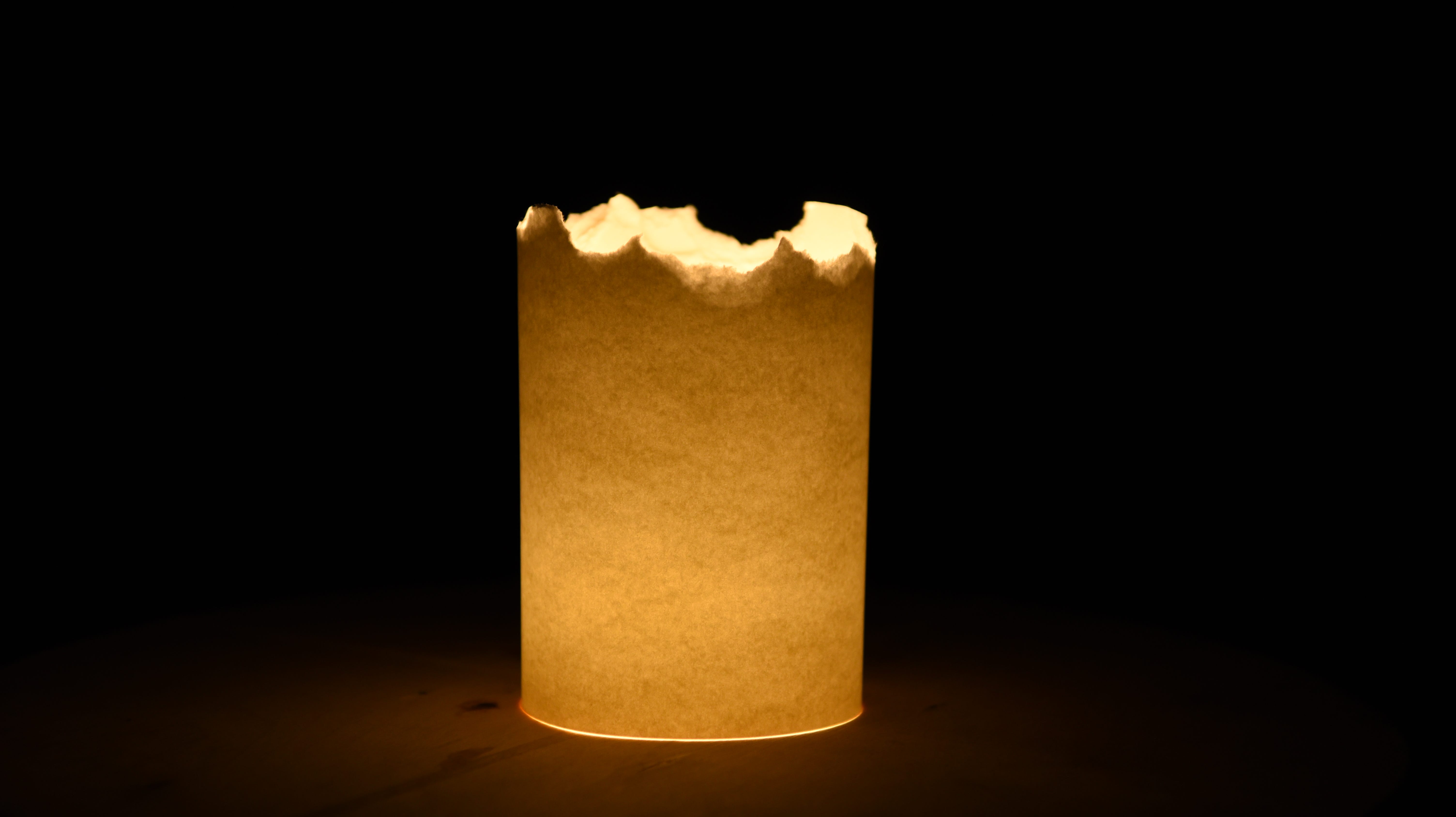
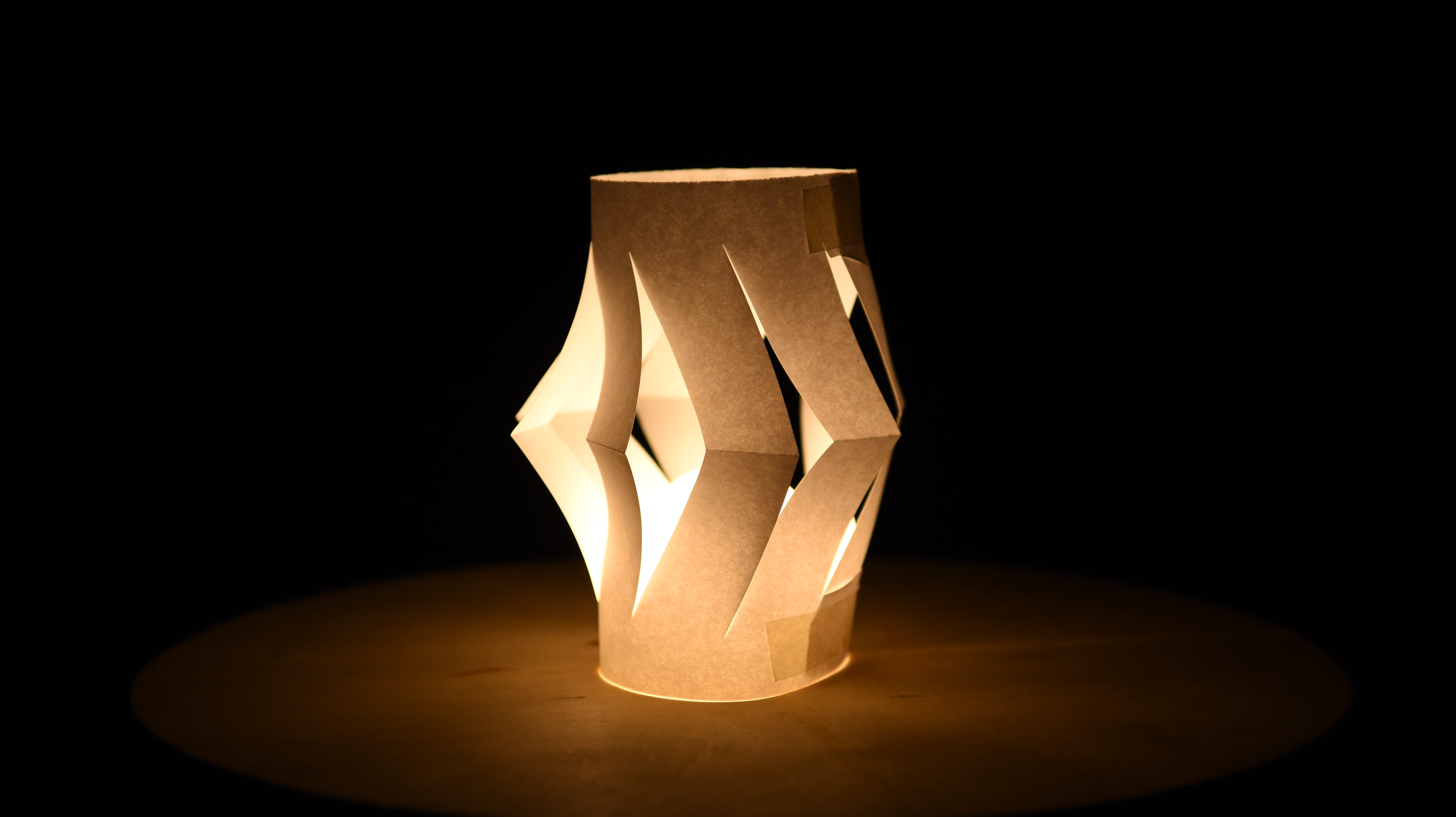
Summary of Experiments
- thicker paper tends to be more saturated (especially in oranges & yellows). Bristol actually shows up as pink when layered!


- creases (folding) will show up both OFF and ON, but it is especially distracting during the ON stage.
- when the light itself is unevenly placed onto a surface, the light cast onto the bottom surface makes the model look very unintentional (the effect is exponentially amplified, so the light dispersion is a big giveaway!)
- reflected light (i.e., cast onto a surface) is generally very evenly dispersed.
- layering paper changes the color of the paper! Bristol becomes pinker (salmon? 🐟), watercolor goes from a pale yellow to orange and then a burnt brown color.
- Texture — some paper, like the watercolor had a really interesting grain texture to it. While I found it to be
Other Things I Noticed — Discussion
While I understand that certain lights may feel like they belong in a particular orientation or particular setting, sometimes it’s difficult to pin down why exactly I think that way. Sometimes, that’s because I don’t consciously take note of the lighting in the room and it could be intentionally designed that way! Lighting can be intentionally designed to be unobtrusive/stay out of the way during its OFF state.
Additionally, I feel like some of the understanding of what shapes fit/don’t fit in certain contexts is intuitive until I start to think more about them. For example, I noticed a lot of the lights in my dorm (Donner) are rounded and placed either high on the walls or on the ceilings. They disperse light really well, so a lot of the time, I barely register them as being there. While this doesn’t fit in every single context, I do think there is merit to keeping in mind that in some contexts, lights should not be the main focus or draw a lot of attention. (Though, I wonder how applicable that is to our prompts?)
11.12 — LOOKING AT EXPERIMENTS
What are some of the requirements for each category of lighting? And how are they (the prompts) different from each other?
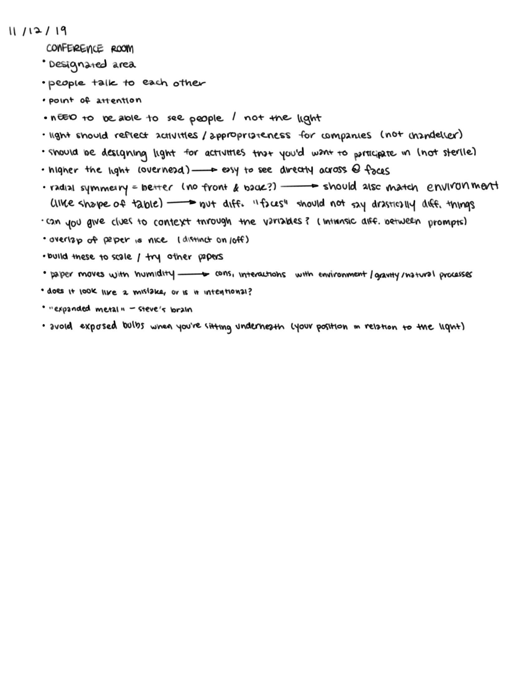
Sketch Models:

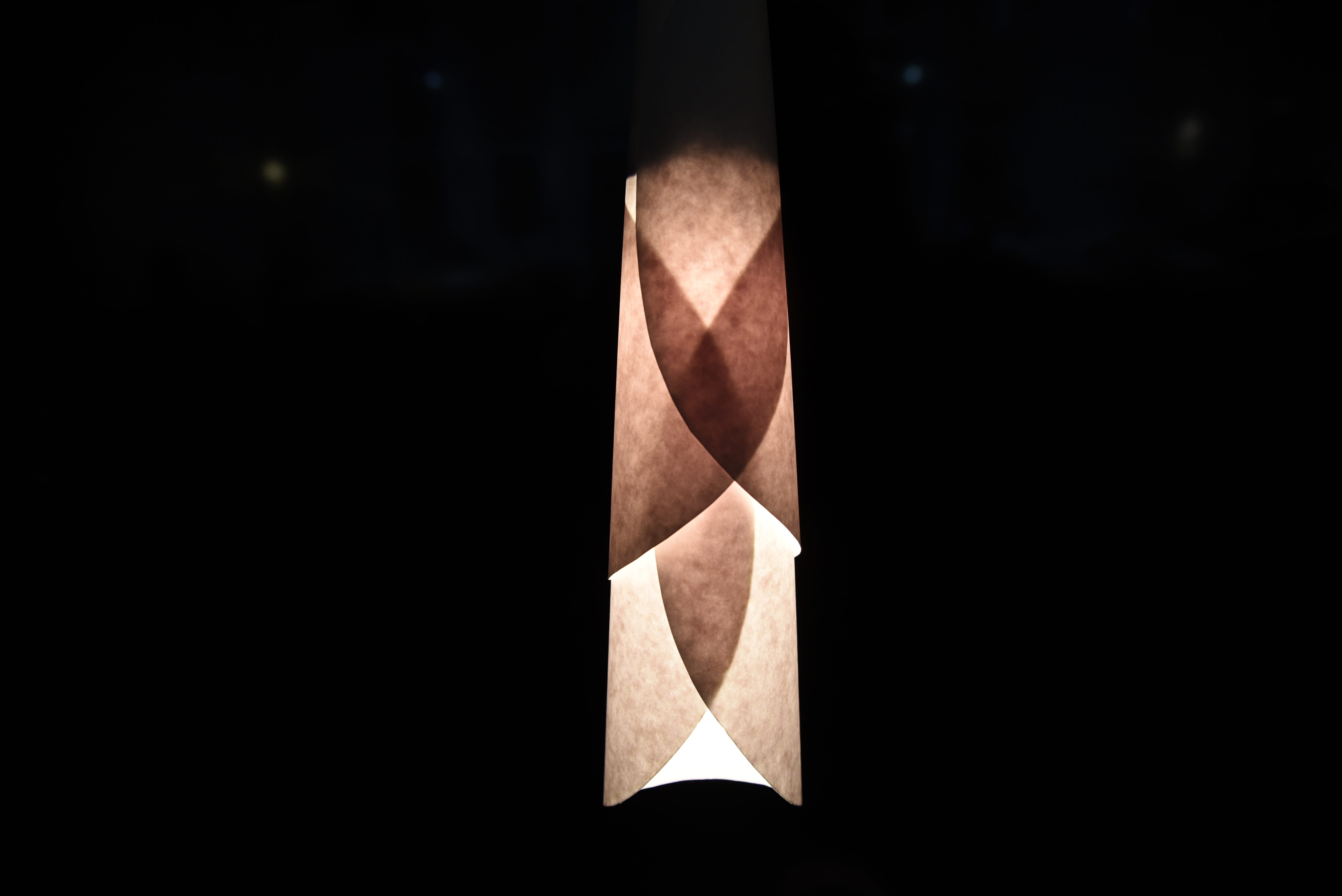


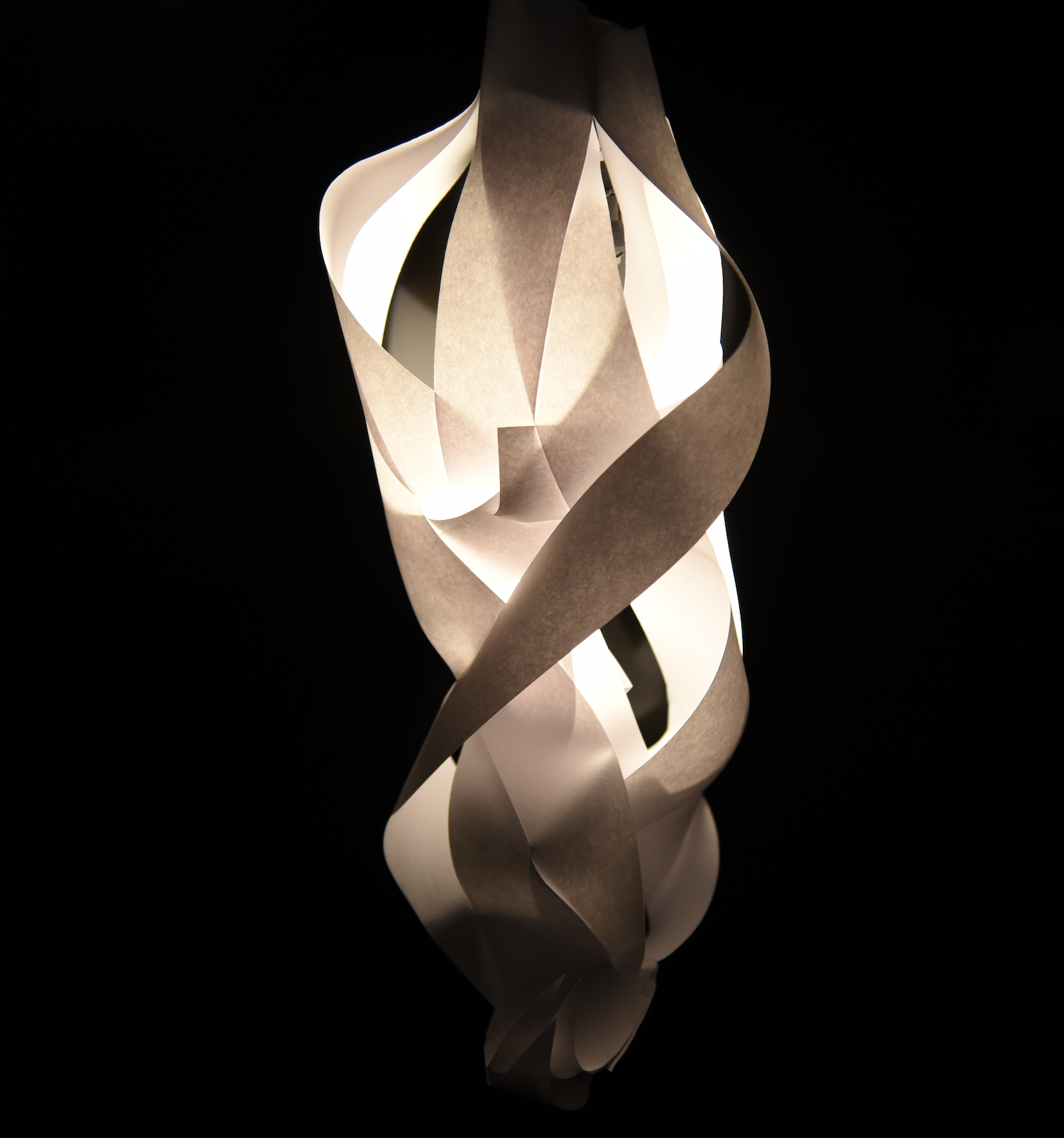

In general, we discussed a lot about the appropriateness of form, and how crucial craft is. A lot of the discussion was facilitated through a ‘what worked? what didn’t?’ structure, which I found interesting because it made me question more in-depth why I felt certain ways about certain lighting engines.
For example, when something wasn’t level, I got the impression that it was skewed because the lighting was falling apart and definitely not meant to be that way. This is especially evident when the engine is overtly geometric/symmetrical in design.
Another thing I found interesting is how height plays a huge role in a lot of contexts. Not only does this sometimes create problems with the lightbulbs + glare, but a higher hanging light feels different than a lower hanging one. (Generally, I found the lower hanging lights to be intimate, and draw people in; maybe this has something to do with the dispersion of light?)
Problems with primary 2D (surface-only) lighting engines. There was a particular sketch model that had cut-out shapes and formed a long tube. Steve and Stacie talked about how this is essentially a 2D object, as all of its features are pasted onto the individual sides.
Decorative; is it a problem? We also discussed a lot regarding ‘decorative’ elements and whether or not they’re problematic. Personally, I think it’s only an issue when they don’t serve any meaning aside from being decorative — for example, the decoration can sometimes add to the mood/tone, aesthetic or overall appeal. However, decoration that isn’t warranted can be off-putting — and especially if it’s overt, or ‘kitschy’.
Craftsmanship. The importance of craftsmanship was highly emphasized, especially regarding keeping things level, not seeing the bulb (direct glare) or really obviously unintentional seams. Something I found interesting was also
Glare. Where is the lamp positioned? (most lights are hung high up; where the exposed bulb would be super blinding if someone just happened to look up.
Leveling: How do you adjust something so that the socket remains level? Furthermore, how do we include the socket as part of the
Intentionality. Even though it is a one-off, it should look intentional (scrunched paper = does not look intentional even if it looks cool; how do we make something that communicates a level of craft and care?)
Ranking/Scale:
Where does your lighting engine fall?
Warm — Cool
Loud — Quiet
Large — Small
Public — Intimate
Dim — Bright
Soft — Sharp
Smooth — Harsh
What adjectives come to make? Like we learned in psychology, certain shapes remind us of certain words and sounds. What types of descriptors do we associate with certain light forms, and why? How can we analyze and figure out
Iteration #1:


Iteration #2:


11.14 — Group Discussion for Reading in Bed
In our groups, we discussed specific requirements/needs that our context
Warm vs. Cool Lighting: My classmates think warm lighting is good for reading, whereas I prefer cool tone lighting. Personally, I think this is a matter of personal preference/maybe even the type of book you enjoy reading?
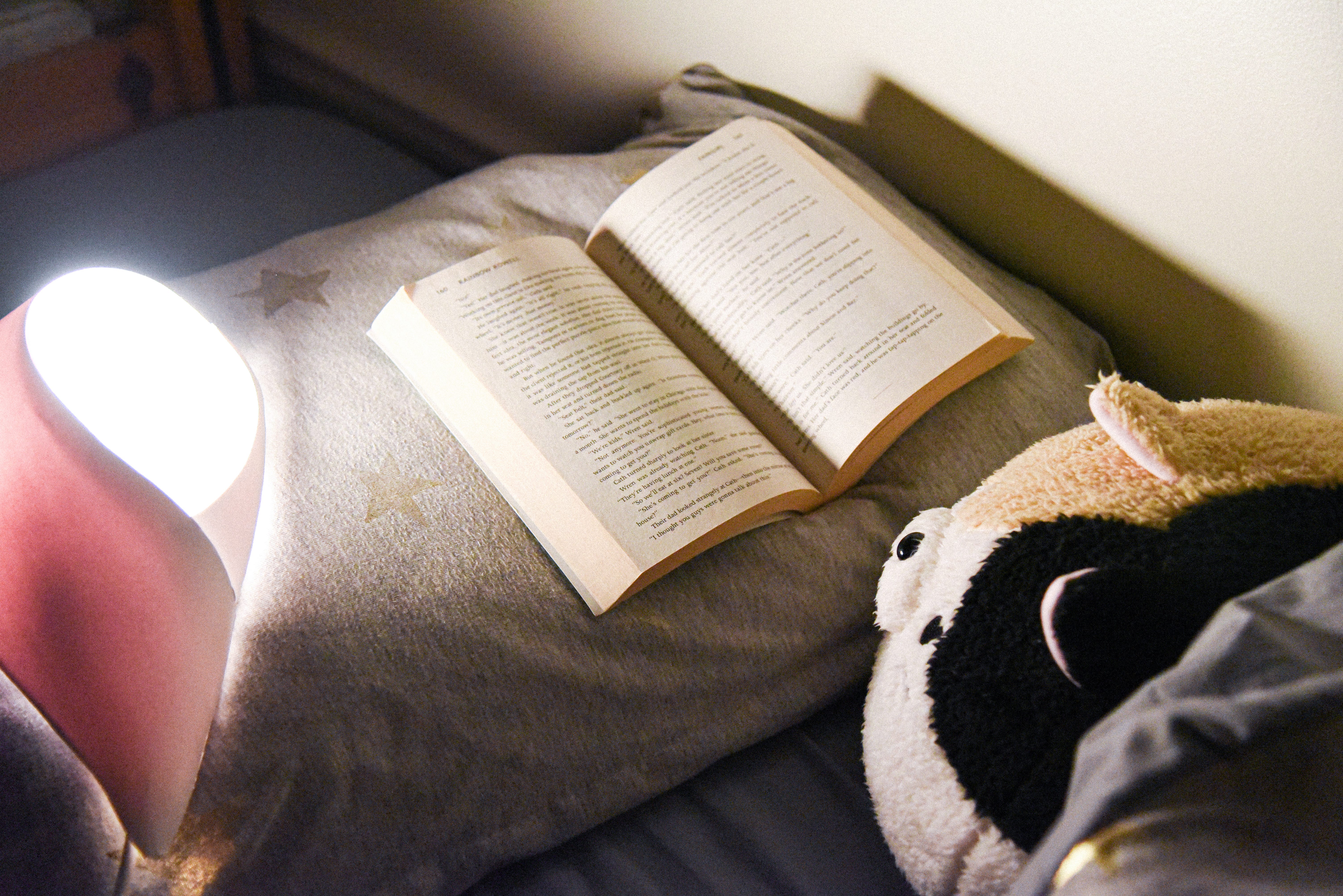
Where is the light placed? If it’s too low, you might see the bulb or not have it illuminate enough of the space. This brought me to consider what position someone would be reading in? I read in bed a lot but I switch up the positions every so often, so I considering accounting for a bit more flexibility (can be both mounted on the wall + left on the bed/table) Because my prototype had a sturdy back, it was brought up that it’d be interesting to leave it on the bed itself, which inspired me to think about this even further.
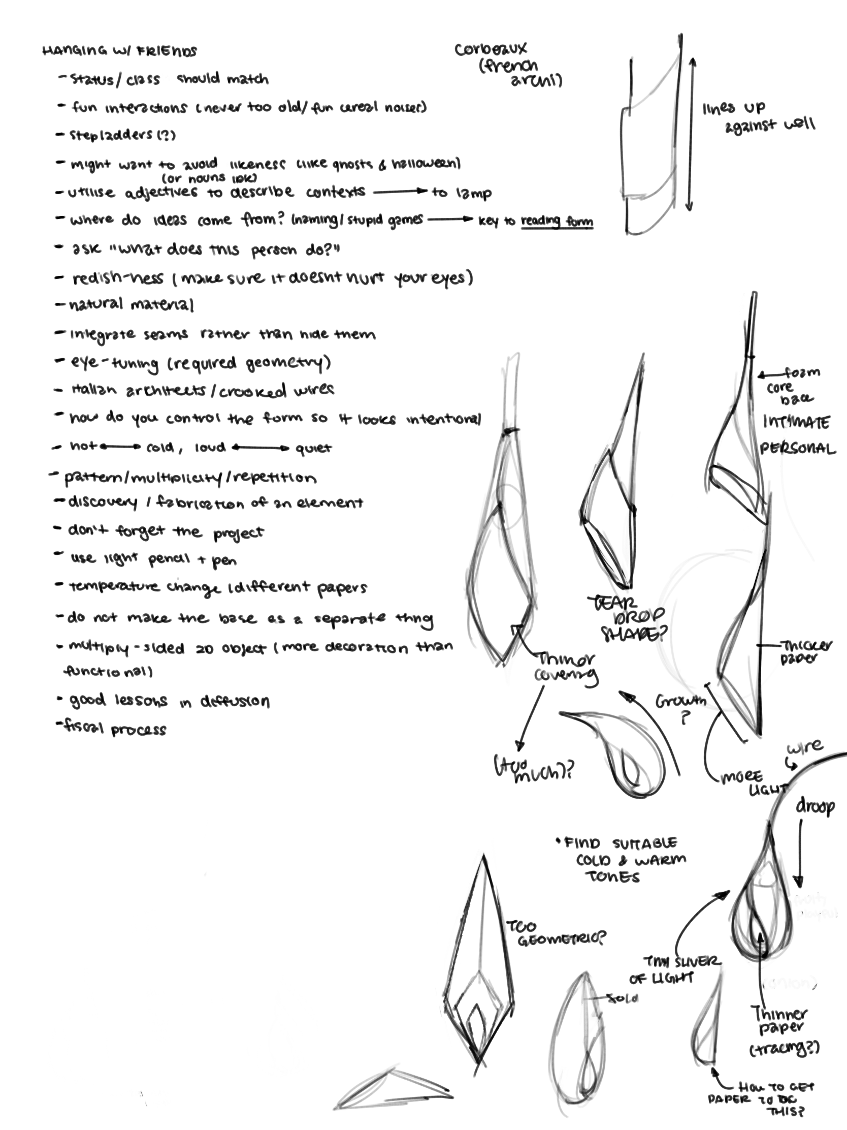
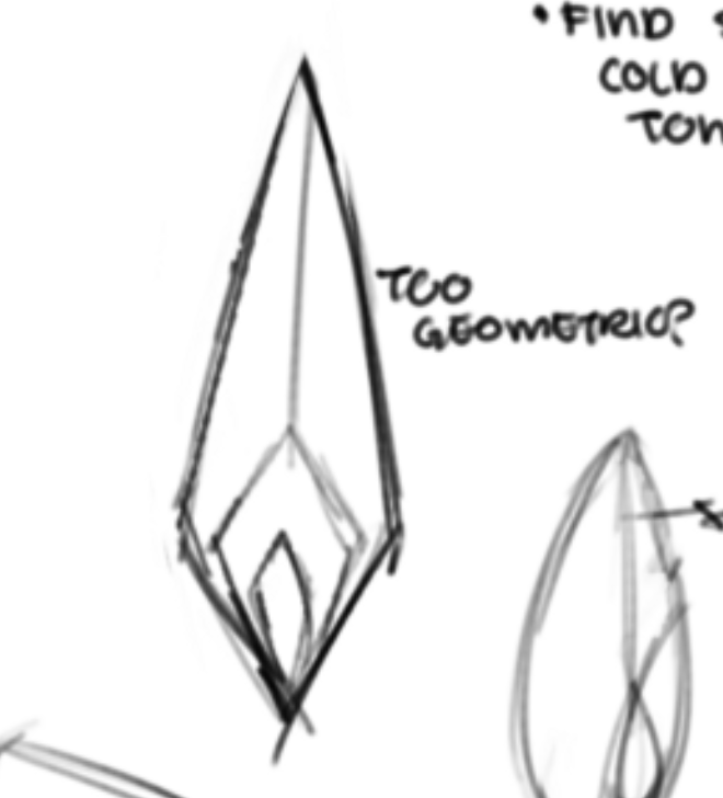
Too ‘clinical’ (prison? star trek? star trek prison?) → informs me to try going back to my original idea of teardrop shapes: symbolic but not too representational.
Advice: look at McDonald's french fry container, orange peels, and highschool graduation hot air balloons → all ways to crease & get a curved surface from a flat piece of paper.
Iterations #3 and #4:
A Continuation from iteration #1, I pushed a bit further regarding how to get my form to look more like a teardrop shape.
Before this, however, I took a short trip to Home Depot to look at their lights just to get a better sense of how lighting is displayed.


After my trip, something I started to consider was different viewing angles. I got the idea for my light to have a singular side/angle that would block the light from where the people are sitting/laying down, but would still have a really bright window that would shine on the book, so I deviated from my original ‘centered window’ idea from iteration #1 and revisited one of my earlier sketches where the window was slanted:
Reading in Bed: What is that?
Getting down to what I want in a reading light design.

The initial goal of this design is to take elements of a task light and give the engine a ‘face’ or side that directs the light to a particular place, but not in a harsh or overt way. For me, I enivision reading lights to be soothing and not distracting. I would describe them to be curved and gentle, and very simple/minimalistic in terms of elements.
Process:

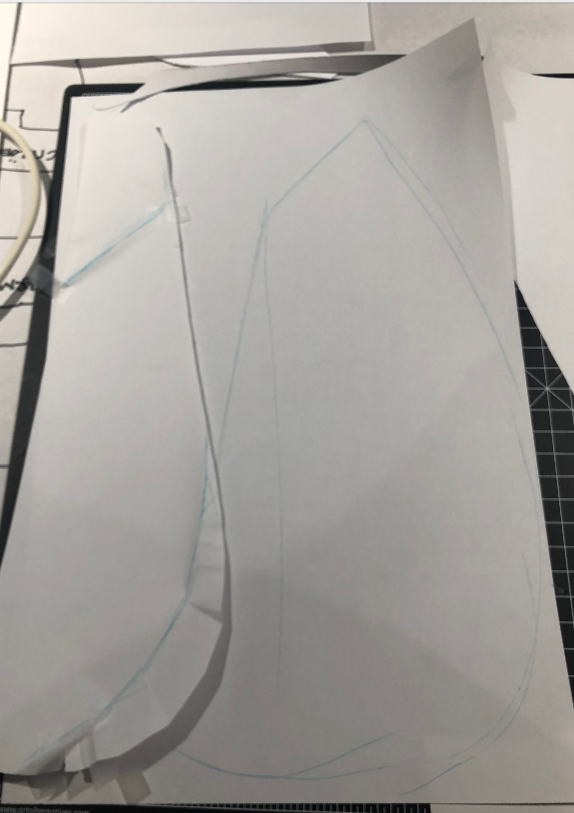
Iteration #3:
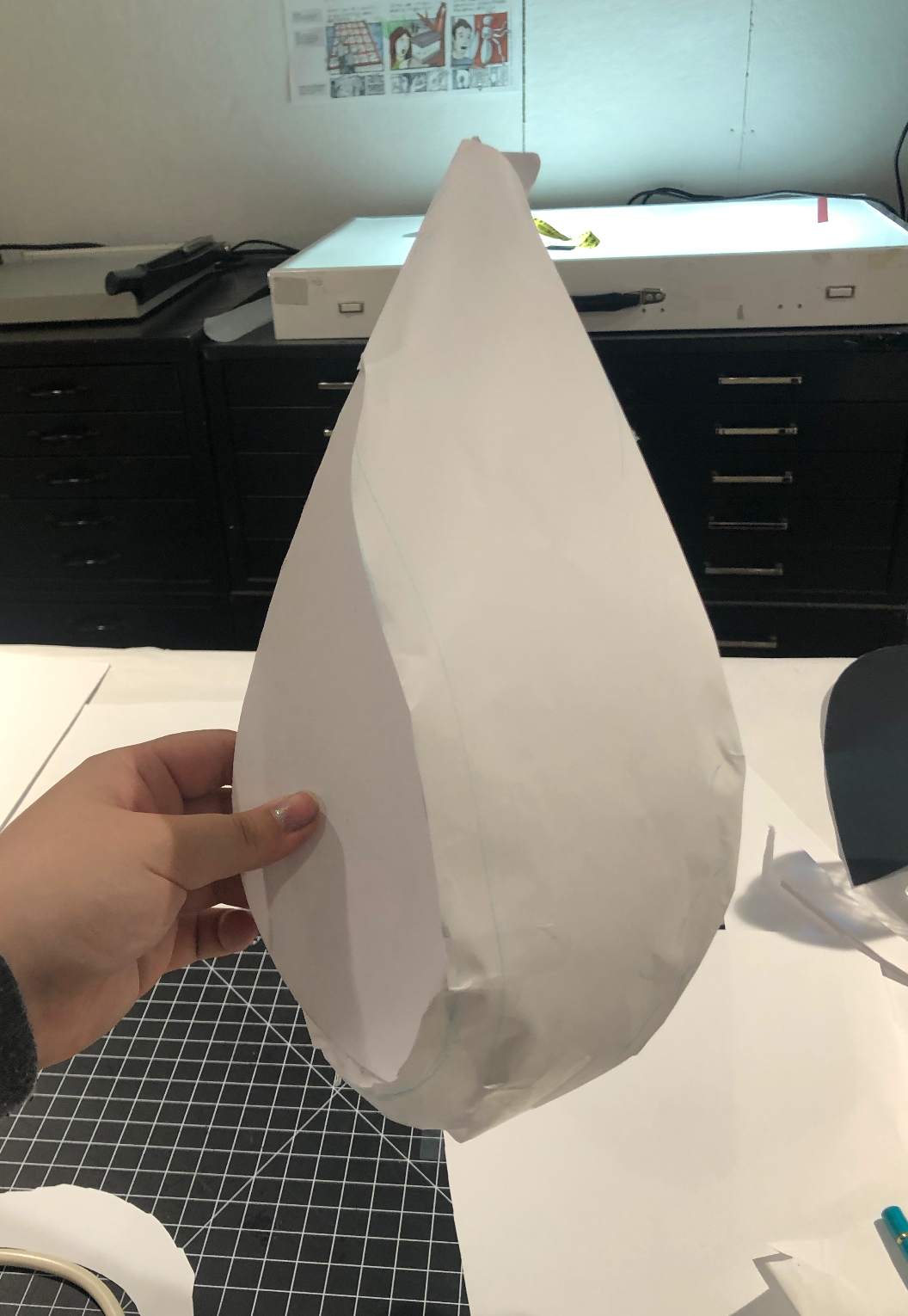
The biggest issue with iteration number 3 was how untidy it was — there was a lot of visible adhesives (chunky hot glue and flaky tape). The general shape was alright, but the visible creases in the mat board were off-putting. This is because I created the shape after bending a piece of paper back and forth on the teardrop base until I got a flattened version of the curvy shape. Additionally, there are problems with the transfer paper and how bent it was.
- Very Warm (some of the images don’t show this particularly well)
- Matboard let in significantly less light than transfer paper
- you can see the bulb through the transfer paper pretty clearly
- Lots of light leaks (yikes)
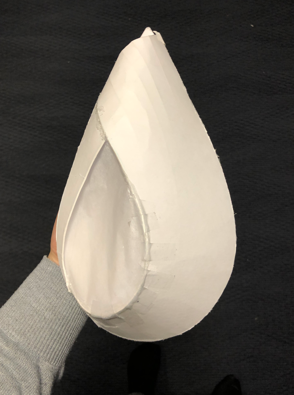

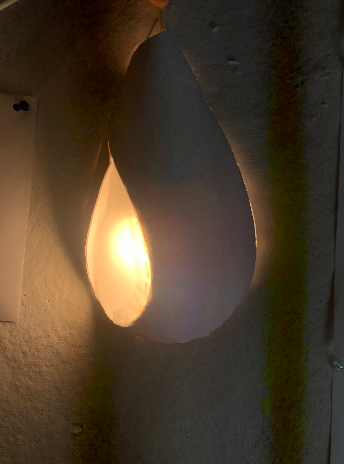
Iteration #4:
I attempted to rectify some of the issues that presented themselves in iteration #3 by experimenting with different materials. For this attempt, I used bristol with a mat board back. The biggest problem is that the bristol was pulled to a sharp point at the bottom right side of the teardrop — something I didn’t feel matched the soothing vibe I was going for. I wanted to mirror the larger overall shape in the transfer paper window, and the window was pulled so tightly I felt that there was a feeling of tension that I didn’t really enjoy. For me, the edge protruded too much for it to be comfortable — I wanted something softer so I reconsidered using bristol despite the smooth exterior being much better than the matboard.


(I decided to make a wall since I want my light to be put in context — I constructed this using foam core & corrugated cardboard.

A reprise of things to consider/What do I want out of my engine?
because I’m assuming reading in bed with a light happens at night (there’s an adequate amount of sunlight during the daytime based on the way that the room is designed), I want to make sure my light is relatively dim. As my current engine design runs on the small side, I definitely want to make sure I diffuse it well enough.
should be flexible in terms of placement: both on the wall, on the bed/bedside table in order to accommodate different reading positions. Experiment placing it on the window? This is not a requirement, but I personally think it’ll be a cool aspect to explore, as there is a lot to be said in considering the context in different ways. (How flexible can we be? Should we assume most people act a certain way? Should we stereotype? For example, in ‘hanging with friends’, how does the type of friends influence the type of engine one finds appropriate?)
Some people prefer to read by cool light and others by warm light. While I don’t think this particularly matters & is completely dependant on preference, I chose to go with either a neutral colored light or pink (salmon?), like the bristol is when layered.)
11.19 Group critique on my Lighting Engine
For my feedback, people wanted it to be more adjustable in terms of placement/position. I was surprised that it seemed like it would only work a certain way, but I think part of that has to do with the specific wall setup I had. Because of this, I think I’ll pursue my potential ideas of having a reading light engine that is actively designed to work in more than one position further & think of ways to make it more flexible.
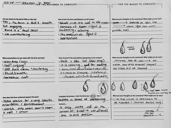
Additionally, people thought that the window was too big, but I found that a larger window facilitates the diffusion of light much better (especially at different angles), and therefore chose to keep it the way it was in my iteration.
Things I noticed from critiquing other peoples lights:
- Stands. In our class critiques earlier, we talked about how the stand should be not treated separately from the light. For a lot of the desktop lights, we noted that the stands were often weaker than the lights themselves, i.e., most of them looked like they were an afterthought.
- Light sockets. Much like stands, we discussed how leaving out the light socket made the light feel much less ‘complete’. However, this didn’t matter as much for high hanging lights, such as conference lights where we couldn’t see the top unless we strained ourselves and actively looked for it.
- On/Off Stages. In some instances, it felt like the iterations had significantly stronger ON stages than OFF, and other projects vice versa. For example, imperfections in the form were emphasized when the light/layers were not showing through them.
- Cannolis & Connotations. For one of the lights, we unanimously agreed that the shape reminded us of food, which we didn’t feel was appropriate for the prompt, which was conference lighting. In this particular instance, my groupmate suggested that because the shape was 1.) interesting and 2.) foodlike, he felt like he’d spend a lot of time looking at the light during this hypothetical conference and being hungry rather than paying attention.
- Intentionality. Some lights had issues of asymmetry/symmetry that was either so slight or so exaggerated that it did not feel intentional.
- Novelty Item. Another thing we noticed was that with some of the lights we saw, it was kind of difficult to see it as a light and not as an object, like a novelty item that just happens to light up. (I.e., I have a cactus nightlight in my room, but the emphasis is on the fact it is a cactus and not the fact that it is a lamp.)
Iteration #4


I reevaluated some of the issues I had with my last iteration and the main ones I wanted to prioritize on were:
- The bristol pulled the teardrop shape to a point due to the fact the shape naturally pulled itself to a certain point, which made the profile more triangular than teardrop-shaped. Because the reflection of the smaller teardrop within the larger one is an important aspect of my design that I wanted to keep, I wanted to figure out a way to maintain the shape without using a super stiff material like matboard, which has a lot of distracting creases in it that take away from the overall form.
- The transfer paper was too wrinkly and a bit grainier than I preferred, so I want to use another material instead. Some of my classmates recommended Yupo, which is a type of synthetic paper. I think this will really help decrease the number of creases present and give the lighting engine a much more smooth appearance (which is an adjective I’m aiming for) during its off state.
- The window should be more teardrop shape — aka echo/reflect the larger shape it is in. (The one in this iteration is a bit too round, but it’s definitely more teardrop-shaped than before. )
- The overlap in iteration #4 was too dramatic, and a lot of people thought that there was simply too much disconnect between the two shapes. I tried to make it smaller in this iteration, but some people thought I was just bad at lining the two pieces of bristol up — it doesn’t feel intentional enough.
- Paper.
11.21 — Class Crit
Are we changing our ideas too much?
During this discussion, we talked a lot about synthesizing ideas & how rational decision making or process isn’t necessarily the only way to work (sometimes ideas just happen?), but we shouldn’t be collectively driven by fear and pressure to change our ideas. For me, this felt like a crucial discussion seeing as it put in context a lot of my own working practices. For me, the project at this stage feels drastically different from the way I normally approach projects — I happened to just have an idea one day and kept pursuing it throughout the project, without making really making drastic changes to the overall form or design of it. Personally, I had been doubting my decision to not make drastic adjustments (all my iterations look very similar), but this discussion really made me question whether or not drastic changes are necessary. I think that there definitely is a lot of pressure to experiment and find the ‘perfect’ solution, but there is also definitely merit in experiments that don’t end in the way we want them to. (“The only bad experiments are the experiments that aren’t done.”) For me, I want to work on finding a balance between experimentation and pursuing an idea in a linear/rational way, as I think there is a lot of merit in both (breadth and depth) and while I don’t necessarily want to limit myself from the get-go, I want to be comfortable working an idea through the process without getting caught up and frustrated by the progression.
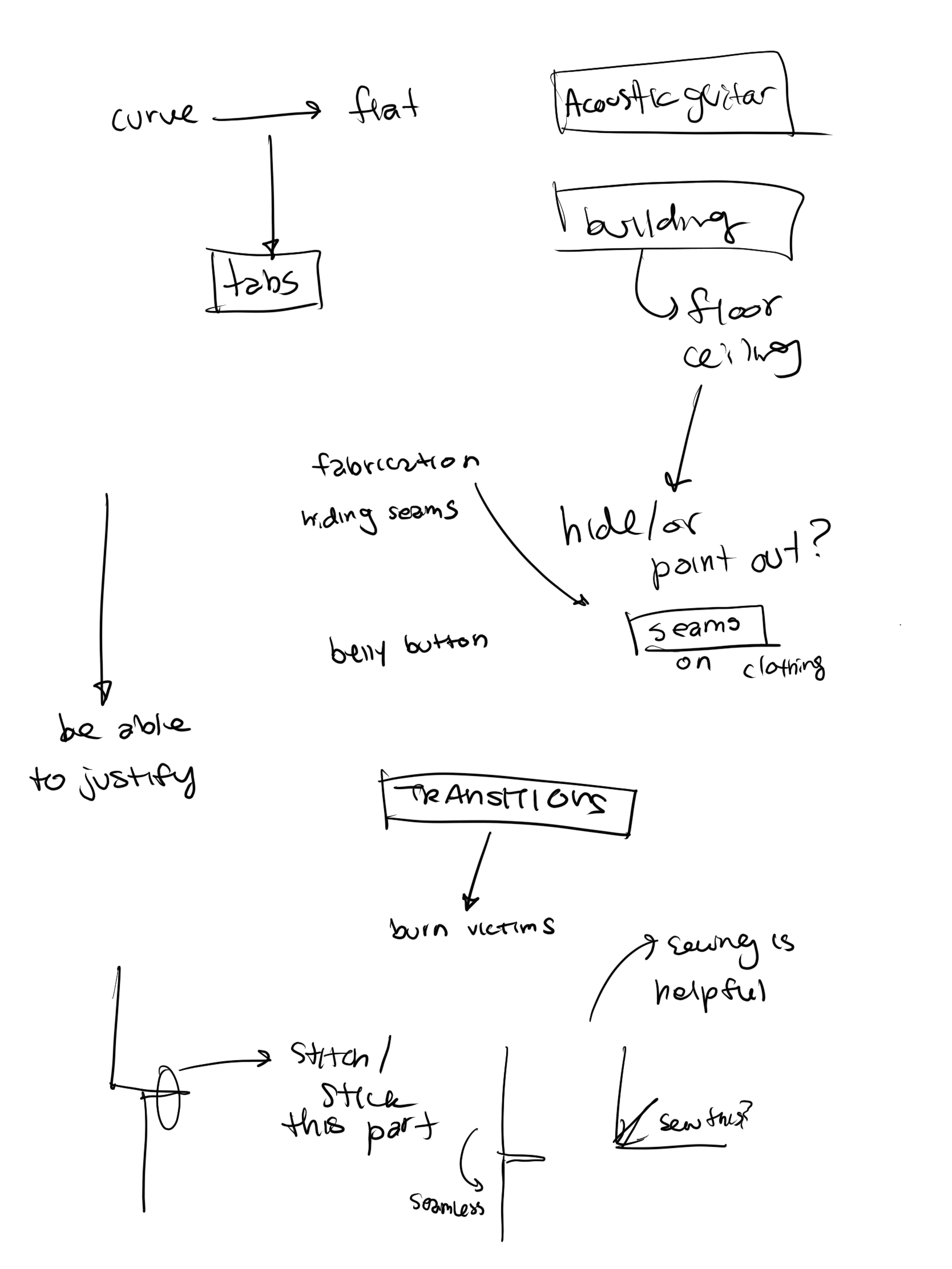


What do I want to change from here?
Feedback:
- don’t make drastic changes to the design. I agreed with this, as this class had been the designated ‘design freeze’ and I wanted to bring my current design to completion.
- craftmanship is kicking my ass. (Okay, but when is it not?) We discussed the use of tabs and other techniques to minimalize or eliminate issues.
- Should do something about the cord, the large gap is unsettling (? → make the opening smaller)
Recommendations/Stuff to Try:
- Cutting the foam core (base water drop shape) at an angle, so it’d be easier to attach the bristol.
- Attaching the back afterward, so the Yupo wouldn’t be as crinkly or irritating to work with. (alternatively, cut a hole out of the foam core backing → insert lightbulb → profit.)
- types of adhesives to deal with crustiness caused by the tape and hot glue: spray-on adhesive (may not be strong enough), superglue (might stain).
- In order to get the shape but clean finish, consider using mat/conservation/shape board to create a base, and put bristol on top. (concern: this might change the color of the lighting engine drastically since most of these are a different color than bristol)
Last Iteration:
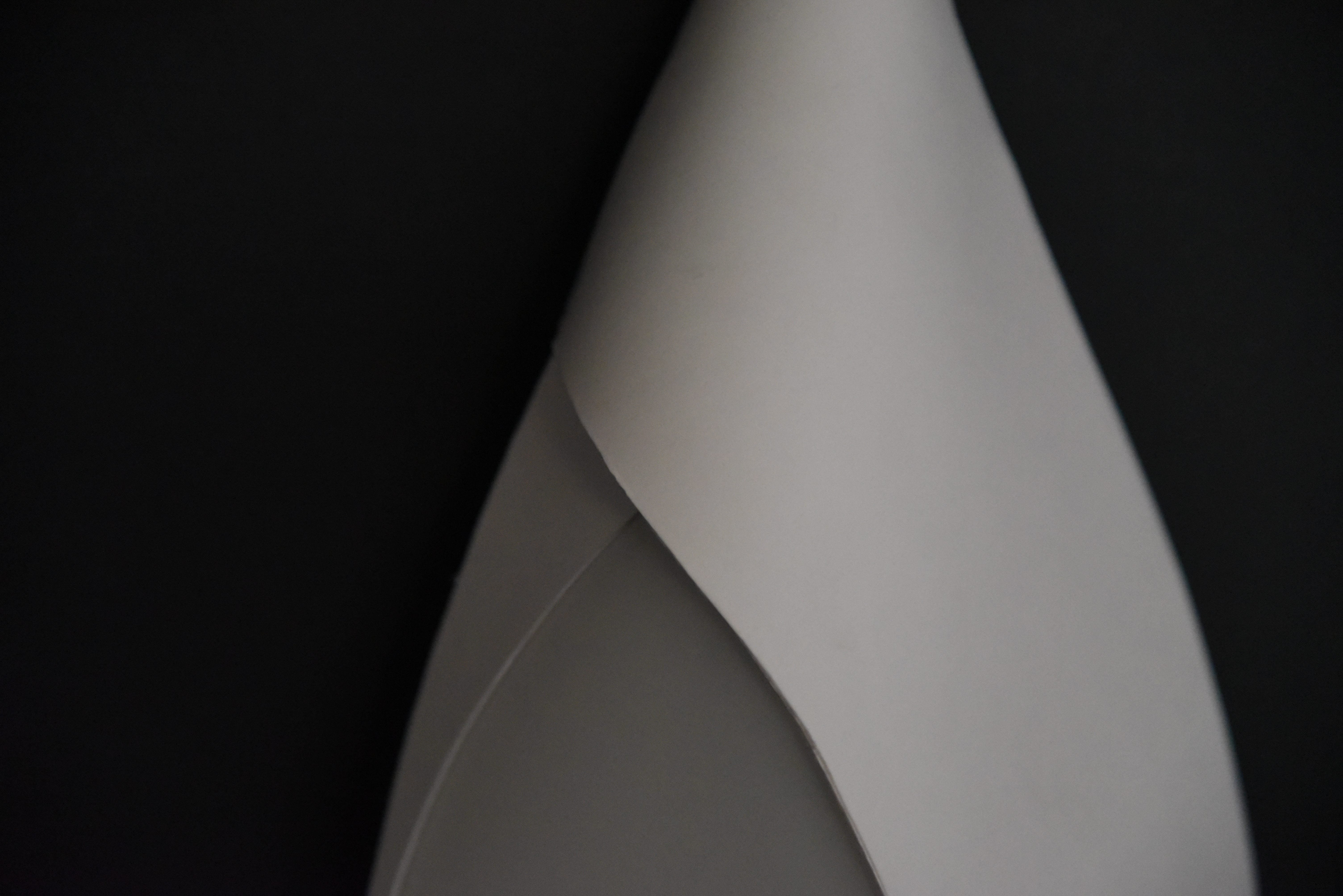
For my last iteration, I started with a list of approaches I wanted to take.
- Layering bristol — instead of two, go for three. This will make it sturdy enough to not have everything to draw to a specific point along the curve, and also you can sacrifice the appearance of paper for the correct angle of the curve on the bottom two layers if necessary since the top layer should hide it.
- Cut out the foam core back after attaching it and using that to attach the layers of Yupo so you can have a seamless edge (unlike literally every single iteration until now.)
- Tape the bristol done first on the outside so keep its form, and then secure it on the inside. This prevents bending/breaking throughout the process.
- Layer the bristol 3 times, and the Yupo 5–6 times to ensure there is maximum diffusion — the size of the light is relatively small (intimate) and I didn’t want people to be able to immediately tell where the lightbulb is.
Process:
I restarted a couple of times, particularly because I kept failing to wrap the bristol around the foam core teardrop shape successfully. This took multiple attempts and different bristol configurations before I got it correct — and I had to scrap a few just because the creases were getting too much, even if I were to hide it underneath the top layer of bristol.
I tried a lot of different adhesives, with varying degrees of success. Hot glue was terrible as it was difficult coordinating everything at once by me and most of the time the gaps were large enough that it just looked way too messy.
I ended up using superglue in gel form, which is less strong in smell/stinging in the eyes and nose, and it definitely worked well enough when I could hold down the paper long enough for it to dry in place. This is what I ended up doing for my final iteration.


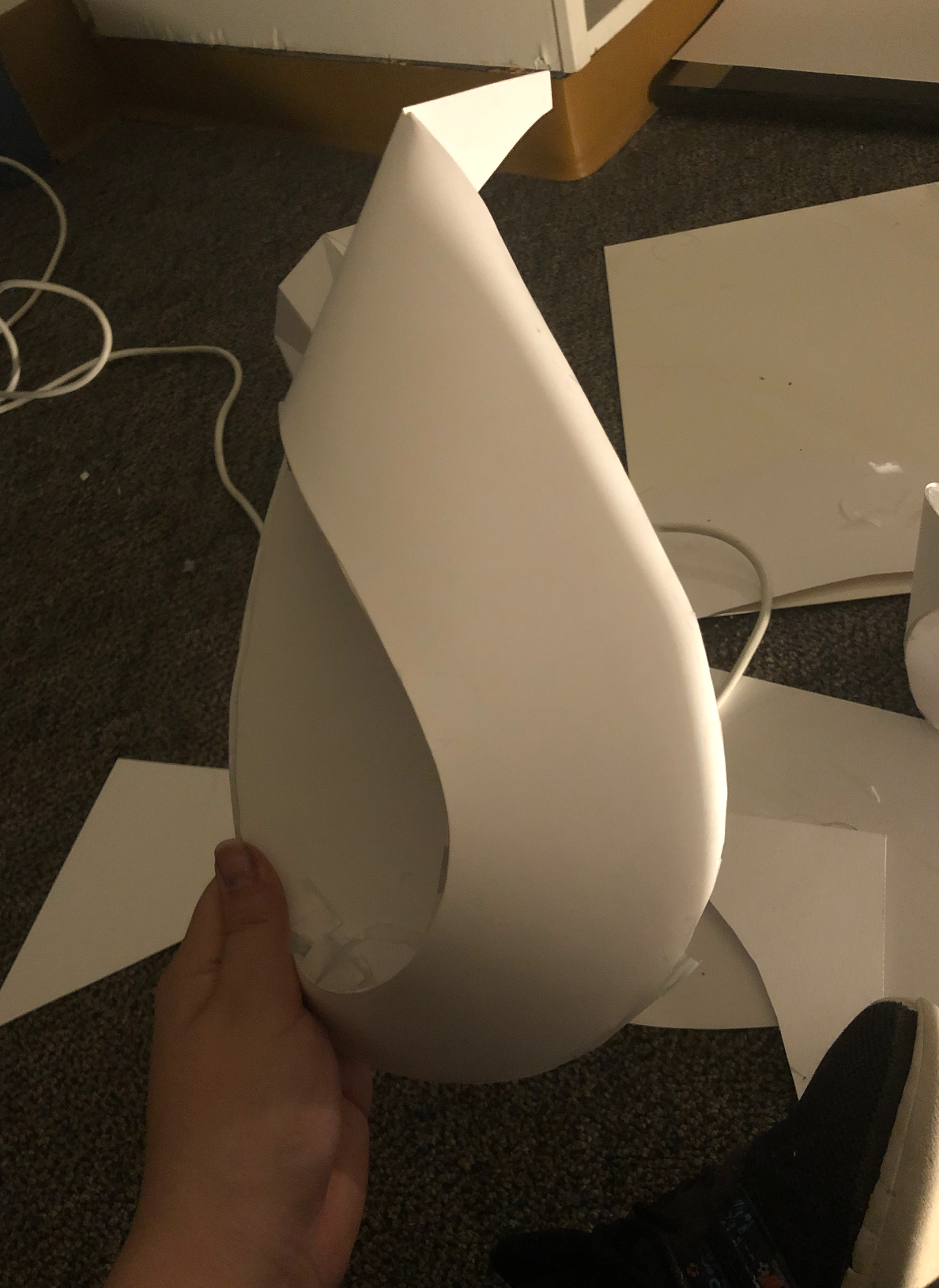


I also taped the lightbulb to the center of the teardrop to keep its place, so the lightbulb wouldn’t be too bright shining through one area of the Yupo window or one area of the bristol.
Most of the approaches I listed above worked, though usually after 2–3 attempts — I definitely also had to ask people to help me hold stuff down from time to time, so overall it took a lot of effort to get through.
FINAL

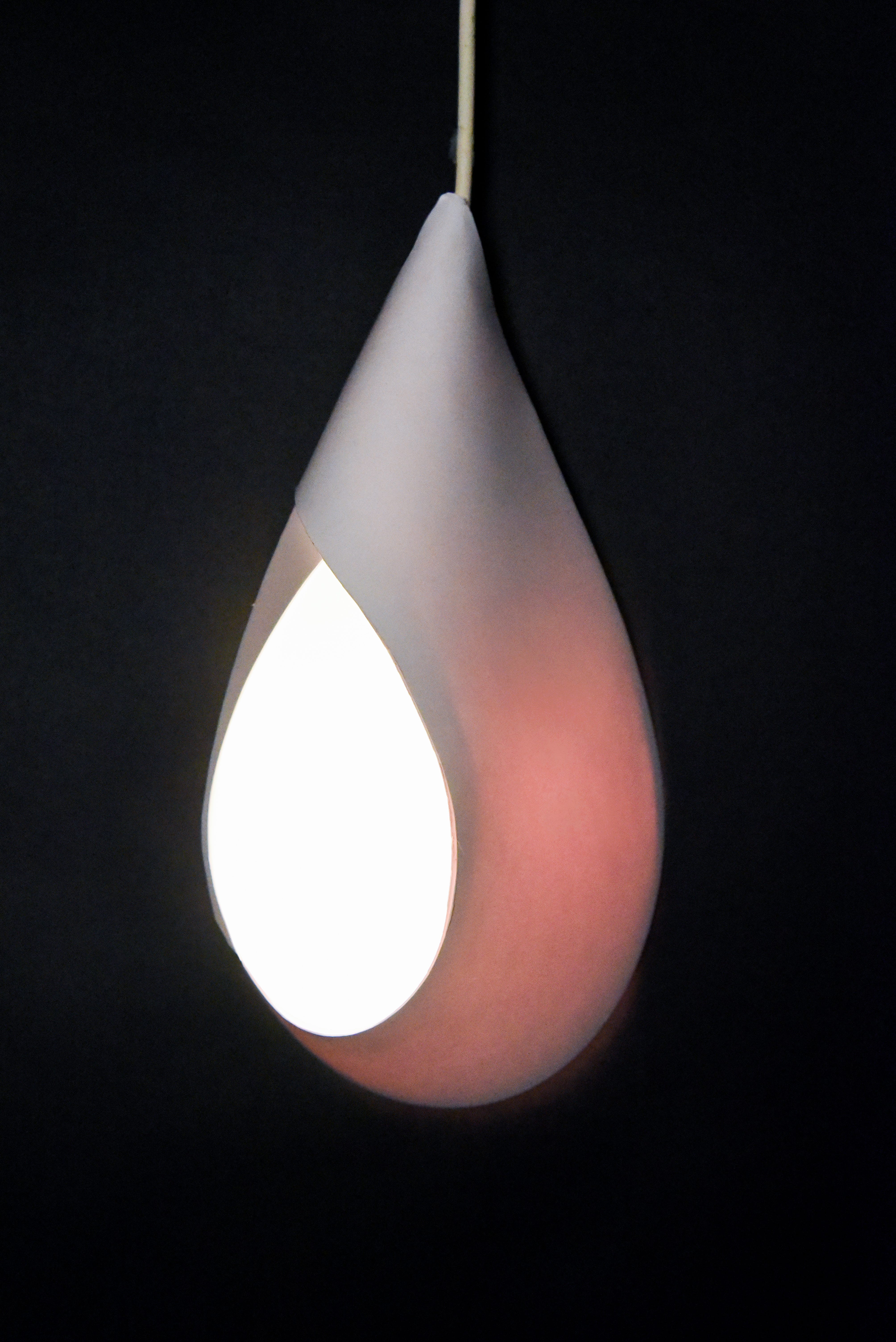
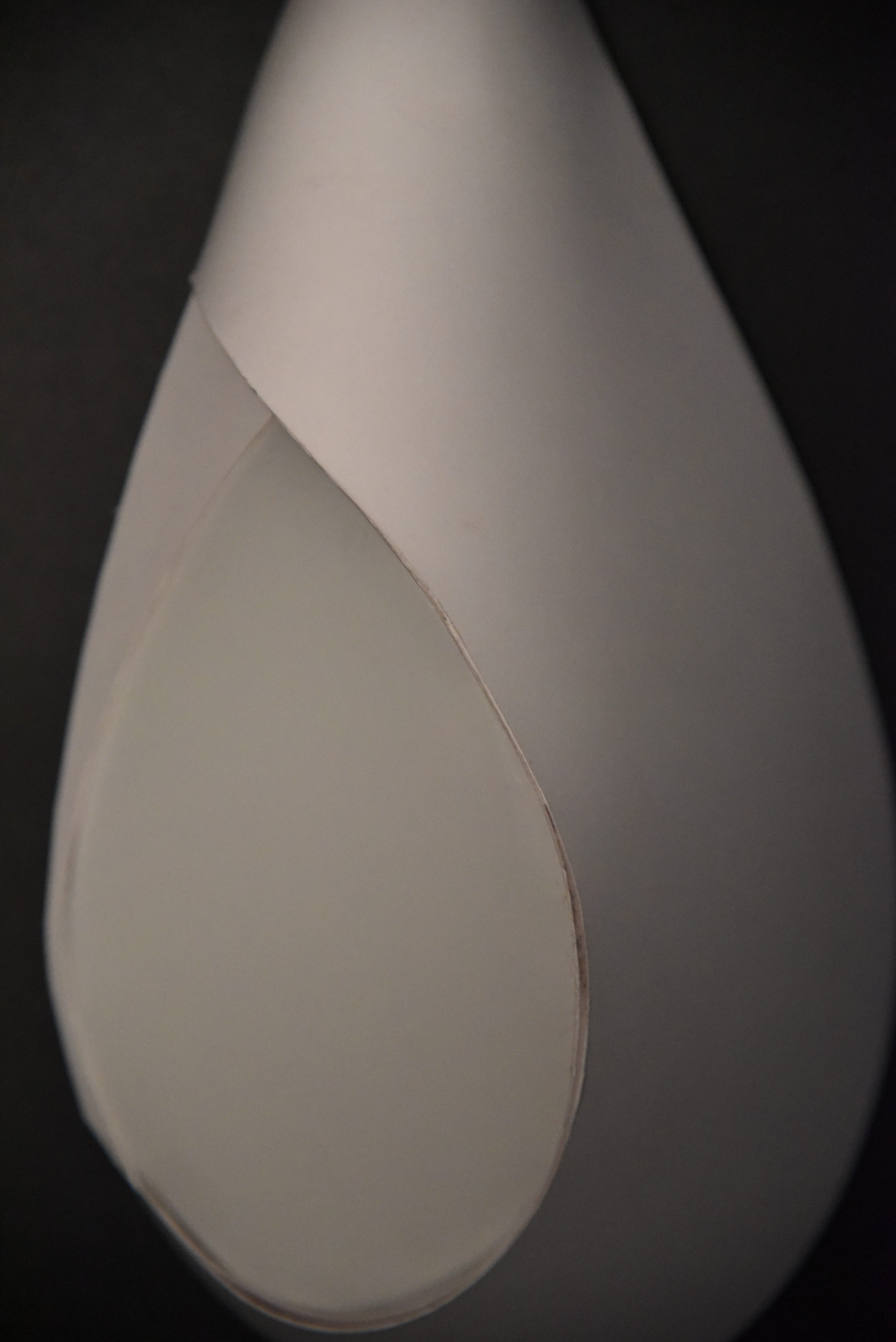
Context:

Additional Context:

Reflection:
Overall, I want to start by saying I genuinely enjoyed this project! It definitely felt like I had (relatively) fewer moments of stress throughout its duration. However, I think that the approach I took in this project is definitely reflective of everything else I’ve learned through the other projects this semester. I enjoyed thinking and learning to notice light fixtures in a more in-depth context than I’ve ever before.
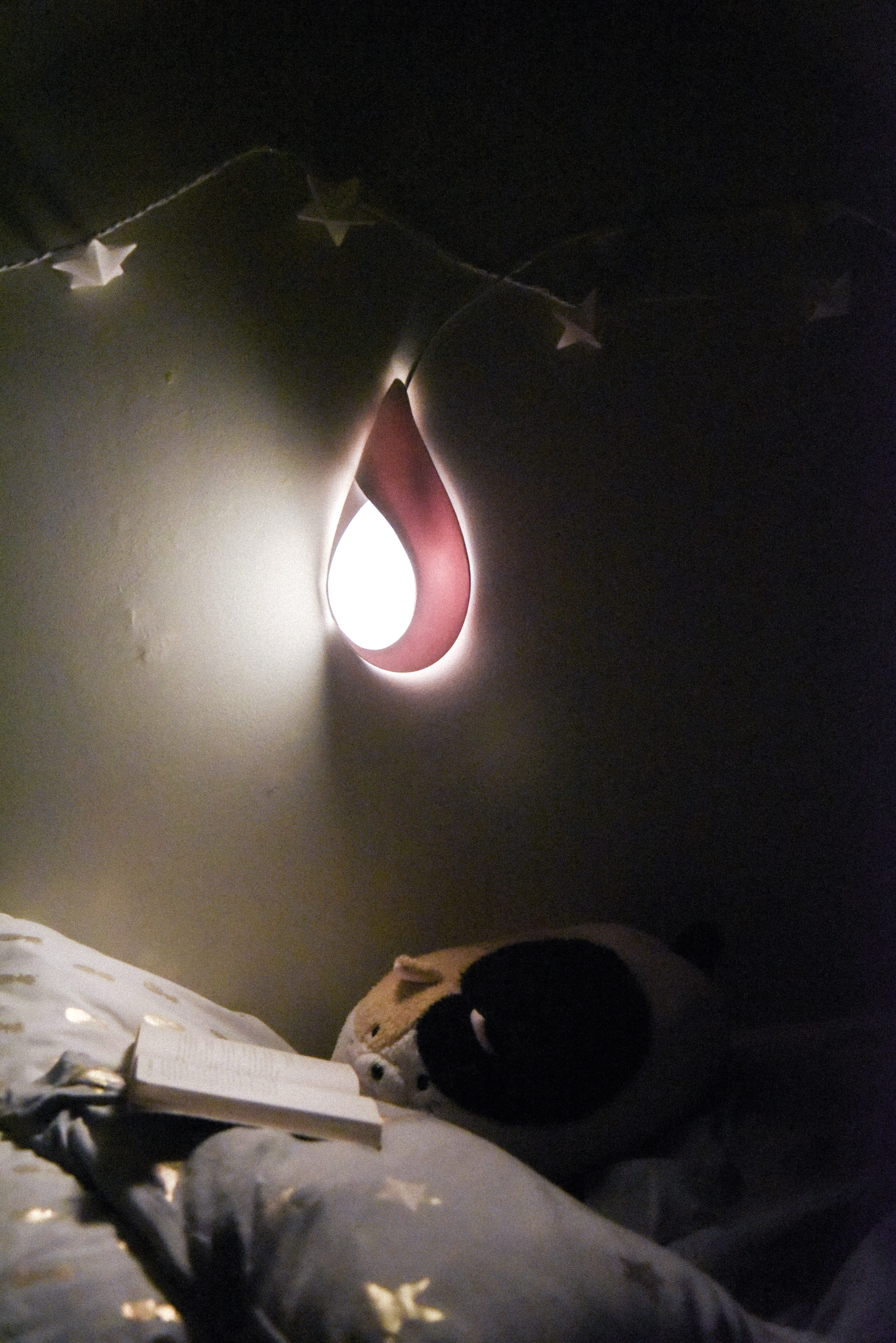
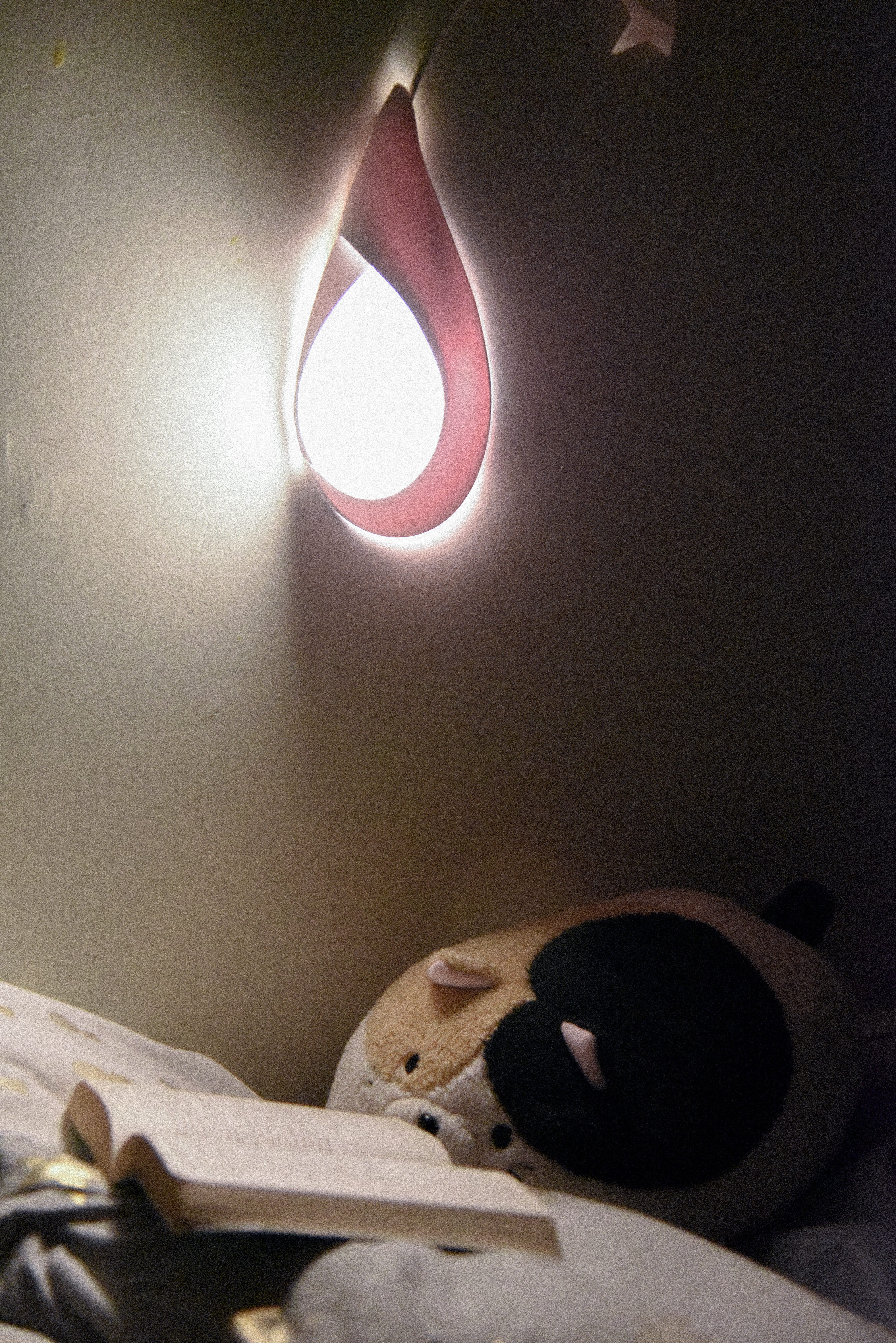
One of my biggest takeaways is Context & Creation. I think something that really hit me with this project is how much the experience matters. Even just after building a fake wall (literally three pieces of flat things stuck together), I was able to look at and appreciate and analyze my light in a different way.
Additionally, I was pleased with how much time I had to hone my craft — the design ‘freeze’ is something I want to implement in my future projects as well since it took the pressure off during the last few days enough for me to focus and really get to the details that honestly add so much to the product. It’s as if the smallest details like light peeking through in the wrong place can throw the entire thing off.
Something I found interesting was instead of changing the form continuously throughout my iterations, I was changing my crafting methods over and over again to get the lighting engine to somehow look like the previous iteration, but without the problems that come with the previous method of crafting. In every single iteration, I played with a different approach and I think I learned a lot about paper & process from it.
Being happy with your design and not changing it out of fear is also something interesting I learned to moderate in this project — while experimentation and branching out is important, I also found the importance in being able to justify my own design choices.
That being said…
Going Forward:
Something I struggled with in this project is the constant nagging feeling that I wasn’t experimenting enough. It definitely feels rough to have to choose between spending your time perfecting your craft as much as you can, versus taking a step back and re-analyzing your design choices from a distance. However, I definitely went into this project with the intent of figuring out a definite design to bring to completion way before the actual deadline, which may or may not be a good thing in the end. I think there’s a lot to be said about finding a balanced working process that works for you, specifically, and I don’t think this project helped me achieved that. However, I feel more comfortable acknowledging this imbalance and working with it now than I did before, so I think to become conscious of the issue is a step in the right direction.
Additionally, as much as I tried to eliminate mistakes & errors in craft, I wasn’t able to get there completely. It’s definitely frustrating, since craft doesn’t just mean ‘being careful’, but also actually redesigning my crafting process. If glue keeps peeking through, it doesn’t just mean I have to be careful about glue application but also change up the entire blueprint and use tabs instead to eliminate the problem altogether. I think that while this realization made my process easier since I was able to come to terms with what I had to do, but also this realization doesn’t make the actual process go any faster :’) There’s definitely some choices I would reconsider and reevaluate even in my final iteration, but there’s also been a lot of progress from my first iteration, which I am really pleased about.
Overall, I think I’ve learned a lot about working with paper and how much work is put into something that looks very simple and easy to do, which is also satisfying in its own way. In general, I’m looking forward to seeing how the ways I approached this project will influence future projects.
