
Project + Grid Systems Introduction — September 1st
In this project, my teammates (Elysha Tsai, Joseph Kim. Se A Kim) and I worked to break down The Atlantic systematically in order to better understand The Atlantic from both a print and web context. To start, we looked at some of the basic terminology and concepts of print design in Lab:

First Impressions of The Atlantic — September 5th
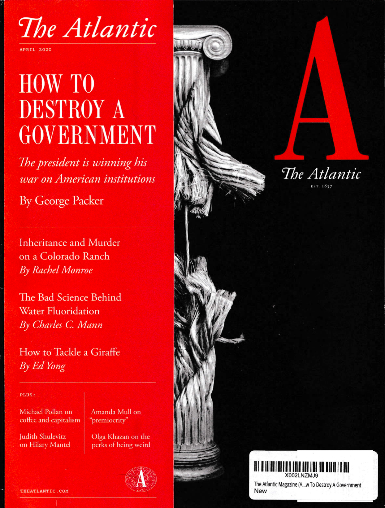
After retrieving a physical copy of The Atlantic, my group and I got to work on brainstorming how we wanted to approach the project through tentative qualitative observations regarding the kind of first impressions that The Atlantic left on us:
- Very politically and socially involved (cover featured articles discussing COVID-19, Social/Racial Justice, Trump’s Presidency, and U.S.–Chinese relations). This left the impression that the Atlantic is a publication that doesn’t shy away from more serious topics.
- Esteemed and intellectual. The magazine places a lot of emphasis on being catered towards serious readers, thinkers, and writers.
- Emphasis on individual voices of creators. The Atlantic contains many opinions or commentary pieces, often with writers delving into the issue through their own lens and letting their individual voice navigate the narrative. Visuals tend to be illustrative and more artistic in nature than direct/literal depictions of events.
- Critical, somewhat pessimistic (?). While entirely a subjective and personal observation, many of the topics covered by The Atlantic had a more somber undertone than a hopeful one. Articles with titles like “Why the Virus Won” were certainly attention-grabbing, but definitely did not make for a very light read. They were not hesitant in calling out parties or individuals they deemed responsible for areas of concern/inadequacy in society, invoking a sense of urgency with their writing and presentation.

Phase I: Background Research
Next, we began doing background research in order to gain a better overall understanding of the context and functioning system of the Atlantic through questions about their important stakeholders, reach, and historical context.
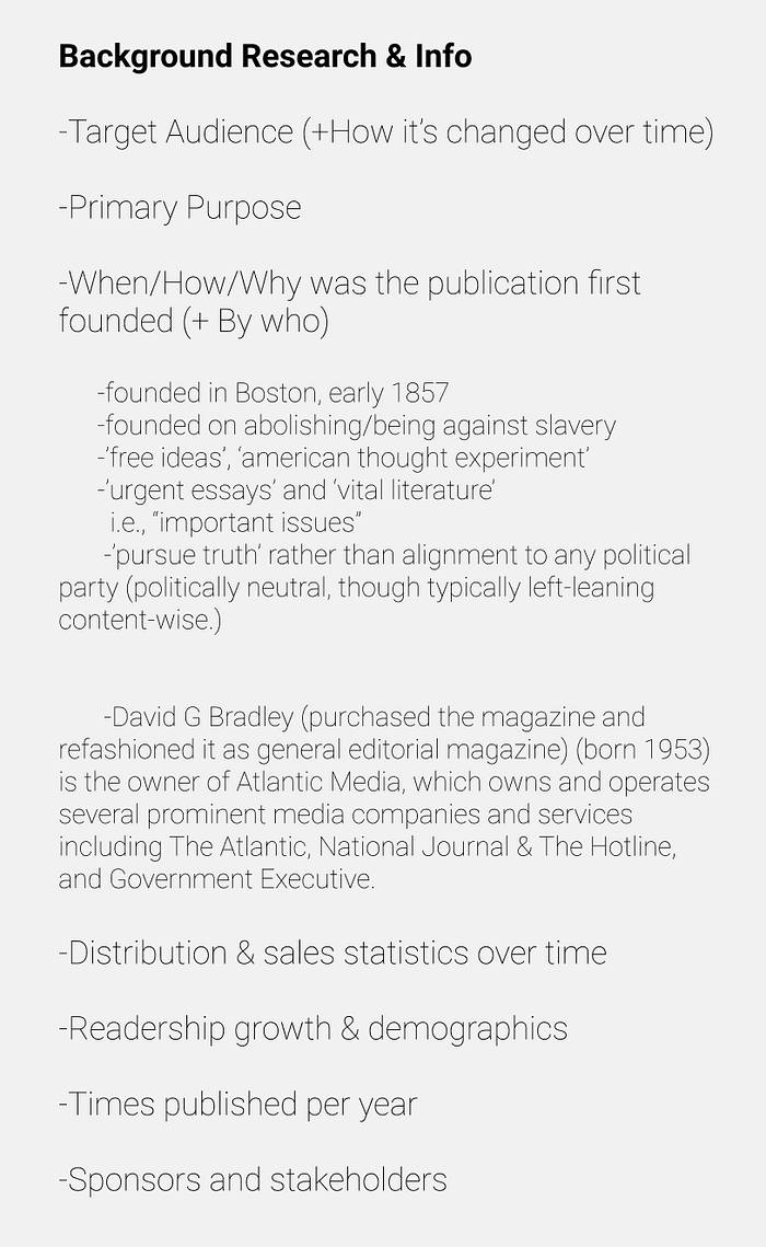
To look for answers regarding their audience, sponsors, growth, and demographics, I spent a lot of time looking at their mission statement and the publically accessible ‘Media Kit’ (2011) and (2015): https://cdn.theatlantic.com/static/front/files/MediaKit_2011.pdf
https://rethink.theatlantic.com/static/img/upload/pdfs/TheAtlanticMediaKit_2015.pdf
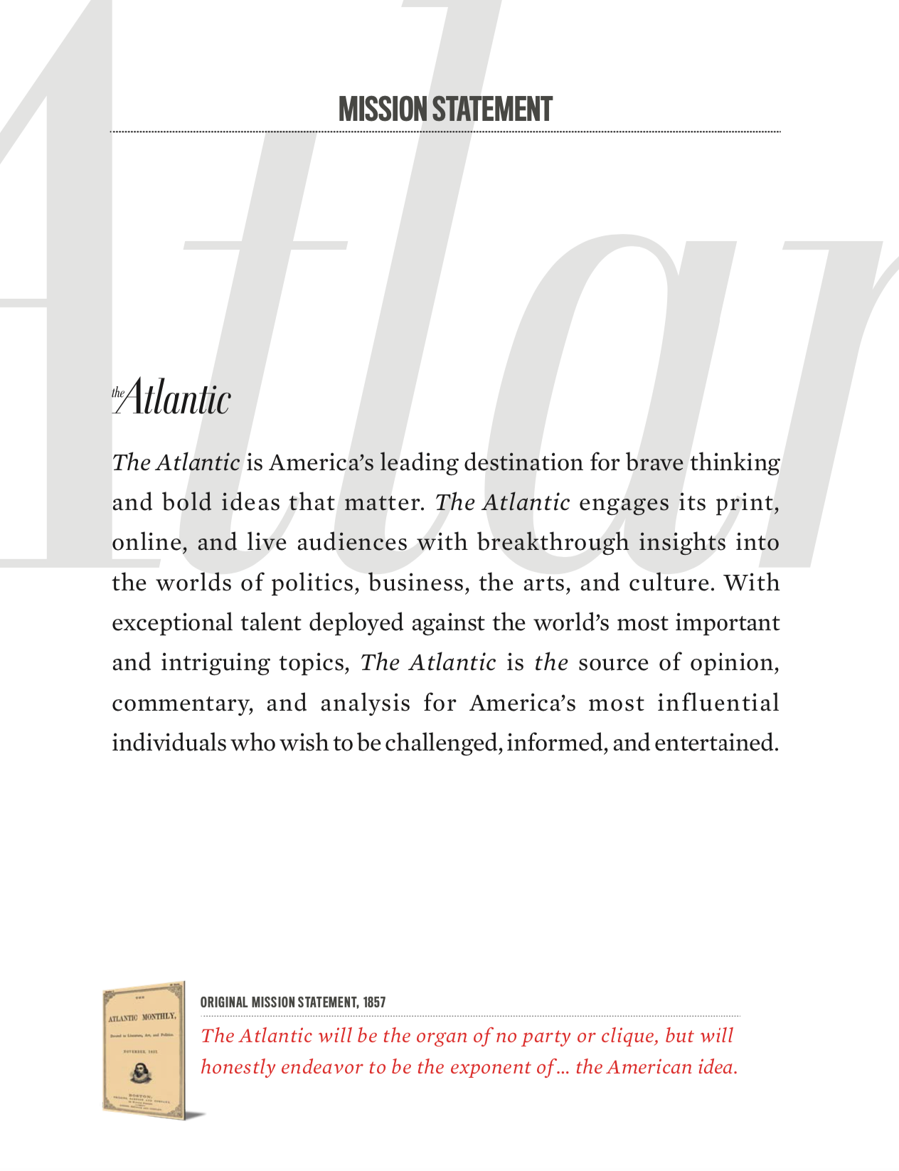
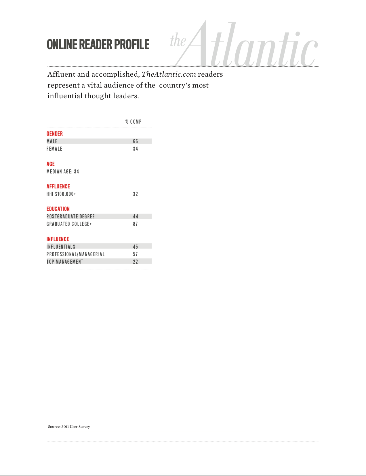

Something of note was that the Atlantic often distinguishes its readers as individuals who are “Affluent and accomplished”, citing the education and career statistics of their readers in the dataset. From this, we got the impression that The Atlantic was a publication/organization valuing affluence and power, most likely targeting to appeal to those who are considered highly educated/respected in their fields in order to affirm that their readership consists of renowned and respected individuals. This could be an effort to make The Atlantic appear to be a more respected and trusted source from a psychological perspective, or that they hold their reputation in high importance.
Print Specifications + Questions:


Content Specifications + Questions:


Design and Layout Specifications + Questions:


Phase II: Macro
In this phase, we began to look at the overall flow and organization of the Atlantic in terms of their print issue, the role that the history of the publication plays in informing its design (and re-design):
- Each section/article was separated by a cover spread (illustration, graphics, photography, text) followed by a consistent design “theme” (repetitive use of a single color, font, pull quotes, or style of photographs unique to that article + matching cover)
- More visuals towards the middle of the magazine: should look at the distribution of pages.
- Each article had a different number/configuration of grid structure unique to that article, no two back-to-back articles shared the same number of columns per page, for example. We considered the psychology of maintaining reader interest/preventing fatigue through diversity (+ priority of artist/writers’ individuality over the Atlantic’s brand)
- cardstock (with mail-in subscript form) ensured the readers almost ALWAYS open to one specific spread (in sept. issue, this was the featured article “How the Virus Won”) which was very visually interesting!
- Covers were more curated, less noisy, and evoked a sense of timelessness. The logo is on prominent display, and easy to spot for those who know what they’re looking for.
- Hierarchy of articles presented (features?)
Information on Redesign:
In an email exchange, Vicki brought our attention to the recent rebranding done by the Atlantic just last year.


The Redesign as Our Visual Narrative:
In our discussions about our findings, we decided to make the most recent re-design the core of our visual narrative:
- Ties in typography, color, grid, and overall qualitative visual personality/brand for both print and web platforms. The re-design covered a lot of ground and made for a good foundation for explaining the larger picture.
- Strong basis for intentionality — we were really able to get into the heads of the designers’ behind the Atlantic through comparing and contrasting the difference between the older and newer versions and were able to treat their choices as conscious acts of change, which helped our analysis a lot.
- It’s an interesting narrative that incorporates its historical significance with a clear and strong emphasis on the Atlantic’s intentional branding message and “vision”. It also allowed us to present our information in a semi-linear way, combining print and web together to make a cohesive narrative.
Phase III: Micro
For micro research, I mostly looked at the broader visual elements of The Atlantic Print in terms of color and visual comparisons between the older 2019 version and the 2020 re-design while Joseph took on analyzing grid structures and typography.

- The new Atlantic features more works of 2D and 3D graphical art when compared to the older version, which has a clear preference for using portrait photography.
- Most commonly, headshots and busts of individuals take up the majority of space on the cover, whereas the newer versions seem to shy away from depicting human facial features and prefer designs leaning towards a more symbolic and abstract overall look. (adds to timelessness)
- There are fewer visual elements overall, making the publication stand out in stores.


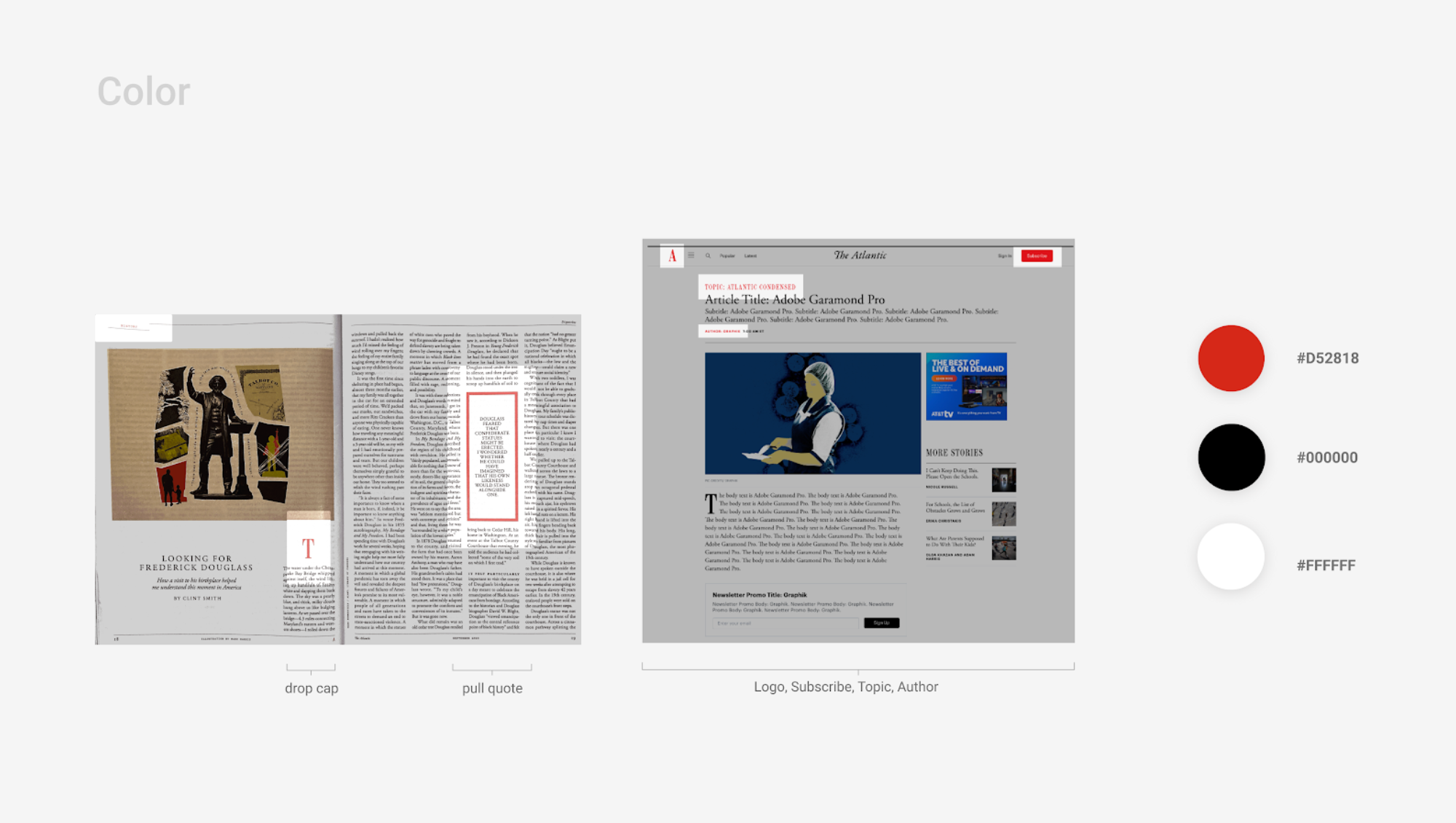
- The Atlantic uses red specifically for page numbers, drop caps, pull quotes, section headers, for signaling the conclusion of an article (with a small, red A), or for larger areas of text and individual design elements.

- Overall, there are elements of being center-aligned or oriented present in most spreads, allowing the magazine to seem cohesive as a whole.
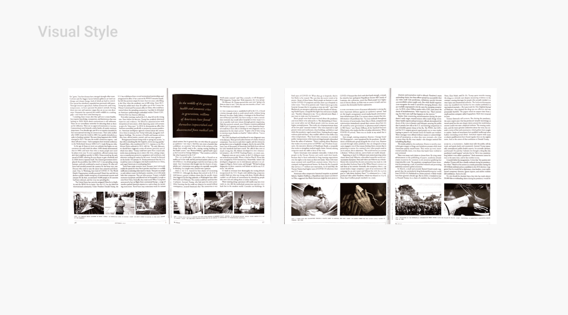

- The Atlantic prefers black and white photos over colored originals, which is another thing that helps keep the publication cohesive in terms of visual language and design. Even when they have illustrations (see right) the photo aspect is kept black & white.
- The Atlantic maintains a balance of having a diverse range of illustrations yet a cohesive overall style! → emphasis on author/artist voice but also the Atlantic as a cohesive brand.
Draft Presentation & Feedback
(The script is in presenter notes)
Feedback (MIT group + Vicki)


Phase IV: Revisions
After our presentation, we got together and decided the types of revisions we wanted to prioritize for our final presentation:
- Cut down on time! 16 minutes is kind of ridiculous.
- Conclusions weren’t as strong, no sense of “finality”. Consider how to use visual aids to signal a conclusion and wrap things up concisely.
- More information about the demographic and audience as introduced in the background context in the beginning. How is the audience reflective or representative of the Atlantic’s look? How does the audience inform its look? (Consider relationships and feedback loop → how they gain or lose subscribers of each demographic)
- Unify the color-coding system between print and web.
For my pages specifically, I worked on taking out some of the color swatches so it would only have the colors I explicitly bring up, creating another slide specifically for demographics with my teammates, combining color for print and web into one slide (efficiency), and condensed my information so there were fewer slides overall and also less information to take in per slide:



(Overall, we definitely spent the longest time in the vicious cycle of re-editing our script and doing practice runs so we could deliver it in hopefully-less-than-16 minutes but not strip too much of our presentation away.
Definitely pretty brutal, but we got it to 9:32:04 and it was great practice! 👍🏻)
Final Presentation & Feedback
(The script is in presenter notes)
Carl:
- good start of the presentation
- good flow overall
- missed some history between the migration from print → web
- takeaway = good summary
Rachel:
- more about how web grid contrasts with each other and how modules have to be reformatted when you transition between web and print
- highlights enlarged = good
- taking about the header/gutter, column, etc. could be highlighted better
- very clean
Vicki:
- well scripted and practiced (note: it was a long four hours of practice for us)
- For the typeface, it would’ve been interesting to see WHY they were used instead of WHAT they used. Discuss the effect on the readers (briefly mention serif = trustworthy, true)
- more info about custom design font would be good (Atlantic Condensed)
Hannah:
- really good at the end
- simple and clean aesthetic
- san-serif contrast with serif good
- the narrative was clear and the flow was good
Andrew:
- grey was made darker (note: …and actually visible, cheers)
- the simplicity of red was nice, but the Atlantic uses red as well so it was confusing what we were drawing attention to vs what was actually a design element of the Atlantic.*
- We decided to change one of the more confusing examples (the giant red circle) into something less saturated; it doesn’t resolve the issue completely, but that particular spread was problematic as it was not a case of the Atlantic consistently and systemically using red as a spot color but the actual “theme” of the article itself. Other than that, our meta-presentation-spot-color was not used on the slide about colors IN the Atlantic…Hope this helps a bit!
Project Takeaways
Retrospectively, there was a lot I didn’t know about print organization and structure. Although I had worked with some of the more technical aspects of Print design before, I had never put in that much thought into the essence of what makes (or doesn’t make) a work of print engaging, trustworthy, or give off a particular kind of impression beyond basic accessibility and readability. What stuck with me the most throughout this project is how in studio and lab classes, our professors brought up how similar (or identical) content can provide a user with completely different experiences and how sometimes using the grid effectively means breaking it. It really helped put into perspective the struggles I’ve previously experienced in choosing between sticking with a set of pre-established “rules” or conventions for print design versus going for something that is more intuitive yet “imperfect”. I think that overall, this project helped me negotiate the balance between the methodical and consistent side of design versus its more qualitative and intuitive side.
One aspect I really enjoyed about this project was being able to set aside the micro (or “nitty-gritty”) part of things and focus on how aspects of print design work in a larger context. I had a lot of fun looking into the statistics and marketing research for the Atlantic and working backward to understand the intention behind the design. Working in this macro to micro process allowed me to incorporate aspects of psychology and economics into my understanding of the design and better understand their visual narrative as a complete picture with a rich context grounded in historical importance.
Looking forwards, I would like to bring some of my focus back into the technical aspects of grid and structure analysis in a way that incorporates both technical aspects of print design and its broader influence. Below is our shared working process/space for this project: