C-Mini F2020 | Sophomore Design | Iris Yip
Project Introduction
In this project, we are aiming to explore visual hierarchy through “a set of specific and systematic exercises, […] exploring typographic variables in clarifying a message based on the content’s hierarchy”
Event: Carrie Carpool Cinema
The event I received was ‘Carrie Carpool Cinema’ presented by Rivers of Steel, which is a drive-in theater event occurring periodically on Friday and Saturday evenings throughout the summer and fall season here in Pittsburgh. The venue is the Historic Landmark of Carrie Furnace, and all proceeds go to help to preserve the site.

The weekends are all themed differently, ranging from “filmed in Pittsburgh” to “80s Family Weekend” and “Classic Horror Flicks” to take place in October around Halloween.


Sentence Describing Carrie Carpool Cinema
“Experience a drive-in like no other! With the Carrie Blast Furnaces as your backdrop and a lineup of can’t-miss double features, the stage is set for summer fun!”
-(https://riversofsteel.com/experiences/carrie-carpool-cinema/)
Adjectives Describing Carrie Carpool Cinema
Retro, Nostalgic, Lively
After browsing both the webpage for the event, reviews online, and researching the venue and organization behind the event, I had a distinctly retro impression of the event; many of the films they present are “classics” or “throwbacks” which coupled with the history of drive-in theatres reaching their peak popularity in the 1950s, is bound to inspire nostalgia for a more middle-aged audience. Many of their weeks are all also “family-friendly”, therefore signaling that they may be advertising to an older audience who have children and families of their own. Buzzwords including “classics” or “80s-themed” and “rockin’” add to this impression as well.
The event descriptions themselves are also very lively and enthusiastic, often indulging in wordplay, alliteration, gratuitous use of exclamation points, and an overall very amiable tone of voice.
Rivers of Steel — ABOUT
Rivers of Steel, the organization behind Carrie Carpool Cinema, is responsible for many other events focusing on showcasing the innovation of Pittsburgh’s “industrial and cultural heritage” through offering unique experiences including workshops, tours, festivals, exhibitions, and more. The proceeds go to support historical landmarks and sites in Pittsburgh and increase “economic revitalization” in the community.


Carrie Blast Furnace — ABOUT
Carrie Blast Furnace is a former blast furnace located along the Monongahela River, operating from 1884 to 1982, producing up to 1,000–1,250 tons of iron per day. It is considered a significant historical landmark, being among the “only pre-World War II 20th century blast furnaces to survive”.
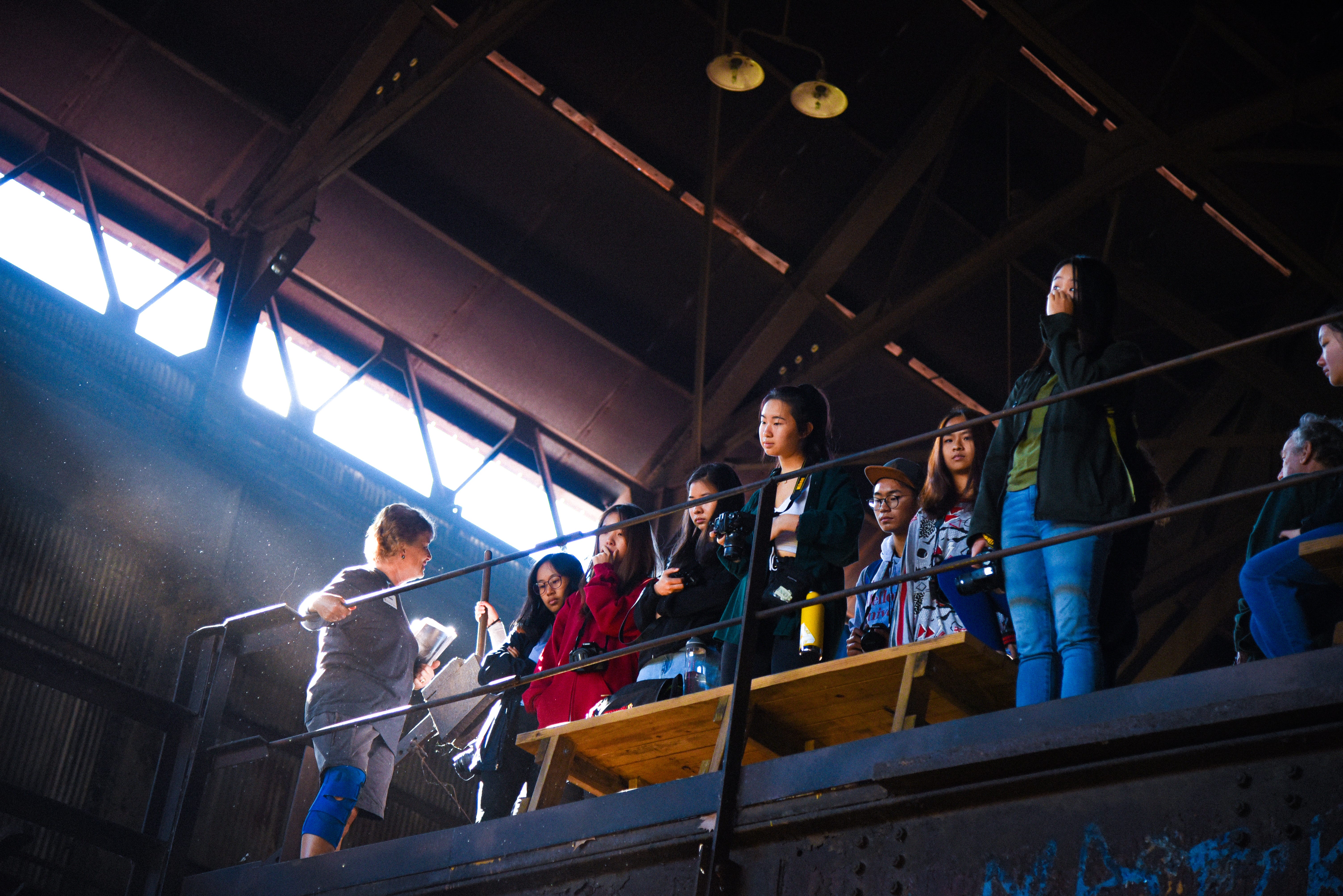


Neue Haas Grotesk — ABOUT
sans-serif typeface, very cool.


Part I Exercises
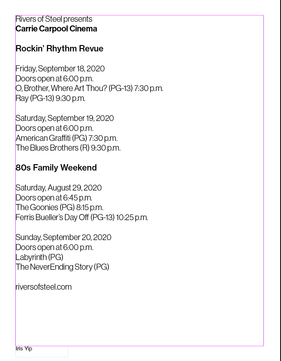
For Part I of the exercises, this was the text I was given:


I started by analyzing the text for informational importance in order o sort them into an appropriate hierarchy. Out of the 22 (?) lines of text, 8 were film titles, their ratings, and the time of start. Three were specific weekend film series/themes, such as “Filmed in Pittsburgh”, “Rockin’ Rhythm Revue”, and “80s Family Weekend”. The dates and times for “Doors open at[..]” seem to specifically precede the two back to back films on that day, which has their own screening times. Other than that, there is the organization name, Event name, and site.
Stroke Weight
- choose 2 stroke weights
- have 4 lines with the heavier stroke weight
- 17 with the lighter one
- why do i count 22 lines am i blind
For this exercise, I decided to use a combination of 45 Light and 65 medium — the 75 bold ended up being a bit too strong and somewhat bled together, but 44 roman and 65 medium did not show enough contrast to actually bring out the hierarchy.
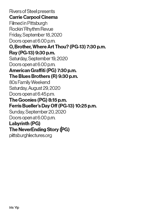
In terms of the 4:17 (4:18?) line weight distribution, I chose to use the bolder stroke weight to highlight the event “Carrie Carpool Cinema” and the individual film titles, since I felt like the films themselves were one of the larger selling points and important to-know information about the event that should be conveyed to the audience.
Alternatively, I tried emphasizing the event/weekend theme names, but there wasn’t a good distinction between the sections, and ‘Carrie Carpool Cinema’ blended in as the lines are back-to-back, making the type of information I was trying to convey more ambiguous and confusing.
[See below]

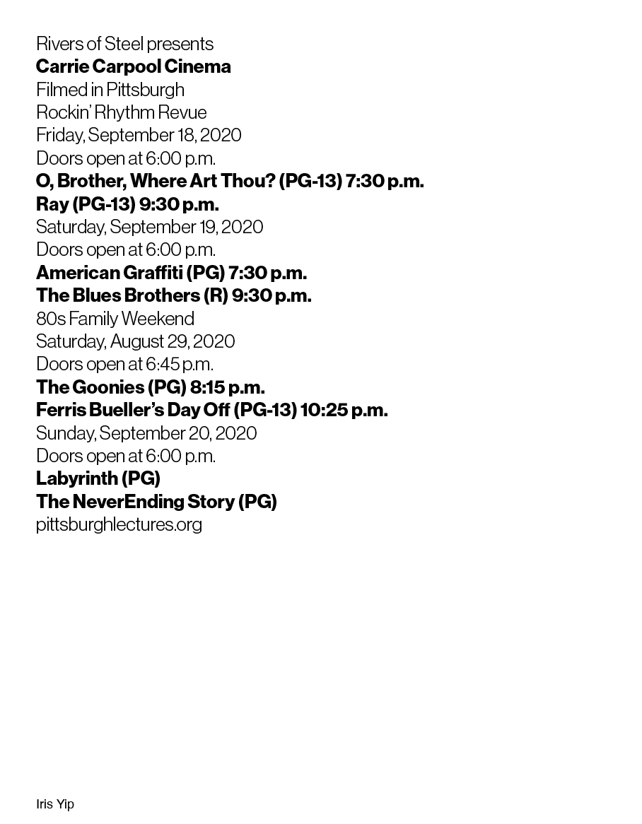
Line spacing
For line spacing, I chose the following two (?) as the most communicative examples.
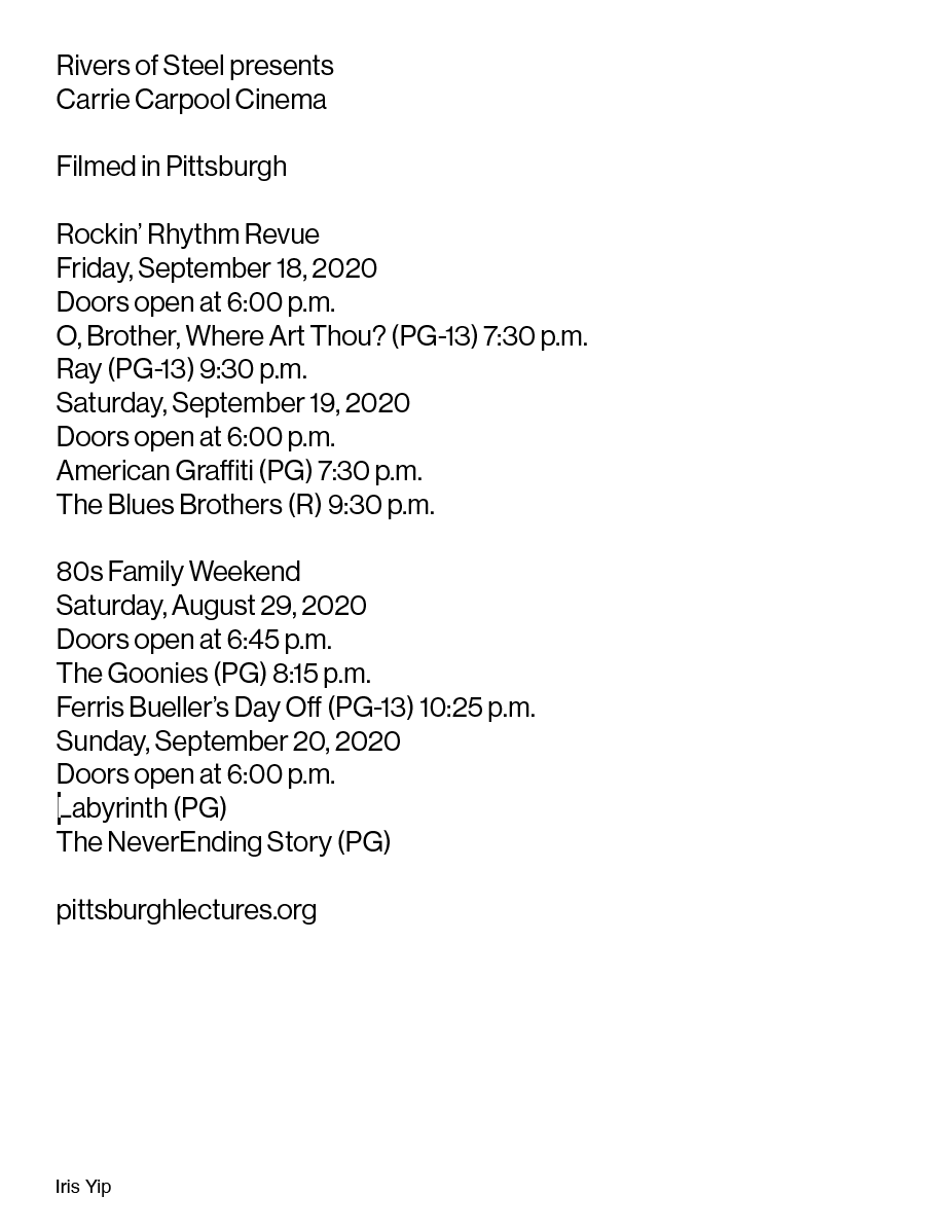

[insert bad rejected ones here]
Horizontal shift: two flush-left margins


oops I hate all these
Horizontal shift: three flush-left margins


Part II Exercises + Class Exercises
In class, we went over the different exercises in part I and continued on to combine exercises 1+2 and 1+(3 or 4)
Key Takeaways:
- given 4 different stroke weights, consider the level of contrast! For example, light 45 and medium 65, or roman 55 and bold 75 were good combinations, whereas light 45 and bold 75 ended up being overall less readable.
- consider the 6ft →6in rule! What do you need to see from far away (getting the viewer’s attention) and how do you maintain it once you’re close?
- resist the urge to center and fill the page on principle! Think about how negative space can be beneficial (or necessary) when conveying information effectively.
In-Class Exercise
With the in-class exercises, I ended up deciding that my two most effective attempts were the following:


notes:
- How do different ways of creating hierarchy compliment or obstruct each other?
- how can we utilize negative space effectively?
- different prompts with different amounts of text: for some, is it more important to have many different embedded ways of achieving hierarchy? For Carrie Carpool, should consider event →date →film →rating →time? versus some events which might only have event →date in which case excessive hierarchy can be destructive? (ex. if everything is highlighted, then nothing is.)
Exercise III — Adding Color + Scale:
For part II, we began to add color and scale of text to our text. First, I broke down the different ways I could approach looking at color:
Harmonious Color Palettes/Relationships
This is typically my go-to for choosing color: find colors that complement each other and work well together. In Lab, we worked with Andrew on how to effectively generate/collect color palettes and translate them into our working space.
I also collected some magazine print samples that had interesting, or “eye-catching” color combinations in order to get a better sense of how colors are informed in physical print and not just the web.
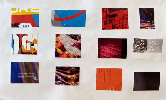
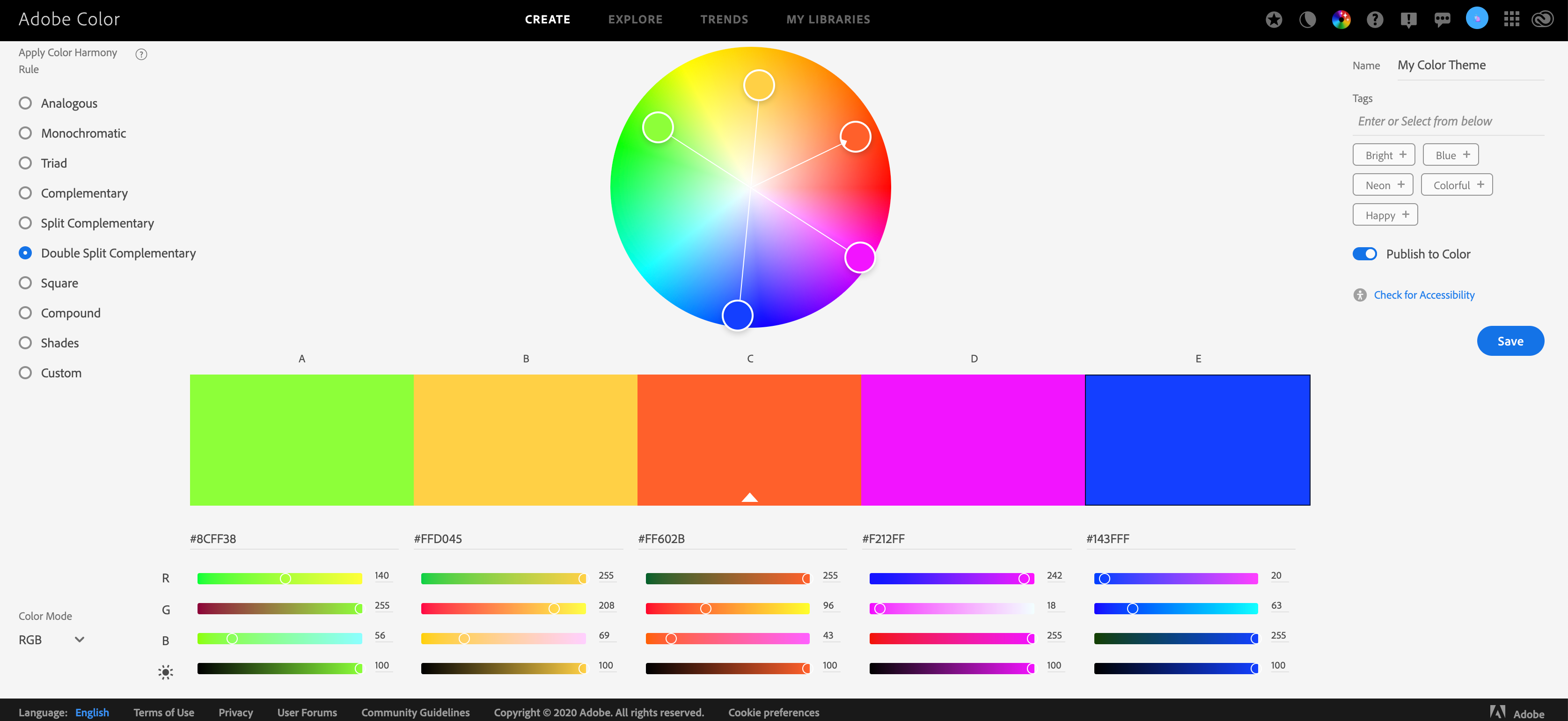
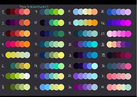
Overall, in this stage of my process, I was primarily trying to get the color to just work — establishing an equal balance between the text and its background in order to create something visually digestible.


Contextual Color Palettes/Relationships
Taking it further, I decided to take a step back and consider color on a more macro scale; what colors will help inform about the nature of the event? How can color convey a certain mood or even atmosphere?
I tried to consider the zeitgeist of when drive-in cinemas were at their popularity peak and the types of colors that are reminiscent of that time/feeling.
keywords (and the colors I reconcile them with):
- nostalgia: lack of pure white (a duller cream/beige/yellow signifies a sense of age/time), warm yet unsaturated tones, low(er) contrast
- sunset: bright oranges/reds against warm-toned purples or dark blue/grey
- movie theatre: high contrast, rich red chairs and bright screen → text?
- summer: yellows and oranges, greens, blues
- retro: (???) purples and reds with teal/turquoise. Very funky. Circus vibes.


Text as an accessory Versus point of interest
At this point, I realized I was falling into a trap of treating the text like it was an arbitrary design element — in the way that it was more used to bring some sort of highlight/contrast to the background than something that actually conveyed information and needed to be accessible and readable.
As a result, I was creating some truly heinous looking color schemes. Maybe I was subconsciously sick of the one-line ‘O, Brother, Where Art Thou? (PG-13) 7:30 pm’ being an eyesore for every composition I tried putting it in. I don't know.


wouldn’t it be nice to only have 4 lines of text? sigh.
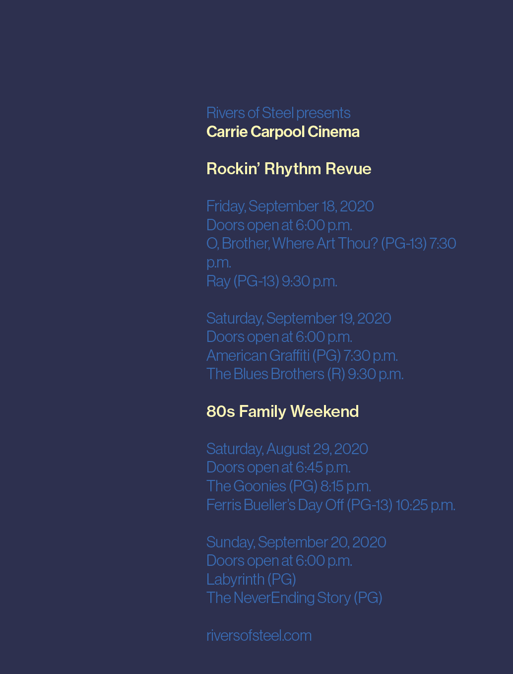
Regardless, I revisited the colors, this time taking care to make sure they’re legible and worked to highlight the informative nature of the text, not the decorative one. Part of the issue was figuring out how to rework my pre-existing ways of establishing hierarchy in the text after color was introduced.
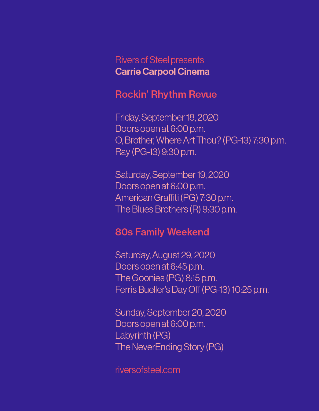
I ended up with two that I felt were the most communicative and “context-accurate” (from my point of view):
I chose these because they incorporated a darker background, which reminded me of a movie theatre or night sky, and also had a warm but relatively unsaturated text color. I felt the one on the right was more successful with drawing attention to the event names, but the one on the left was overall more cohesive and the actual film titles didn’t fade into the background as much as the one on the right did.

Class notes:
- consider one constant variable (ex.background color) and just change text color on a micro-scale to help recontextualize the hierarchy in the text
- What is the most important information to know from a distance? (higher contrast, more visibility) What is the most important up-close?
- Look in the perspective of the viewer
- Think outside the box with color: cut the page in half/section the page? What looks different? What stands out?
Scale
honestly in hindsight… please don’t ask me what I was thinking with some of these.
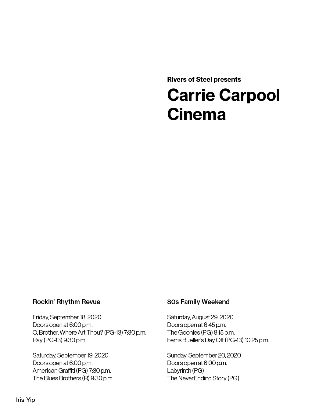

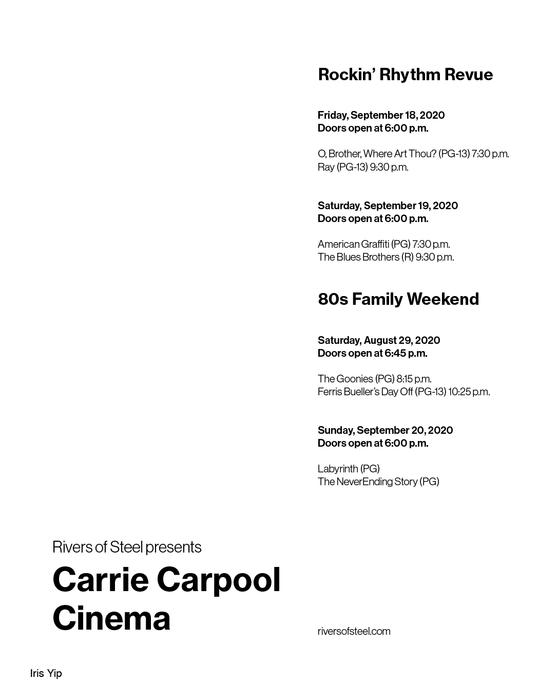
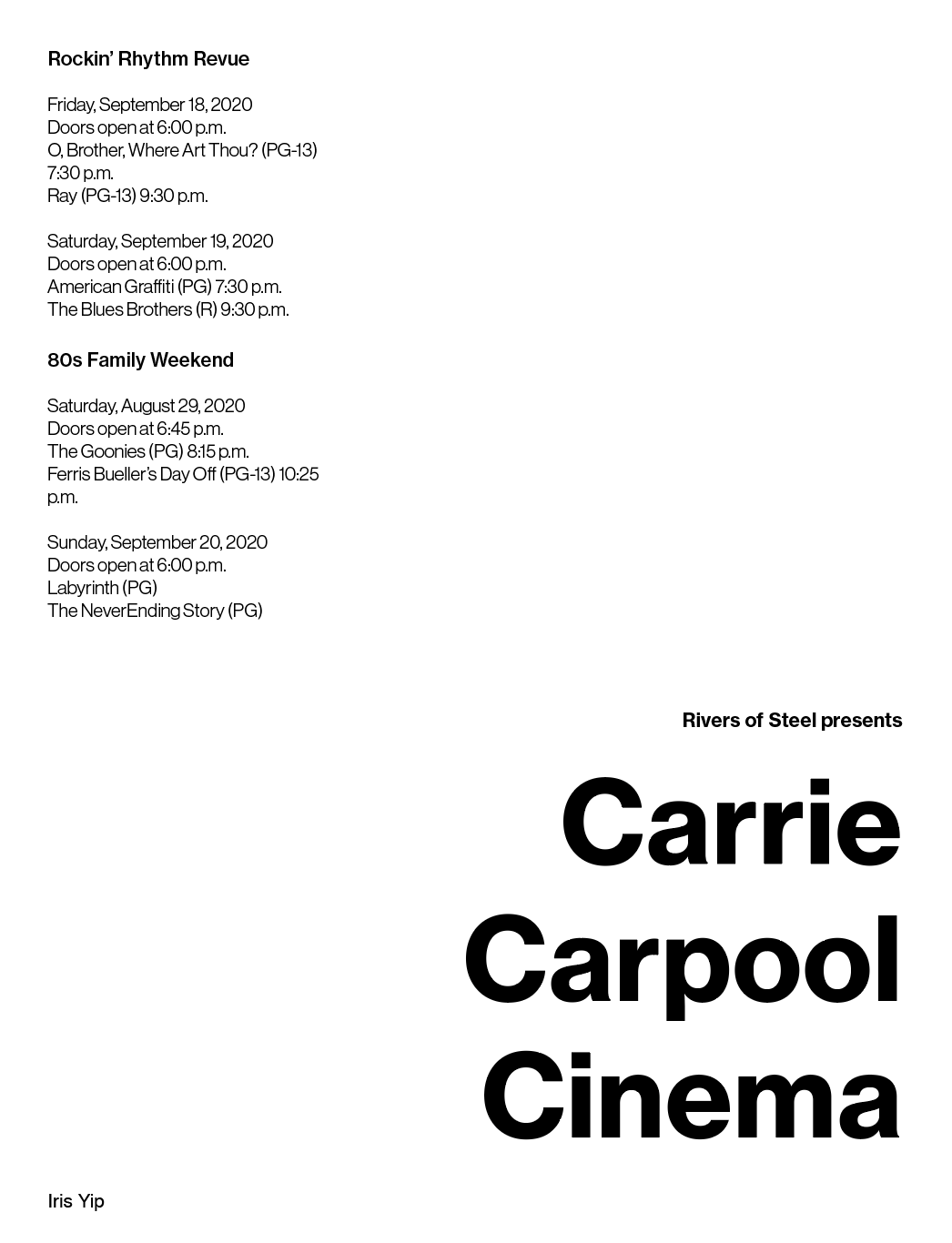


Overall, I found it interesting that I subconsciously chose to make the title the largest almost always — with the exception of occasionally making the event name larger.
Class Comments:
- sideways text: you gotta try it once, but it’s not accessible. More often than not it’s trying to downplay text that is important? but not really. If that makes sense.
- Consider how big the text should be! Print it out! From far away, everyone could only really see Irish Music Series — don’t just focus on how it looks on the screen, print is a physical object!
In the end, I thought about my most effective ones and why:


LEFT: good and interesting way to leading the viewer's gaze up and down, the balance of ‘CCC’ not being overpowering. And yes, the alliteration did drive me insane at some point.
RIGHT: interesting and engaging event titles! But very little affiliation to Carrie Furnace, which is a cool selling point especially given the nature of rivers of steel events.
Part IV: Images!!!!!!
In the next exercise, we started to incorporate images. In class, we did an exercise with Andrew where we put up images on Figma and had people comment on a word they associated with the image.

other than the fact I am a little worried at how many people initially wrote something along the lines of ‘burnt toast’ for one of the examples, I found it really interesting to consider how different people have different reactions to images — what might be self-explanatory for me isn’t necessarily for others.


Early Iterations:
I found this surprisingly difficult — it felt like I had built up too much from color and type alone that making the transition felt more like starting from scratch.

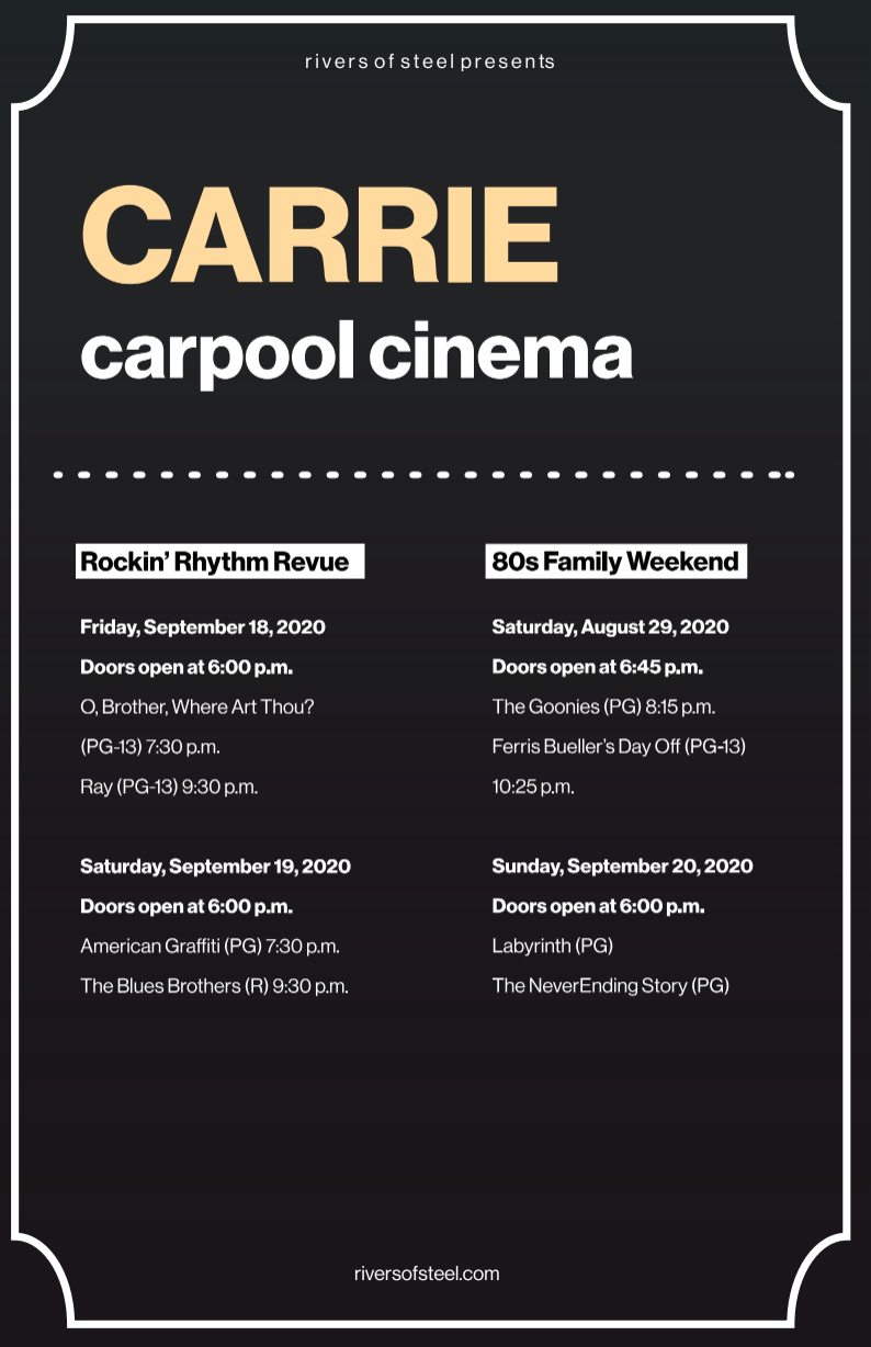


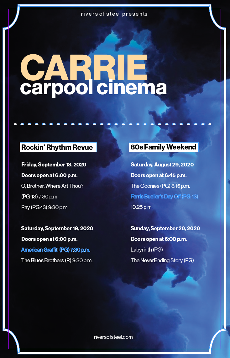

Mini-Group Feedback:
- People weren’t really a fan of the one that looked like a ticket (center on both rows) since it looked a bit kitschy — which is understandable. Similar to the one of the light and the cinema seats, they were both just ideas I had to try.
- A lot of people enjoyed the framing of the bottom right but felt that the top left had more to do with the event, albeit on an abstract level
- (Andrew followed up with the top left poster saying it had a few margin/gutter issues where sometimes the text would be too close — and OF COURSE, IT WAS THE O, BROTHER MOVIE TITLE AASKDJASLKD — and the composition felt a bit too centered. Also, it looks a bit like popcorn, which is a lot better than my classmates calling it bacteria. I think.)
- People liked the blue but also was confused on how it informed anything about the event. The short answer is that it doesn’t. :)
Overall, the opinions weren’t divided, but I didn’t get the strong urge to continue with any of my iterations past this point either. The one that I felt was the most “successful” at this point was:

… but there was still a lot I didn’t feel like was intentional, including the image which worked visually but not contextually.
Things that did work:
- Carpool in another color: this way it could also be read as ‘Carrie Cinema’ and the carpool part stands out. It also helps with the fact the alliteration throws the composition off slightly as the 3 C’s stand out a lot in my opinion.
- Overall composition. The vibrancy sticks out a lot.
Things that didn’t work:
- contextless image?
- micro-details of text: the hierarchy got lost during the transition to using imagery, and I would need to re-work it in order for it to be effective and not overpowered by the image.
Final Iteration
I met with Vicki during this time since I was pretty lost on how to continue with the project. Overall, I received similar feedback on needing to focus on the micro-levels of text rather than the macro, but I was still feeling hesitant about continuing in any one direction and we revisited an iteration I didn’t finish during round one of crit.
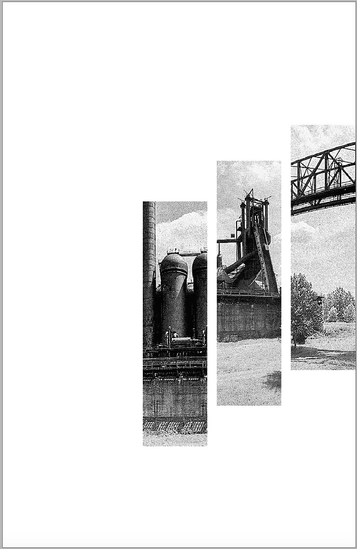
I agreed that all of my iterations used very abstract imagery and relied heavily on the ‘carpool’ or ‘cinema’ aspect, rather than the Carrie Furnace aspect. I realized that I had a lot of trouble communicating this abstract idea of summer/film/family/nostalgia through images and decided to rework the direction of the poster from another angle altogether.

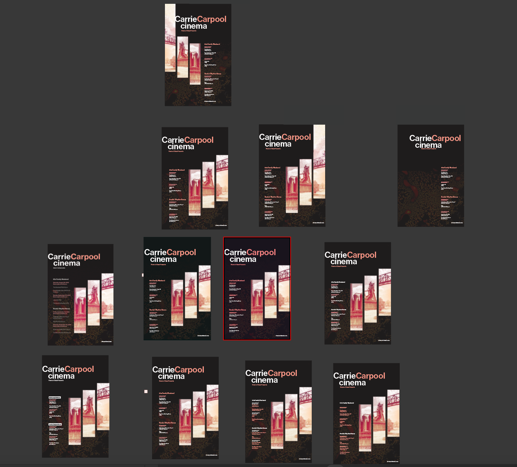
Key Aspects:
- similar energy and color palette to my original ‘final’ iteration — darker background to represent night+cinema, warmer highlight, and text for furnace/summer/celebration
- Kept the different colors for Carrie and Carpool (and eventually made cinema lowercase so there would be a shift down to the body text+ less repetitive alliteration of CCC)
- reworked the text hierarchy so that each ‘category’ (name, rating, time, title) had slightly different levels of hierarchy nested in each other. This took an embarrassingly long time, yes it did.
- used staggering photos of Carrie furnace with a color overlay to convey the specific energy I wanted.
Final Crit + Key Takeaways

There wasn’t that much feedback generated for my specific poster, but we did look at which posters drew us in from a distance, consideration for the context (the pure white background stood out a lot, which surprised me because I did forget that in real life, almost no background is going to be as white as the paper — similar to the earlier the conversation about how white itself is actually very striking) and how different content requires different levels of attention to hierarchy.
Takeaways
I was pretty scared to basically re-start something from scratch the day before the final, but as I was working on it I noticed that the exercises I did with hierarchy and type ended up coming through in the end, so while I felt like I had started with new material a lot of my decisions were informed by what I learned and took away from the process itself.
It was also a pretty valuable lesson in being able to scrap my own work sometimes if I felt like it wasn’t going to work out. I didn’t have copious amounts of iterations for any of the other versions I worked on as I did with my final, so I felt like overall I made the right decision to switch when my gut instinct told me the overall concept itself just wasn’t working for me.
That being said, I do wish I had more time to revise and work on my final; I feel like I didn’t get to go through an iterative process as much with my final idea as I could’ve had I stuck with an earlier draft, but sometimes the project timeline and my own timeline of working things out don’t necessarily line up and I’m actively working on getting better at accepting the fact and adapting the best I can :)
Overall, I feel just a bit more confident in being able to take on a poster/type project of this nature as a designer after going through this process. There were both a lot of little technical mishaps that I would find in my work from earlier years that I now know what to avoid as well as a more concrete sense of the type of print design I personally lean towards.
Even if I’m not entirely satisfied with the end result, I think it was a good exercise in helping me understand the basics of text hierarchy in print.
(And I’m joking when I complain about the length of the film titles. Mostly.)